
Expert Guide Series
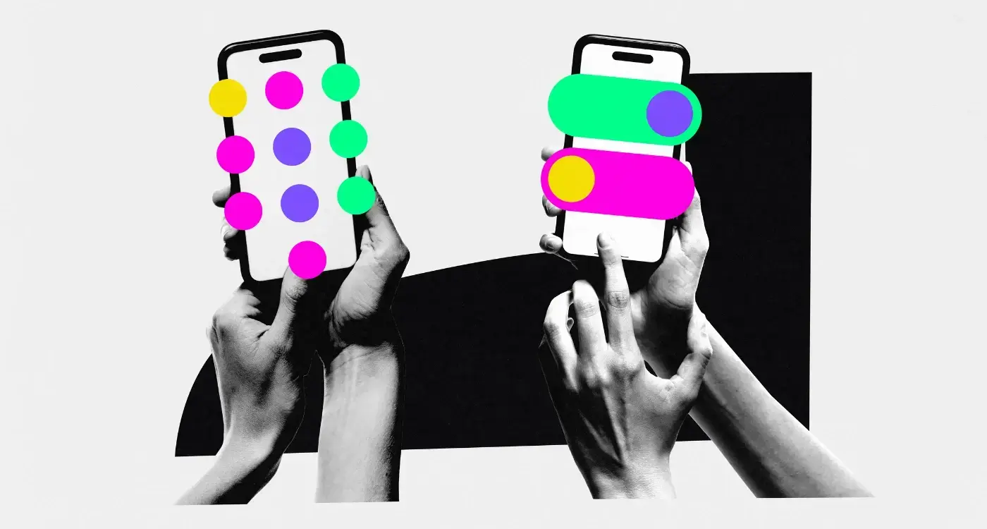
10 micro interactions that will transform your apps user experience
Your app might have perfect functionality, but users still feel frustrated. They tap a button and nothing happens. They wait for content to load with no indication of progress. They make an error and face harsh, technical messages. These moments of uncertainty and confusion can make or break the user experience.
The solution lies in the smallest details. Micro-interactions are those tiny moments of feedback that bridge the gap between what users do and what your app does in response. They're the digital equivalent of body language in conversation, adding meaning and emotion to every interaction.
Micro-interactions transform cold functionality into warm connections.
When designed thoughtfully, these small touches operate below conscious awareness whilst providing instant feedback loops. Users get immediate confirmation for their actions, which creates psychological conditioning that keeps them engaged. The difference between an app that feels responsive and one that feels sluggish often comes down to these micro-moments.
Ten specific micro-interactions and UX design principles can transform how users experience your app. Each one addresses a different psychological need, from reducing anxiety during waiting periods to creating confidence through clear feedback.
The Psychology Behind Micro-Interactions
When we have conversations with people, we pick up countless visual cues beyond the words being spoken. A raised eyebrow, a slight smile, the way someone leans forward. These subtle signals add richness and meaning to our interactions, helping us understand not just what someone is saying, but how they feel about it.
Digital products work the same way. Between the obvious communications (buttons, text, images), there's space for extra meaning and emotion. Micro-interactions fill that space, conveying personality and creating connection through movement, timing, and visual feedback.
Building Trust Through Responsiveness
The human brain craves acknowledgement for its actions. When we push a physical button, we expect it to depress slightly. When we turn a door handle, we expect resistance and then release. Digital interfaces need to provide similar feedback to feel natural and trustworthy.
Without this feedback, users experience what psychologists call learned helplessness. They perform an action, receive no confirmation, and become uncertain whether anything happened at all. This uncertainty breeds frustration and erodes confidence in the product.
Creating Emotional Connections
Micro-interactions also serve as opportunities to inject personality into otherwise functional experiences. A playful animation when completing a task can create joy. A gentle pulse when saving data can provide reassurance. These small moments accumulate over time, shaping how users feel about your product beyond its practical utility.
Loading States That Build Anticipation
Nothing tests user patience quite like waiting for content to load. Traditional loading spinners leave users in limbo, wondering how long they'll wait and whether the process is even working. Smart loading states transform this dead time into an opportunity for engagement.
Progressive loading shows content as it becomes available rather than waiting for everything to finish. Social media feeds excel at this approach. Instead of showing a blank screen whilst fetching posts, they immediately display a skeleton outline that gradually fills with real content. Users see progress happening, which reduces anxiety and maintains their attention.
Smart loading states turn waiting time into engaging moments.
Contextual loading messages can also help users understand what's happening behind the scenes. Rather than generic "Loading..." text, explain the specific process. "Finding your perfect matches" feels more meaningful than "Please wait" because it connects the delay to value.
Use skeleton screens for content-heavy interfaces. Show the shape and structure of what's coming whilst the real data loads. This creates the perception of faster loading times.
Animation during loading serves multiple purposes. It confirms the system is working, provides visual interest during the wait, and can even prepare users for what they're about to see. A map that zooms into the correct location whilst loading feels more connected than one that suddenly appears fully formed.
UX/UI design built around real psychology
We design app interfaces around how people actually think and behave. User research, psychology-driven UX/UI design and technical specs delivered as one complete package.
Button Feedback That Feels Responsive
Every button press is a moment of trust. Users invest a small amount of effort and expect the system to respond appropriately. When buttons provide immediate, clear feedback, they create confidence. When they don't, users question whether their action registered at all.
Visual feedback should be immediate and obvious. A button that changes colour, size, or elevation when pressed confirms the interaction instantly. The change doesn't need to be dramatic, but it must be perceptible. Even a subtle darkening or slight scale reduction can signal responsiveness.
Timing and State Changes
The timing of button feedback matters enormously. Research shows that responses within 100 milliseconds feel instant to users. Anything longer begins to feel sluggish. However, some actions need processing time, which creates an opportunity for progressive feedback states.
Consider a "Submit" button that transforms through multiple states. First, it responds instantly to the press with visual feedback. Then it shows a loading indicator whilst processing. Finally, it displays success confirmation before returning to its default state. Each phase keeps users informed about what's happening.
Design different button states for default, hover, pressed, loading, success, and error conditions. Users should never wonder whether their action was recognised.
Haptic feedback on mobile devices adds another layer of responsiveness. A subtle vibration when tapping important buttons creates a physical connection to digital actions. This is particularly valuable for critical actions like purchases or deletions, where users need extra confidence in their choices.
Progress Indicators That Reduce Anxiety
Multi-step processes create natural anxiety points. Users wonder how much more effort they need to invest and whether they're making progress towards their goal. Well-designed progress indicators address these concerns by providing clear orientation and motivation to continue.
Traditional progress bars work well for linear processes with predictable timeframes. But many digital processes don't fit this model. File uploads might progress in bursts. Form validation happens in steps. Complex calculations take unpredictable amounts of time.
Managing Expectations
The key to reducing anxiety lies in managing expectations rather than providing perfectly accurate timing. Users are more tolerant of delays when they understand what's happening and roughly how long it might take. A progress indicator that shows "Step 2 of 5" provides valuable context even without precise timing.
Breaking complex processes into smaller, visible steps makes them feel more manageable. A checkout process that shows "Shipping Information", "Payment Details", and "Confirmation" as separate stages feels less overwhelming than one long form. Users can track their progress and understand how much work remains.
Celebrating completed steps reinforces progress and motivates continuation. A green checkmark next to "Personal Details Complete" acknowledges the user's effort and creates momentum towards the next step. These small wins accumulate to create a sense of achievement throughout the process.
Show users both how far they've come and how far they have to go. Highlighting completed steps is often more motivating than emphasising remaining work.
Error Messages That Encourage Recovery
Errors are inevitable in digital products, but they don't have to be experience killers. The way your app handles mistakes can either frustrate users into abandoning their task or guide them confidently towards resolution. The difference lies in the tone, timing, and helpfulness of error messages.
Traditional error handling treats mistakes as system problems requiring technical explanations. Users encounter cryptic codes, passive aggressive language, and vague instructions that leave them feeling stupid or frustrated. Better error messages treat mistakes as natural parts of the user journey that deserve helpful, human responses.
Immediate and Contextual Feedback
Timing makes error messages more effective. Real-time validation that highlights issues as users type feels more helpful than batch validation that waits until form submission. When users see their password requirements updating live as they type, they can correct issues immediately rather than discovering problems later.
Context-specific guidance helps users understand not just what went wrong, but why and how to fix it. Instead of "Invalid email format", try "Email addresses need an @ symbol and domain name, like name@example.com". This approach teaches users whilst helping them recover.
Visual design can soften the emotional impact of errors. Red typically signals danger and creates stress. Consider using orange or yellow for correctable mistakes, saving red for serious problems. Gentle animations that draw attention without startling users also help maintain calm during error states.
Write error messages in your user's voice, not your system's voice. Focus on what they can do next rather than what went wrong technically.
Onboarding Touches That Create Connection
First impressions in digital products happen within seconds. Users form opinions about your app's quality, trustworthiness, and value before they've accomplished anything meaningful. Thoughtful micro-interactions during onboarding can create positive emotional connections that carry through the entire user relationship.
Personalisation, even in small doses, makes users feel recognised and valued. When an app remembers a user's name and incorporates it naturally into interface elements, it creates a sense of individual attention. "Welcome back, Sarah" feels warmer than "Welcome back" because it acknowledges the person behind the screen.
Building Confidence Through Small Wins
Early achievement opportunities help users build confidence with your product. Celebrating wins in relation to the person themselves works particularly well. Rather than comparing new users to global standards they can't meet, acknowledge their personal progress. "You've completed your first task" means more to beginners than "You're in the top 50% of users".
Social proof during onboarding helps users understand they belong in a broader community. Showing how many others have taken similar steps or achieved similar goals creates connection and normalises the user's experience. "Join 10,000 others who started their journey today" positions the user as part of something larger.
Progressive disclosure prevents overwhelming new users whilst building familiarity with your interface patterns. Instead of showing every feature at once, reveal functionality gradually as users demonstrate readiness for more complexity. Each new capability feels like an unlock rather than additional burden.
Design onboarding micro-interactions that celebrate user progress rather than product features. Make people feel successful, not educated.
Conclusion
These ten micro-interactions represent more than design techniques. They're opportunities to create human connections through digital interfaces. Each small moment of feedback, each gentle animation, each thoughtful message contributes to how users feel about your product and whether they choose to continue using it.
The most successful apps understand that user experience extends far beyond functionality. People remember how products made them feel long after they've forgotten specific features. Micro-interactions shape those feelings through countless small touches that accumulate over time into lasting impressions.
Implementation requires attention to psychological needs rather than just visual polish. Users need confirmation that their actions matter, reassurance during uncertain moments, and encouragement when things go wrong. When micro-interactions address these human needs consistently, they transform routine interactions into moments of connection.
Start with the moments that currently create friction in your user experience. Where do people hesitate? Where do they abandon tasks? Where do they express confusion or frustration? These pain points often indicate missing or inadequate micro-interactions that could bridge the gap between user intent and system response.
Remember that the best micro-interactions feel invisible to users whilst dramatically improving their experience. They should enhance natural workflows rather than calling attention to themselves. When users leave your app feeling satisfied and confident, you've achieved the true goal of thoughtful interaction design.
Ready to transform your user experience through strategic micro-interactions? Let's talk about your app's emotional design and create those crucial moments of connection that keep users engaged.
Frequently Asked Questions
What exactly are micro-interactions in app design?
Micro-interactions are tiny moments of feedback that bridge the gap between what users do and what your app does in response. They're like digital body language, providing instant confirmation for user actions through movement, timing, and visual feedback. These small details operate below conscious awareness whilst creating psychological conditioning that keeps users engaged.
Why do users feel frustrated with apps that have good functionality?
Users become frustrated because they lack proper feedback when interacting with the app. When they tap a button and nothing happens visually, or wait for content with no progress indication, they experience uncertainty about whether their action worked. This creates what psychologists call learned helplessness, where users lose confidence in the product.
How do micro-interactions build trust with users?
Micro-interactions build trust by providing the acknowledgement that the human brain craves for its actions. Just as we expect physical feedback when pressing a real button, digital interfaces need similar responsiveness to feel natural and trustworthy. Without this confirmation, users become uncertain and frustrated with the experience.
What are progressive loading states and why are they better?
Progressive loading states show content as it becomes available rather than waiting for everything to finish loading. Social media feeds use this approach by displaying skeleton outlines that gradually fill with real content instead of showing blank screens. This reduces user anxiety and maintains attention by showing that progress is actually happening.
Can micro-interactions really affect how users emotionally connect with an app?
Yes, micro-interactions serve as opportunities to inject personality into functional experiences. A playful animation when completing tasks can create joy, whilst a gentle pulse when saving data provides reassurance. These small moments accumulate over time, shaping how users feel about your product beyond its practical utility.
What's the difference between traditional loading spinners and smart loading states?
Traditional loading spinners leave users in limbo, wondering how long they'll wait and whether the process is working. Smart loading states transform this dead time into engaging moments by showing progressive content loading or contextual messages. This approach turns waiting time into an opportunity for user engagement rather than frustration.
Do micro-interactions actually impact user behaviour?
Yes, micro-interactions create immediate feedback loops that provide psychological conditioning to keep users engaged. They operate below conscious awareness but make the difference between an app that feels responsive versus one that feels sluggish. These small touches can make or break the overall user experience.
How do micro-interactions address different psychological needs?
Each type of micro-interaction addresses specific psychological needs, from reducing anxiety during waiting periods to creating confidence through clear feedback. They help users understand not just what's happening functionally, but provide emotional context and reassurance. This bridges the gap between cold functionality and warm, human-like connections.
Related Articles

The UX Effect: How design decisions impact app success
Most app developers focus on features and functionality, building products that work perfectly on...
by Simon Lee
What Are the Most Common Types of Micro-Interactions in Mobile Apps?
Mobile apps have become part of our daily routine, but what makes some apps feel smooth and natural...
by Simon Lee