Expert Guide Series
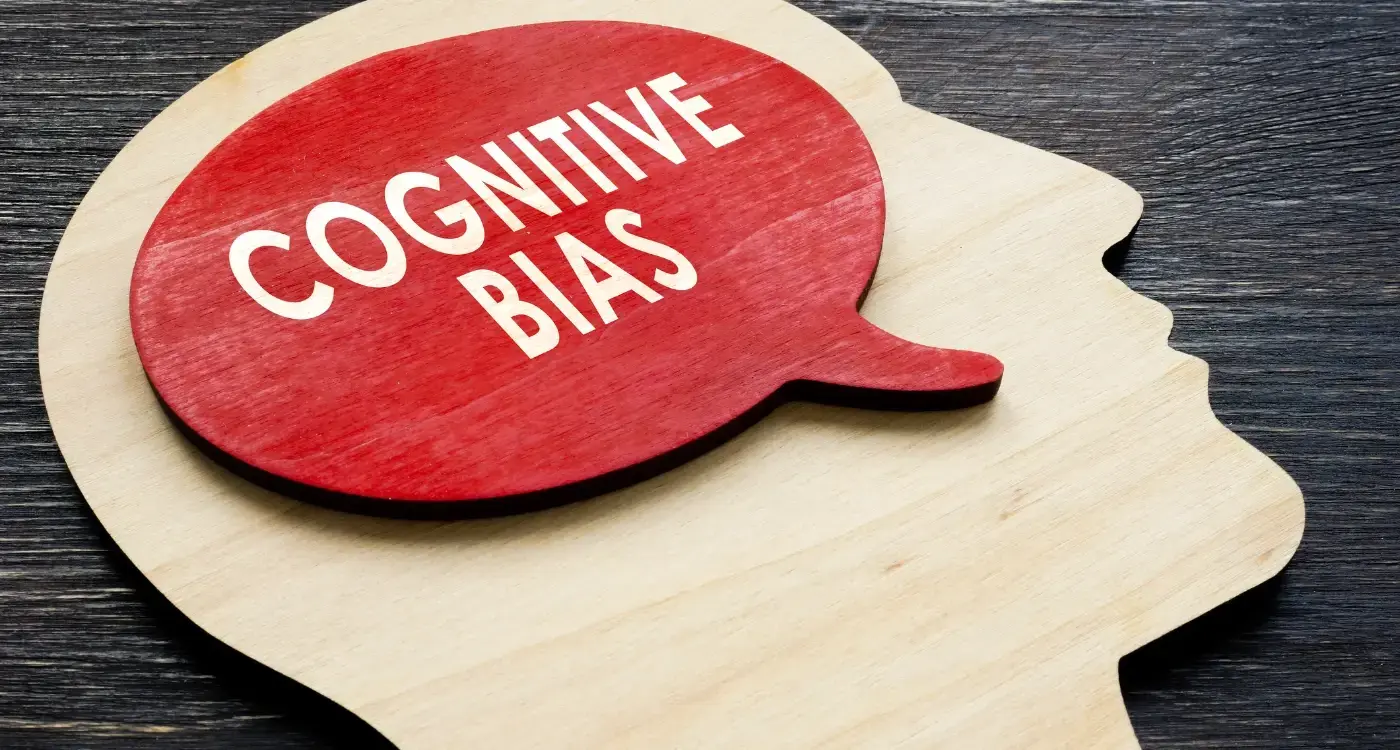
7 cognitive biases that kill your app store performance
Your app has the potential to be brilliant. The functionality works. The design looks polished. The value proposition is clear. Yet downloads are sluggish, retention rates disappoint, and user reviews tell a frustrating story of abandonment.
Most teams look in the wrong places when diagnosing poor app store performance. We often assume poor app store performance stems from obvious issues like bugs, slow loading times, or confusing interfaces. These surface issues mask deeper problems. The real culprit often lies in the cognitive biases shaping user decisions about your app.
These biases operate below the surface, influencing how you prioritise features, interpret user feedback, and design experiences. They seem logical during development but consistently produce apps that fail to connect with real users. Understanding these psychological traps can transform how your app performs in the wild.
Your biggest competitor isn't another app, it's the cognitive biases shaping your decisions.
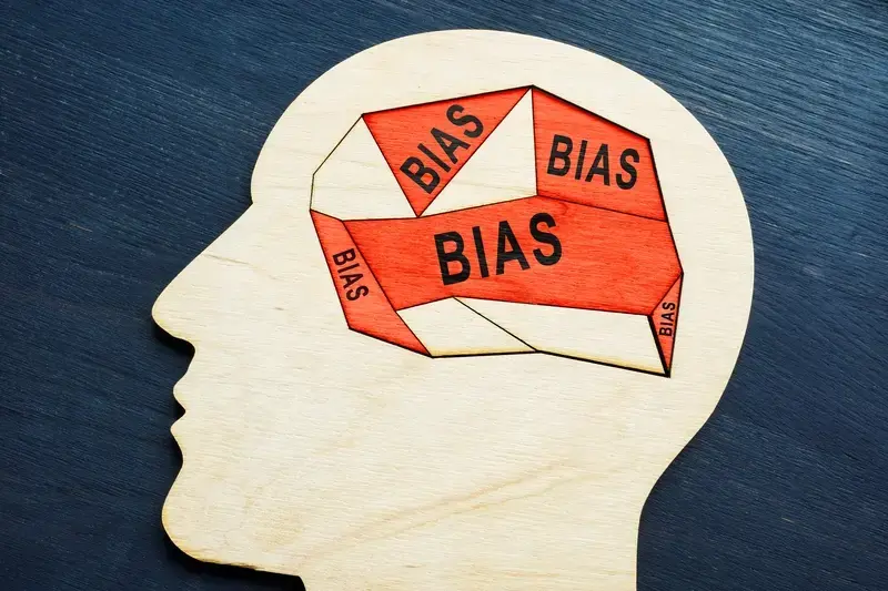
The seven biases we see most frequently share a common thread. They all involve making assumptions about users based on limited or skewed information. They lead teams to build what feels right internally rather than what actually works for people trying to solve real problems.
Confirmation Bias in Feature Prioritisation
Development teams naturally gravitate towards evidence that supports their existing beliefs about what users want. When you've invested weeks designing a particular feature, you become psychologically invested in its success. This makes you more likely to notice positive feedback about that feature while glossing over signals that suggest it's missing the mark.
The result is feature prioritisation that feels data-driven but actually reflects what the team hoped would work. User research gets filtered through the lens of existing assumptions. Analytics get interpreted in ways that support predetermined directions. Feedback from vocal users drowns out the silent majority who simply abandon the app.
Create a devil's advocate process where someone actively argues against your most beloved features using real user data.
This bias becomes particularly dangerous during the early stages of app development. Teams often build extensive feature sets based on their own needs or the feedback of a small group of enthusiastic early adopters. They miss the fundamental disconnect between what power users want and what the broader market actually needs.
Effective teams combat this by actively seeking disconfirming evidence. They look for patterns in user behaviour that contradict their assumptions. They pay attention to what people do rather than what they say. Most importantly, they remain genuinely curious about being wrong.
The Availability Heuristic Trap
Recent and memorable events carry disproportionate weight in decision-making. That passionate user review from yesterday feels more important than the anonymous analytics showing thousands of people quietly abandoning your onboarding flow. The feature request from your most vocal customer seems more urgent than the pattern of silent drop-offs happening across your user base.
This creates a skewed understanding of user priorities. The problems that get attention are those that generate noise, not necessarily those that affect the most people. App teams end up solving for the edge cases while fundamental usability issues remain unaddressed.
In the first thirty seconds of using a product, users are consciously and subconsciously assessing multiple factors. They evaluate the quality and trustworthiness of the app, whether it was hastily put together, the clarity of what the product does, what will be asked of them, and how long the process will take. These critical assessments often happen silently, without generating feedback.
Weight feedback by the number of users affected, not the volume of complaints generated.
The most damaging aspect of this bias is how it shapes feature development cycles. Teams chase the loudest problems while fundamental user experience issues create steady but silent attrition. The result is apps that serve vocal minorities while failing to retain the broader user base needed for sustainable growth.
Design that understands your users
We build app experiences around real user behaviour, not assumptions. Research, psychology-driven design and technical specs that turn users into loyal advocates.
Anchoring on First Impressions
The first piece of information you encounter about user behaviour becomes the reference point for all subsequent decisions. If your initial user research suggests people want more features, every subsequent piece of feedback gets interpreted through that lens. If early analytics show people spending lots of time in one particular section, that becomes the "important" area deserving of more development resources.
First impressions create mental anchors that are remarkably difficult to adjust.
This anchoring effect is particularly problematic in app development because early users are rarely representative of your eventual user base. Early adopters typically have higher tolerance for complexity, more time to invest in learning your app, and different motivations than mainstream users. Building around these initial insights often creates apps that work well for enthusiasts but struggle with broader adoption.
App abandonment occurs in distinct timeframes with specific causes. Immediate abandonment within 3-4 seconds is caused by slow loading, poor performance, sluggish interactions, and technical failures. Within 60-120 seconds, abandonment is driven by onboarding issues including forced early registration, confusing tutorials, and invasive permissions without explanation. These patterns reveal how anchoring on early user behaviour can miss the critical friction points that affect mass adoption.
Regularly challenge your foundational assumptions about users with fresh data from different user segments.
Overconfidence in User Understanding
Building an app creates deep familiarity with its logic, structure, and intended use cases. This familiarity breeds overconfidence in how intuitive the app will be for new users. Developers and designers know exactly where to find every feature, understand the reasoning behind every interaction pattern, and can navigate efficiently through complex workflows.
This expert knowledge becomes a liability when trying to optimise for first-time users. What feels obvious to someone who built the app often feels confusing to someone encountering it fresh. The gap between expert and novice understanding is consistently underestimated, leading to onboarding experiences that assume too much knowledge and interfaces that require too much learning.
In high-stress environments, user problems stem from lower comprehension rather than inability to find interface elements. Users lose understanding of the overall process they're going through because they're operating on a more emotional level, abandoning logical thinking. When users struggle with fundamental task comprehension, this typically indicates they need more guidance, not just better button placement.
Companies commonly make the mistake of oversimplifying their products when trying to reduce cognitive load, which actually dumbs down the product and hides important information. Instead, they should use progressive disclosure to layer information, giving users different levels of detail and complexity based on their emotional state and understanding.
Watch completely new users try your app without any guidance or explanation from you.
The Dunning-Kruger Effect in Design
Teams with limited user experience expertise often overestimate their ability to design intuitive interfaces. This psychological phenomenon leads to interfaces that feel logical to their creators but confusing to actual users. The problem compounds because the same overconfidence that creates poor design also makes teams resistant to feedback suggesting their interfaces need improvement.
This manifests in apps that prioritise aesthetics over usability, complex navigation structures that made sense during planning but confuse users in practice, and feature placement based on technical architecture rather than user mental models. The result is apps that look professional but feel awkward to use.
Signs of Design Overconfidence
Several warning signs indicate when teams are falling into this trap. Dismissing user feedback as "people just need to learn how to use it" is a classic symptom. So is prioritising visual design over interaction design, or assuming that if the team can navigate the app efficiently, users will be able to as well.
The most effective remedy is systematic usability testing with people who haven't been involved in the app's development. Fresh eyes reveal assumptions that feel obvious to the development team but actually require significant cognitive effort from new users.
Building Genuine Design Expertise
Overcoming this bias requires acknowledging the difference between building functional software and creating intuitive user experiences. These are distinct skill sets that require different approaches and different types of validation. Functional software works when you know how to use it. Intuitive software works even when you don't.
Loss Aversion and Feature Bloat
The fear of removing features creates apps that accumulate functionality over time without ever becoming more focused or easier to use. Teams worry that removing any feature will upset existing users, even when usage data shows those features are rarely used and may be creating confusion for new users.
This loss aversion extends beyond features to entire user flows, design elements, and content. The app gradually becomes more complex as new capabilities get layered on top of existing ones. Each addition feels necessary in isolation, but the cumulative effect is an app that tries to do too much and succeeds at too little.
Understanding what leads up to somebody using a product and their emotional state when entering the app is absolutely critical for effective user experience design. Users often arrive at your app with specific goals and limited patience. Feature bloat creates friction between their intent and their ability to take action quickly.
- Track feature usage data over time, not just at launch
- Measure how features affect overall app performance, not just individual feature success
- Consider the cognitive cost of each feature on new user onboarding
- Test whether removing underused features improves core user flows
Regularly audit your app by removing features used by less than 10% of active users and measuring the impact.
The most successful apps resist this accumulation by establishing clear principles about what they will and won't do. They recognise that saying no to feature requests is often more valuable than saying yes. They understand that simplicity requires ongoing curation, not just initial design.
Conclusion
These cognitive biases don't operate in isolation. They reinforce each other, creating systematic blind spots that affect every aspect of app development. Confirmation bias makes you seek evidence supporting your anchored first impressions. Overconfidence prevents you from questioning those impressions. Loss aversion keeps you from correcting course even when evidence suggests change is needed.
Breaking free requires systematic approaches that counteract these natural tendencies. Regular user testing with fresh participants. Data analysis that actively seeks disconfirming evidence. Feature audits that prioritise simplicity over completeness. Most importantly, building cultures that reward being wrong quickly over being right slowly.
The apps that succeed in competitive markets are typically those that understand their users' emotional states and cognitive limitations. They recognise that great user experience emerges from systematic attention to psychology, not just functionality. They build with humility about their own assumptions and curiosity about user behaviour.
Your app's potential can only be realised when these invisible barriers are identified and addressed. The technical capabilities might be impressive, but user adoption depends on navigating the psychological realities of how people actually interact with software. Let's talk about your app's user experience and identify which biases might be limiting its performance.
Frequently Asked Questions
What are cognitive biases and how do they affect app performance?
Cognitive biases are unconscious psychological patterns that influence decision-making below the surface. In app development, they shape how teams prioritise features, interpret user feedback, and design experiences, often leading to apps that feel right internally but miss the mark with real users. These biases cause teams to make assumptions based on limited or skewed information rather than building what actually works for people solving real problems.
How does confirmation bias impact feature development?
Confirmation bias leads development teams to seek evidence that supports their existing beliefs about what users want, particularly when they're psychologically invested in features they've spent time designing. This results in feature prioritisation that feels data-driven but actually reflects what the team hoped would work, with user research and analytics being filtered through existing assumptions. Teams end up noticing positive feedback whilst glossing over signals that suggest features are missing the mark.
What is the availability heuristic and why is it problematic for app teams?
The availability heuristic causes recent and memorable events to carry disproportionate weight in decision-making, such as a passionate user review feeling more important than analytics showing thousands of quiet abandonments. This creates a skewed understanding of user priorities where problems that generate noise get attention over those affecting the most people. App teams end up solving edge cases whilst fundamental usability issues remain unaddressed.
How can teams combat confirmation bias in their development process?
Teams can create a devil's advocate process where someone actively argues against beloved features using real user data. Effective teams actively seek disconfirming evidence, look for patterns in user behaviour that contradict their assumptions, and pay attention to what people actually do rather than what they say. Most importantly, they remain genuinely curious about being wrong.
Why might a technically sound app still perform poorly in app stores?
Even apps with working functionality, polished design, and clear value propositions can suffer from sluggish downloads and poor retention due to invisible cognitive biases influencing development decisions. These psychological traps operate below conscious awareness, causing teams to build based on internal assumptions rather than real user needs. The problem often isn't obvious issues like bugs or slow loading times, but rather these fundamental decision-making biases.
What's the main issue with relying on feedback from early adopters?
Teams often build extensive feature sets based on feedback from enthusiastic early adopters, missing the fundamental disconnect between what power users want and what the broader market actually needs. This approach can lead to apps that serve a vocal minority whilst failing to address the needs of the silent majority who simply abandon the app. Early adopters typically have different needs and tolerance levels compared to mainstream users.
How should teams approach user feedback to avoid bias?
Teams should focus on patterns in user behaviour rather than just vocal feedback, paying particular attention to what people actually do versus what they say. It's crucial to look for silent signals like abandonment rates and usage patterns, rather than only responding to the loudest voices. Anonymous analytics often reveal more about genuine user needs than passionate reviews or feature requests from vocal customers.
Related Articles
What Cognitive Biases Should I Consider In App Design?
Every single day, users make thousands of split-second decisions whilst using their mobile...
by Simon Lee
Behavioural Science in App Development: A Complete Framework
The gap between an app that functions and an app that succeeds is almost always a behavioural gap....
by Simon Lee