
Expert Guide Series
App development: Roadmaps, templates, and best practices
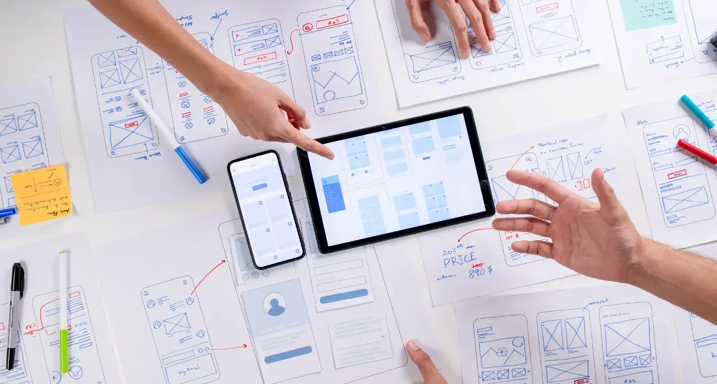
App development roadmaps typically focus on features, timelines, and technical milestones. Teams plan sprint cycles, map user stories, and define acceptance criteria. But the most successful apps understand something deeper about human behaviour.
People abandon apps within the first three seconds of opening them. They delete products after a single confusing interaction. They develop emotional relationships with interfaces that feel intuitive and trust brands that communicate clearly during stressful moments.
App success depends on emotional intelligence, not just technical execution.
The difference between apps people tolerate and apps people love lies in understanding how users feel at each touchpoint. When development teams consider the emotional journey alongside the functional requirements, they create products that people genuinely want to use.
Mapping Emotional Touchpoints in Development
Traditional user journey maps track what users do. Emotional touchpoint mapping reveals how users feel while doing it. This approach examines every interaction through the lens of human psychology, identifying moments where emotions shift from positive to negative and back again.
Start by creating a comprehensive journey map that covers touchpoints before, during, and after product use. Look for the real high points in that journey where users feel accomplished, understood, or delighted. These moments deserve amplification through design choices that reinforce positive emotions.
Then identify the lower points where frustration, confusion, or anxiety creep in. These moments require careful attention. Some can be improved through better design or clearer communication. Others might be inherently uncomfortable but necessary, like entering payment details or personal information.
When negative emotions are unavoidable, provide context about why the discomfort serves the user's larger goal rather than trying to eliminate all friction.
Before, During, and After States
Users approach your app in different emotional states depending on their context. Someone downloading a banking app after losing their card feels different from someone exploring investment options on a quiet weekend. These arrival emotions colour every subsequent interaction.
During use, emotions shift based on how easily users accomplish their goals. Quick wins build confidence. Unexpected delays or unclear next steps create anxiety. The app's tone of voice and visual design either amplify or soothe these natural emotional fluctuations.
Progressive Information Architecture
Information architecture traditionally organises content logically. Progressive information architecture organises content emotionally, revealing complexity gradually as users build confidence and understanding.
Users need different amounts of detail depending on their emotional state and experience level. Someone stressed about a financial deadline wants streamlined options. Someone researching investment strategies appreciates comprehensive information. The same person might need both approaches at different times.
Structure your app so essential actions remain visible while detailed information stays accessible but unobtrusive. Use progressive disclosure to layer information depth. Show users what they need to know now, with clear paths to learn more when they choose.
Only ask users what you actually need in the current moment. If something can wait until later, save it for later.
Consider how stress affects cognitive processing. Tasks that seem straightforward during calm moments become overwhelming under pressure. Design your information hierarchy to support users in their worst emotional state, not their best.
UX/UI design built around real psychology
We design app interfaces around how people actually think and behave. User research, psychology-driven UX/UI design and technical specs delivered as one complete package.
Psychological Principles for App Engagement
Human psychology provides reliable principles for creating engaging digital experiences. People seek autonomy, competence, and connection in their interactions with technology. Apps that satisfy these fundamental needs feel more rewarding to use.
Autonomy means giving users meaningful choices about how they interact with your app. This includes customisation options, multiple pathways to complete tasks, and clear ways to undo or modify actions. Users who feel control over their experience engage more deeply.
When gamification aligns with natural usage patterns, it feels organic rather than imposing.
Competence develops through progressive skill building and clear feedback about progress. Design onboarding that builds from simple wins toward more complex capabilities. Show users how their proficiency grows over time through usage analytics or skill demonstrations.
Connection happens when users feel understood by the app and its creators. This includes appropriate responses to user emotions, acknowledgement of different user contexts, and communication that matches the user's mental model of the task.
Personalised Engagement Strategies
Effective personalisation requires understanding user emotional states, not just behavioural data. Dwell time, movement speed through the product, and re-engagement patterns reveal emotional context that pure clickstream data misses.
Build gamification strategies that match these emotional insights. Stressed users need encouragement and simplified pathways. Confident users appreciate challenges and detailed feedback about their performance.
Critical Abandonment Windows and Solutions
App abandonment follows predictable patterns tied to emotional states rather than random user behaviour. The first three seconds determine whether users feel oriented or confused. The first thirty seconds establish whether the app serves their immediate needs.
During initial orientation, users decide whether your app belongs in their digital environment. Visual design, loading speed, and immediate value proposition all contribute to this snap judgement. Users who feel lost during these crucial moments rarely return.
The onboarding process creates the second critical window. Users arrive with specific expectations about what your app will do for them. When onboarding questions feel irrelevant or the setup process takes longer than expected, abandonment rates spike.
Frame how long orientation processes will take. Users who know what to expect enter the process in a more prepared emotional state.
Ongoing engagement depends on whether users feel competent using core features. Complex interfaces that hide essential functions behind multiple taps create frustration. Users need quick access to primary tasks and clear feedback about their progress.
Stress-Responsive Design Patterns
High-stress use cases require different design approaches. Financial stress, medical concerns, or time pressure change how users process information and make decisions. Standard interface patterns may become unusable under these conditions.
Provide guided pathways through complex processes rather than expecting stressed users to navigate independently. Use voice input for detailed information capture when typing feels burdensome. Separate immediate needs from comprehensive documentation that can happen later in calmer moments.
Brand Personality in Digital Interactions
Brand personality in digital products goes beyond visual identity to encompass how the app behaves in different situations. Users develop emotional relationships with apps that respond appropriately to context and communicate with consistent personality traits.
Define your app's personality by imagining it as a person sitting in your user's home, helping them accomplish their goals. How would this person talk? What questions would they ask? How would they provide reassurance during difficult moments? This exercise creates a foundation for every design decision.
Judge every interaction against this personality. Does the tone of voice match the character you've defined? Do the visual choices reflect how this person would present themselves? If an interaction feels inconsistent with the personality, redesign it to maintain coherence.
Use the same personality framework for error messages, loading states, and edge cases. Consistency during problems builds stronger user relationships than perfection during normal use.
Different product categories suit different personality types. Healthcare apps benefit from calm, knowledgeable personalities that provide reassurance. Gaming apps can embrace playful, enthusiastic personalities that celebrate user achievements. Financial apps need trustworthy, competent personalities that acknowledge the weight of money decisions.
Tone Consistency Across Contexts
Maintaining personality consistency becomes challenging across different user emotional states. The same app might need to celebrate achievements, provide comfort during setbacks, and offer practical guidance during routine tasks. Each situation requires different communication approaches while maintaining core personality traits.
Testing and Iterating Emotional Responses
Traditional usability testing focuses on task completion and error rates. Emotional response testing examines how users feel during and after interactions, revealing insights that purely functional metrics miss.
Implement sentiment tracking alongside standard analytics. Simple feedback mechanisms like "how are you feeling today" or "how was that experience" provide emotional context for behavioural data. These qualitative insights explain why users behave in specific ways.
Test different approaches to emotionally challenging interactions. Compare user responses to direct versus gradually disclosed information. Measure how different personality approaches affect user comfort and task completion rates.
Monitor emotional metrics over time to identify patterns. Users who report positive emotional experiences during onboarding show higher long-term engagement. Those who feel frustrated during initial use rarely develop strong product relationships, even if they continue using the app.
Use A/B testing for emotional design elements like colour choices, animation timing, and copy tone. Small changes in these areas significantly impact user emotional responses and subsequent behaviour patterns.
Continuous Emotional Calibration
User emotional needs evolve as they become more familiar with your app and as their life circumstances change. Regular emotional audits help identify when personality approaches need adjustment or when new features might address emerging emotional needs.
Conclusion
App development succeeds when teams balance functional requirements with emotional intelligence. Users choose apps that work reliably, but they love apps that understand how they feel and respond appropriately to different emotional contexts.
The most effective development roadmaps, built on building a solid app development roadmap, include emotional touchpoint mapping alongside feature planning. They consider how users feel before, during, and after each interaction. They design information architecture that adapts to user stress levels and emotional states.
These approaches require additional research and testing phases, but they create products that users genuinely want to keep using. When apps respond to emotional needs as thoughtfully as they address functional requirements, user engagement and retention improve dramatically.
Start with small experiments in emotional design. Test different personality approaches for key interactions. Map user emotions alongside user journeys. Measure sentiment alongside standard metrics. These changes build toward products that connect with users on a deeper level.
Building emotionally intelligent apps becomes easier with proper guidance and frameworks. Let's talk about your app development approach and how emotional design principles can improve your user engagement and retention metrics.
Frequently Asked Questions
Why do users abandon apps so quickly, and how can developers prevent this?
Users abandon apps within the first three seconds due to confusing interactions and poor emotional experiences. To prevent this, developers should focus on creating intuitive interfaces and understanding how users feel at each touchpoint. The key is balancing technical execution with emotional intelligence to build apps that users genuinely want to use.
What is emotional touchpoint mapping and how does it differ from traditional user journey mapping?
Emotional touchpoint mapping examines how users feel during interactions, whilst traditional user journey maps only track what users do. This approach identifies moments where emotions shift from positive to negative, allowing developers to amplify delightful moments and address points of frustration. It provides a deeper understanding of the user experience beyond functional requirements.
How should developers handle negative emotions that are unavoidable in their app?
When negative emotions are inherent to certain processes (like entering payment details), developers shouldn't try to eliminate all friction. Instead, provide clear context about why the uncomfortable step serves the user's larger goal. This helps users understand the purpose behind potentially stressful interactions.
What is progressive information architecture and when should it be used?
Progressive information architecture organises content emotionally rather than just logically, revealing complexity gradually as users build confidence. It's particularly useful because users need different amounts of detail depending on their emotional state - stressed users want streamlined options whilst relaxed users may appreciate comprehensive information. This approach shows users what they need now with clear paths to access more detail when desired.
How do users' emotional states before using an app affect their experience?
Users approach apps in vastly different emotional states depending on their context - someone who's lost their bank card feels different from someone casually exploring investment options. These arrival emotions colour every subsequent interaction within the app. Understanding these pre-existing emotional states helps developers design more empathetic user experiences.
What role does progressive disclosure play in app development?
Progressive disclosure layers information depth by showing users what they need to know immediately whilst keeping detailed information accessible but unobtrusive. This technique helps prevent cognitive overload and builds user confidence gradually. It's particularly important because stress affects how people process information, making simple tasks feel overwhelming in tense moments.
How can developers identify the emotional high and low points in their app?
Create a comprehensive journey map covering all touchpoints before, during, and after product use, then examine each interaction through a psychological lens. Look for moments where users feel accomplished or delighted (these deserve amplification) and identify points where frustration or confusion arise (these need careful attention). This emotional analysis reveals opportunities to improve the overall user experience.
Why should developers only ask for information that's immediately necessary?
Requesting only essential information in the current moment reduces cognitive load and prevents user overwhelm. If certain details can wait until later in the user journey, it's better to delay asking for them. This approach respects users' mental capacity and creates a more comfortable, progressive experience that builds trust over time.
Related Articles

How Do You Know if Remote Development Is Right for Your App Project?
Over 70% of successful mobile app projects now use remote development teams in some capacity....
by Simon Lee
How Do You Evaluate App Development Teams Effectively?
Have you ever wondered why some companies end up with brilliant mobile apps whilst others waste...
by Simon Lee