Expert Guide Series
How Do I Handle Images and Graphics in Dark Mode?
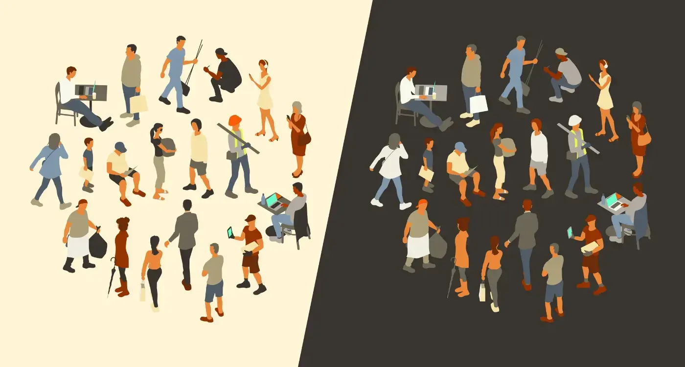
A major retail app launches their sleek new dark mode feature, complete with crisp white text on charcoal backgrounds. Users love it—until they start shopping. Product images that looked perfect in light mode now appear washed out and dull. Brand logos become invisible against dark surfaces. The beautiful photography that once showcased items brilliantly now makes everything look cheap and unappealing. Within days, customer complaints flood in and sales drop.
This scenario plays out more often than you might think, and it highlights a problem that many mobile experience designers face when implementing dark mode. While switching background colours and text seems straightforward, image handling in mobile experience design presents unique challenges that can make or break the user experience.
Dark mode isn't just a trendy feature anymore—it's become an expectation. Users want it for better battery life, reduced eye strain, and personal preference. But here's the thing: most images and graphics are created with light backgrounds in mind. When you flip to dark mode, these visual elements often clash terribly with their new surroundings.
The biggest mistake designers make is treating dark mode as an afterthought rather than planning for it from the start
Getting image handling right in dark mode requires planning, testing, and understanding how different visual elements behave across both themes. It's not just about making things look good—it's about maintaining brand consistency, readability, and user engagement regardless of which mode someone chooses. The good news? With the right approach, you can create images and graphics that look fantastic in both light and dark environments.
Understanding Dark Mode And Image Challenges
Dark mode has become something users expect rather than a nice-to-have feature. Most operating systems now switch between light and dark themes automatically based on time of day or user preference—which means your images need to work properly in both modes without looking awful.
The biggest challenge isn't just making images visible in dark mode; it's making them look intentional. I've seen too many apps where images clearly weren't designed for dark backgrounds and they stick out like a sore thumb. White backgrounds become glaring rectangles, thin borders disappear completely, and carefully crafted shadows suddenly make no sense.
Common Image Problems in Dark Mode
When you switch to dark mode, several image issues become immediately obvious. Logos with white backgrounds create harsh contrast boxes that hurt your eyes. Screenshots taken in light mode look completely out of place against dark interfaces. Icons designed for light backgrounds often lose their definition and become hard to read.
- White or light-coloured backgrounds that clash with dark interfaces
- Insufficient contrast making text within images unreadable
- Drop shadows and effects designed for light backgrounds
- Brand colours that don't work well on dark surfaces
- Screenshots and interface mockups from light mode themes
Why This Matters for User Experience
Users don't just notice these problems—they judge your entire app based on them. When images look broken or poorly implemented in dark mode, it signals that you haven't paid attention to detail. This affects trust and makes people question the quality of your app overall. Getting this right from the start saves you headaches later and shows users you've thought about their experience properly.
Preparing Images For Light And Dark Themes
Getting your images ready for both light and dark themes isn't rocket science, but it does require some forward thinking. The biggest mistake I see designers make is treating this as an afterthought—rushing to adapt images once everything else is planned. Trust me, that's a recipe for headaches and compromises you don't want to make.
Start by auditing your existing image assets. Look at each graphic and ask yourself: will this work against both light and dark backgrounds? Icons with thin white lines might disappear on light backgrounds; dark text in screenshots will vanish against dark themes. It's better to identify these problems early than discover them during testing.
Creating Your Asset Variants
You'll need to create multiple versions of many images. This doesn't mean duplicating everything—some assets work perfectly in both modes without changes. Focus your efforts where they matter most.
- Icons and illustrations with strong colour contrast needs
- Screenshots containing interface elements
- Text-heavy graphics and infographics
- Brand elements that rely on specific background colours
- Decorative graphics with subtle shadows or highlights
Name your image files systematically from the start. Use suffixes like '_light' and '_dark' or organise them into separate folders. Your future self (and your team) will thank you when you're managing dozens of variants.
The key is being methodical about this process. Don't just invert colours and call it done—that approach rarely works well. Instead, consider how each image serves its purpose in both contexts. Sometimes this means redesigning elements completely, and that's perfectly normal in professional mobile experience design and image handling workflows.
UX/UI design built around real psychology
We design app interfaces around how people actually think and behave. User research, psychology-driven UX/UI design and technical specs delivered as one complete package.
Creating Adaptive Graphics That Work In Both Modes
The secret to successful dark mode graphics isn't creating two separate sets of images—it's building smart, adaptive graphics from the start. I've worked on countless apps where teams initially tried the "duplicate everything" approach, only to find themselves drowning in maintenance headaches later on.
Vector graphics are your best friend here. SVG files can be styled with CSS, which means you can change colours, strokes, and fills programmatically based on the current theme. This approach cuts your image management workload in half whilst giving you pixel-perfect results on any screen size.
Smart Implementation Techniques
For raster images that can't be vectorised, there are still clever ways to make them adaptive. Using blend modes in your design software, you can create images that automatically adjust their appearance based on the background colour. Multiply blend mode works particularly well for icons and illustrations.
Alpha channels become incredibly important in adaptive design. A semi-transparent graphic will naturally blend with both light and dark backgrounds, often requiring no additional changes. The trick is getting the opacity levels just right—too transparent and your image loses impact; not transparent enough and it clashes with one of the themes.
Technical Considerations
Modern development frameworks support dynamic image switching through media queries and system preference detection. Here's what works best in practice:
- Use CSS variables for colour values that change between themes
- Implement automatic theme detection to switch graphics seamlessly
- Create fallback options for older devices that don't support dark mode
- Test your adaptive graphics on actual devices, not just simulators
The goal is creating graphics that feel native to whichever mode the user prefers, without them ever noticing the technical magic happening behind the scenes.
Managing Colour Schemes And Contrast Ratios
Getting colour schemes right in dark mode isn't just about making things look pretty—it's about making sure people can actually see and use your app. I've watched countless designers struggle with this part of mobile experience design, and honestly, it's where most image handling problems crop up. The trick is understanding that colours behave differently against dark backgrounds than they do against light ones.
Your colour palette needs to work hard in both light and dark themes. What looks great against a white background might completely disappear against a dark one; what pops beautifully in dark mode could be blindingly bright in light mode. This is where contrast ratios become your best friend. A contrast ratio of 4.5:1 is the minimum for normal text, but I always aim higher when possible—7:1 gives you much better readability and makes your app accessible to more people.
Testing Your Colour Combinations
The best way to check if your colours work is to test them in real conditions. Switch between light and dark modes repeatedly whilst looking at your images and graphics. Do the colours still make sense? Can you read text overlays clearly? Are important elements still visible?
The biggest mistake I see is designers picking colours that only work in one mode and then trying to force them into both
Adjusting Brand Colours
Sometimes your brand colours won't translate perfectly to dark mode, and that's okay. You might need to create darker or lighter variations that maintain the same feeling whilst providing better contrast. This isn't betraying your brand—it's making it work better for your users across different viewing conditions.
Testing Your Images Across Different Devices And Settings
Right, so you've sorted out your adaptive images and got your colour schemes looking spot on—but here's where things get interesting. Testing is where you'll discover if all that hard work actually pays off in the real world. I can't stress this enough: what looks perfect on your design screen might look completely different on your user's phone.
Start with the obvious suspects—iPhones and Android devices with different screen sizes and resolutions. But don't stop there. You need to test on older devices too, because not everyone upgrades their phone every year. The way images render can vary dramatically between a brand new flagship phone and something that's three years old.
Testing Dark Mode Transitions
Here's something that catches people out regularly: the actual switching between light and dark modes. Users don't just sit in one mode all day—they switch back and forth depending on their environment and time of day. Test this transition repeatedly; make sure your images don't flash or show the wrong version for even a split second.
Real-World Lighting Conditions
Take your phone outside and test your app in bright sunlight, then try it in a dimly lit room. The same image that looks brilliant indoors might be completely unreadable outdoors. Auto-brightness settings can also affect how your carefully planned contrast ratios actually appear to users.
Don't forget about accessibility settings either—many users have custom contrast settings or colour filters enabled. Your images need to work with these modifications, not against them. The best approach is to test on actual devices rather than relying solely on simulators, because nothing beats real-world conditions for spotting problems you never saw coming.
Common Mistakes And How To Fix Them
After years of working on mobile experience design projects, I've spotted the same image handling mistakes cropping up time and time again. The good news? Most of these problems are easy to fix once you know what to look for.
The biggest mistake I see is designers treating dark mode as an afterthought. They'll design the entire experience for light mode, then quickly invert some colours and call it done. This approach leads to washed-out images, poor contrast, and graphics that look completely out of place. Your images need proper planning from the start—not a quick fix at the end.
Brand Logo Problems
Brand logos cause major headaches in dark mode. A white logo on a dark background becomes invisible; a black logo on light mode disappears in dark mode. The solution is creating separate logo versions for each theme, or better yet, using SVG files where you can control fill colours programmatically.
Contrast Failures
Many designers forget that contrast works differently in dark environments. Text overlays that looked perfect in light mode become unreadable when the background switches to dark. Always test your text contrast ratios using proper accessibility tools.
Never assume your light mode images will work in dark mode. Create dedicated versions or use adaptive techniques that respond to theme changes.
Here are the most common image handling mistakes to avoid:
- Using the same image assets for both light and dark modes
- Forgetting to test images on actual devices in different lighting conditions
- Ignoring accessibility contrast requirements
- Not providing fallback images when adaptive techniques fail
- Hardcoding image colours instead of using theme-aware properties
The key is testing early and often. Don't wait until your experience is finished to check how images behave across different themes and devices.
Best Practices For Future-Proof Image Design
Building experiences that stand the test of time means thinking beyond what users need today. I've seen too many apps struggle when new iOS and Android versions arrive with updated design guidelines or when dark mode support becomes mandatory rather than optional. The trick is creating image systems that adapt without requiring a complete overhaul.
Start by using vector graphics wherever possible. SVG files scale perfectly across different screen densities and can be styled with CSS, making them ideal for icons and simple illustrations. When you must use raster images, create them at the highest resolution you'll need—you can always scale down, but scaling up looks terrible.
Smart File Organisation
Keep your light and dark mode assets organised in separate folders with clear naming conventions. Something like 'hero-image-light.png' and 'hero-image-dark.png' saves confusion later. Better yet, use your development framework's built-in theme switching capabilities rather than hardcoding image paths.
Design With Flexibility
Create images that work across multiple contexts. Use semantic colour names in your design system rather than specific hex values—this makes global colour changes much simpler. When designing illustrations, consider how they'll look on different backgrounds and build in enough contrast flexibility.
Document everything. Write down your colour ratios, naming conventions, and design decisions. Six months from now, you'll thank yourself when you're adding new features or updating existing ones. The extra time spent on documentation and systematic thinking pays dividends when you're maintaining apps across multiple platform updates and design trend changes.
Getting image handling right in dark mode isn't just about flipping colours and hoping for the best—it's about creating a seamless experience that feels natural regardless of which theme your users prefer. The psychology behind successful dark mode implementation lies in understanding how users perceive and interact with visual elements across different contexts. We craft the user research, experience design, and technical specifications that guide development teams in creating these cohesive visual experiences. Let's design your experience foundation.
Frequently Asked Questions
Do I need separate images for light and dark mode?
Not always. Some images work perfectly in both modes without changes, whilst others need separate versions or adaptive approaches. Focus on creating variants for logos, screenshots, and graphics with specific background colours that clash with dark themes.
What's the minimum contrast ratio for dark mode images?
Aim for 4.5:1 minimum for normal text and graphics, but 7:1 provides better readability and accessibility. Test your contrast ratios with actual accessibility tools rather than guessing, as colours behave differently on dark backgrounds.
Should I use SVG or raster images for dark mode compatibility?
SVG files are ideal for dark mode because they can be styled with CSS, allowing colours to change programmatically based on themes. Use SVGs for icons and simple illustrations, but complex photography will still require raster formats.
How do I handle brand colours that don't work in dark mode?
Create darker or lighter variations that maintain the same emotional impact whilst providing better contrast. This adaptation isn't betraying your brand—it's making it accessible across different viewing contexts and user preferences.
What's the best way to test dark mode images?
Test on actual devices across different lighting conditions—bright sunlight, dim rooms, and various screen brightnesses. Switch repeatedly between light and dark modes to ensure smooth transitions and check how images appear with accessibility settings enabled.
Can I use the same logo in both light and dark modes?
Usually not. Most logos need theme-specific versions to maintain visibility and impact. Create separate light and dark variants, or use SVG formats where you can control colours programmatically based on the current theme.
How do I organise image files for both themes?
Use clear naming conventions like '_light' and '_dark' suffixes or separate folder structures. Document your organisation system so team members can easily locate and manage theme-specific assets without confusion.
Related Articles

How Do I Create Consistent Visual Hierarchy in Mobile Apps?
Have you ever opened an app and felt completely lost, not knowing where to look or what to tap...
by Simon Lee

Should I Hire A Development Team Or Individual Freelancers?
Here's a shocking truth: 68% of mobile app projects fail not because of poor coding or bad design,...
by Simon Lee