Expert Guide Series
How Do I Make My Education App Accessible for Children With Learning Difficulties?
One in five children experiences some form of learning difficulty—that's roughly six children in every classroom. Yet when I look at the education apps flooding the market today, most seem designed for a narrow slice of learners. This creates a massive gap between what children need and what technology actually delivers.
Designing accessible education apps isn't just about ticking boxes or meeting compliance standards; it's about opening doors for millions of young minds who learn differently. Children with dyslexia, ADHD, autism, or processing difficulties shouldn't have to struggle with poorly designed interfaces on top of their existing challenges. They deserve apps that work with their brains, not against them.
Accessibility means designing for the full spectrum of human diversity, not just the middle ground
The reality is that inclusive design benefits everyone. When you create clearer navigation for a child with autism, you're also helping the overwhelmed parent trying to set up the app at bedtime. When you add audio support for dyslexic learners, you're supporting children who simply prefer listening to reading. What starts as accessibility becomes better usability across the board.
Throughout this guide, we'll explore practical strategies for making your education app truly inclusive. We'll cover everything from understanding different learning difficulties to implementing specific technical features that make a real difference. By the end, you'll have the knowledge to create apps that don't just accommodate learning differences—they celebrate them.
Understanding Learning Difficulties in Children
Learning difficulties affect millions of children worldwide, and as experience designers, we need to understand what these challenges actually look like in practice. When I'm crafting education experiences, I always start by thinking about the different ways children's brains process information—because there's no such thing as a "standard" learner.
Dyslexia is probably the most well-known learning difficulty, affecting how children read and spell words. But it's not just about mixing up letters; children with dyslexia often struggle with following instructions, remembering sequences, and processing information quickly. Then there's ADHD, which makes it hard for kids to focus on tasks or sit still for long periods. Autism spectrum disorders can affect how children communicate and interact with others, whilst also creating sensitivity to sounds, colours, or textures.
The Hidden Struggles
What many people don't realise is that learning difficulties often come with emotional challenges too. Children might feel frustrated when they can't keep up with their peers, or anxious when faced with new tasks. Some kids develop coping strategies that mask their difficulties—they become really good at avoiding reading aloud or finding excuses to leave the classroom.
Why Apps Can Help
Here's where mobile apps can make a real difference. Unlike traditional classroom settings, apps can adapt to each child's pace and learning style. They can provide immediate feedback, repeat instructions as many times as needed, and create a safe space where children can learn without fear of judgment. The key is designing experiences that recognise these diverse needs from the ground up—not as an afterthought.
Design Principles for Accessible Education Apps
When it comes to creating educational apps for children with learning difficulties, good design isn't just about making things look pretty—it's about making sure every child can actually use your app successfully. I've worked on dozens of education experiences over the years, and the ones that truly make a difference are those crafted with inclusive design principles from the very beginning.
The foundation of accessible app design starts with understanding that children process information differently. Some need more time to read instructions, others learn better through sounds or pictures, and many benefit from consistent layouts they can predict. Your app needs to accommodate all these different ways of learning without making any child feel left out.
Core Design Elements That Work
Successful accessible design relies on several key principles that work together. Clear visual hierarchy helps children understand what's most important on each screen; consistent navigation means they won't get lost; and flexible pacing allows each child to learn at their own speed.
- Use high contrast colours that are easy to distinguish
- Make buttons large enough for small fingers to tap accurately
- Keep text simple and use fonts that are easy to read
- Provide multiple ways to complete the same task
- Include audio descriptions for visual content
Always test your colour choices with accessibility tools to make sure children with colour vision differences can use your app comfortably.
Designing for Different Needs
Remember that accessibility features often help all users, not just those with specific learning difficulties. Captions help in noisy environments, larger text reduces eye strain for everyone, and clear instructions make your app easier to use across the board. This approach—designing for the most challenging cases first—typically results in better mobile app experiences for everyone.
UX/UI design built around real psychology
We design app interfaces around how people actually think and behave. User research, psychology-driven UX/UI design and technical specs delivered as one complete package.
Creating Clear and Simple User Interfaces
When designing for children with learning difficulties, the interface needs to be their friend, not their enemy. I've worked on education apps where the biggest barrier wasn't the learning content—it was figuring out how to navigate the app itself. That's backwards thinking, and it defeats the whole purpose of what we're trying to achieve.
The golden rule here is simple: less is more. Every button, icon, and piece of text should have a clear reason for being there. If you can't explain why something exists in ten seconds, it probably shouldn't be there. Children with learning difficulties often struggle with cognitive overload, so we need to strip away anything that doesn't serve the learning goal.
Key Design Elements That Work
Buttons should be large enough for small fingers and clearly labelled with both text and icons. Colours need to be consistent throughout the app—green always means go, red always means stop. Don't change these rules halfway through because that creates confusion.
- Use high contrast colours to make text easy to read
- Keep navigation menus short with no more than five options
- Make clickable areas at least 44 pixels wide and tall
- Use familiar icons that children already understand
- Provide clear feedback when buttons are pressed
Text and Typography Choices
Font choice matters more than you might think. Sans-serif fonts like Arial or Helvetica work better than fancy decorative ones because the letters are clearer and easier to distinguish. Size matters too—text should be large enough to read comfortably without squinting.
The spacing between lines and letters can make a huge difference for children with dyslexia. Give your text room to breathe, and your users will thank you for it.
Supporting Different Learning Styles Through Technology
Every child learns differently—some love reading text, others need to hear information out loud, and many learn best by touching and moving things around. When creating education experiences for children with learning difficulties, we need to think about all these different ways of learning and make sure our app works for everyone.
Visual learners need clear pictures, bright colours, and information they can see. Your app might use charts, diagrams, or colourful animations to explain new concepts. Audio learners prefer listening to instructions or having text read aloud to them; they benefit from sound effects, music, and spoken explanations. Kinaesthetic learners—the ones who learn by doing—need buttons to press, objects to drag around the screen, and interactive games that respond to their touch.
Making Content Work for Multiple Learning Styles
The clever bit is designing features that support multiple learning styles at once. A maths problem could show visual numbers, read the question aloud, and let children drag blocks to solve it. This approach means you're not leaving anyone out—you're giving every child the best chance to understand and learn.
The most effective educational apps don't force children to adapt to technology; they adapt the technology to fit how children naturally learn
Personalisation Makes the Difference
Smart education apps let children (or their teachers and parents) choose how they want to learn. Some might turn off background music because it's distracting, whilst others need it to stay focused. Some children prefer large text they can read easily; others want everything read aloud. Designing these choices into your app means each child can create their own perfect learning environment.
Testing Your App with Real Users
You can design what you think is the perfect accessible education app, but you won't know if it actually works until real children with learning difficulties try it out. I've seen too many apps that looked great on paper but completely fell apart when put in front of their intended users.
The key is finding the right children to test with—ones who actually have the learning difficulties your app is designed to help. This might mean working with schools, support groups, or charities. You'll want children of different ages and with different types of learning challenges to get a complete picture.
What to Look For During Testing
When children use your app, watch their faces, not just their fingers. Are they getting frustrated? Confused? Bored? Sometimes a child will keep trying even when they're struggling, so you need to spot the signs early.
- Do children understand what they're supposed to do without being told?
- Can they navigate between different sections easily?
- Are they making mistakes because the buttons are too small or close together?
- Do they lose interest quickly or stay engaged?
- Are they able to complete tasks successfully?
Making Changes Based on Feedback
Don't just collect feedback—act on it quickly. If three different children struggle with the same button, that button needs fixing. Sometimes the changes will be small, like making text bigger or changing colours. Other times you might need to completely rethink how a feature works.
The best part about testing with real users is that children are honest. They'll tell you straight away if something doesn't work, which is exactly what you need to hear.
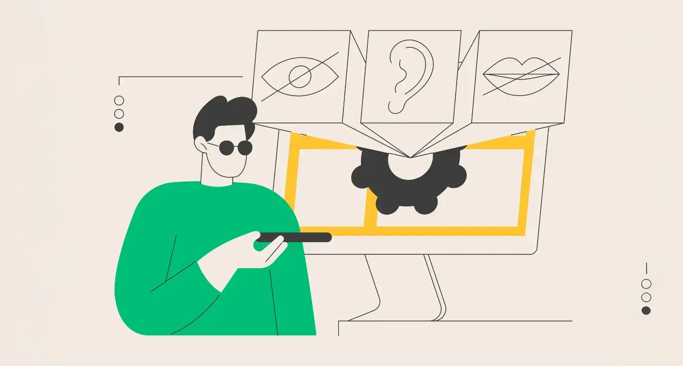
Technical Features That Make Apps More Accessible
When designing an education experience for children with learning difficulties, the technical implementation matters just as much as the visual design. I've worked on countless projects where brilliant visual design fell flat because the underlying technical features weren't there to support accessibility—and trust me, it's heartbreaking to see good intentions go to waste like that.
Screen reader compatibility sits at the top of my priority list. Children who struggle with reading benefit massively from having text read aloud to them. Your app needs to work seamlessly with built-in screen readers on both iOS and Android devices. This means adding proper labels to every button, image, and interactive element; without these, screen readers can't tell users what they're looking at.
Voice Control and Audio Features
Voice recognition technology opens up learning for children who find typing or tapping difficult. Simple voice commands like "next page" or "repeat question" can transform how a child interacts with your app. Audio feedback works wonders too—confirming when a child selects something or providing gentle corrections when they make mistakes.
Adjustable Settings for Individual Needs
Every child learns differently, which is why customisable settings are non-negotiable. Text size controls, colour contrast adjustments, and animation speed settings let parents tailor the experience to their child's specific needs. Some children with learning difficulties find moving graphics distracting, whilst others need high contrast colours to process information properly.
Design these accessibility features from day one rather than adding them later—it's much easier and more cost-effective than retrofitting them into an existing experience.
Remember, these technical features aren't just nice-to-haves; they're the foundation that makes inclusive design actually work in practice. Consider incorporating AI-driven personalisation to adapt the learning experience further, responding to each child's individual progress and needs.
Designing an education app that truly works for children with learning difficulties isn't just about ticking boxes or following a checklist—it's about understanding that every child learns differently and deserves technology that supports them rather than creates barriers. The psychology-based design, user research, and technical roadmap we create becomes the blueprint that any development team can then build from. Without this foundation, you're asking developers to guess what children need. Let's craft your accessible education experience.
Frequently Asked Questions
What are the most important accessibility features for children with dyslexia?
For children with dyslexia, text-to-speech functionality is crucial, allowing them to hear content rather than struggle with reading. Adjustable text size and spacing, dyslexia-friendly fonts (like OpenDyslexic), and high contrast colour options significantly improve readability. Visual indicators and consistent navigation patterns help reduce cognitive load.
How can I make my education app work for children with ADHD?
Children with ADHD benefit from shorter learning sessions with clear progress indicators and frequent breaks. Minimise distracting animations or sounds, provide options to adjust or disable background music, and use gamification elements to maintain engagement. Include focus timers and allow children to pause and resume activities easily.
What testing should I do to ensure my app is truly accessible?
Test with children who have different types of learning difficulties, not just neurotypical users. Use automated accessibility testing tools to check colour contrast and screen reader compatibility. Observe children using your app in real learning environments, and gather feedback from teachers, parents, and support specialists who understand these challenges daily.
How do I balance accessibility features without making the interface too complex?
Build accessibility features into the core design rather than as add-ons, and hide advanced settings in a simple preferences menu. Use progressive disclosure to show only essential features initially, with options to enable additional support as needed. Remember that good accessible design often makes apps simpler and better for everyone.
What are the legal requirements for accessibility in education apps?
In many countries, education apps must comply with accessibility standards like WCAG 2.1 AA guidelines. The ADA in the US, AODA in Canada, and similar legislation worldwide require digital accessibility for educational content. Even if not legally mandated, following these standards ensures your app can be used in schools and by government education programs.
How can I support children with autism spectrum disorders in my app design?
Create predictable, consistent layouts with clear visual hierarchies and avoid sudden changes or surprise animations. Provide sensory controls like volume adjustment, reduced motion options, and colour customisation. Use literal language rather than metaphors, offer visual schedules or progress indicators, and allow children to work at their own pace without time pressure.
Should I create separate versions of my app for different learning difficulties?
No, it's better to create one inclusive app with comprehensive accessibility options rather than separate versions. Many children have multiple learning challenges, and families often have children with different needs. Universal design principles ensure your app works for the widest possible range of users while maintaining a single, maintainable codebase.
Related Articles

How Do Apps Learn From What You Do?
Have you ever noticed how your favourite music app seems to know exactly what song you want to hear...
by Simon Lee

What Happens to Your IP When Developers Leave Your Project?
A language learning startup spent six months working with a freelance developer on their mobile...
by Simon Lee