Expert Guide Series
What Are The Accessibility Considerations For Micro-Interactions?
One in five people worldwide lives with a disability, yet most mobile apps are designed without them in mind. That's millions of users who struggle with simple interactions that the rest of us take for granted—like tapping a button or understanding when something has loaded. The tiny animations, feedback sounds, and visual cues that make our apps feel alive can become barriers instead of bridges.
These small interactive elements, called micro-interactions, are everywhere in mobile app design. They're the subtle bounce when you pull to refresh, the gentle vibration when you toggle a switch, or the colour change when you tap a button. They make our apps feel responsive and human, but they can also exclude people if we're not careful about how we design them.
Inclusive design isn't about designing for disabilities—it's about designing for the full range of human diversity
This guide will walk you through the accessibility considerations you need to think about when designing micro-interactions for your mobile app. We'll explore how these small details can make or break the user experience for people with different abilities, and more importantly, how to design them in a way that works for everyone. Because when we design inclusively from the start, we create better experiences for all users—not just those with disabilities.
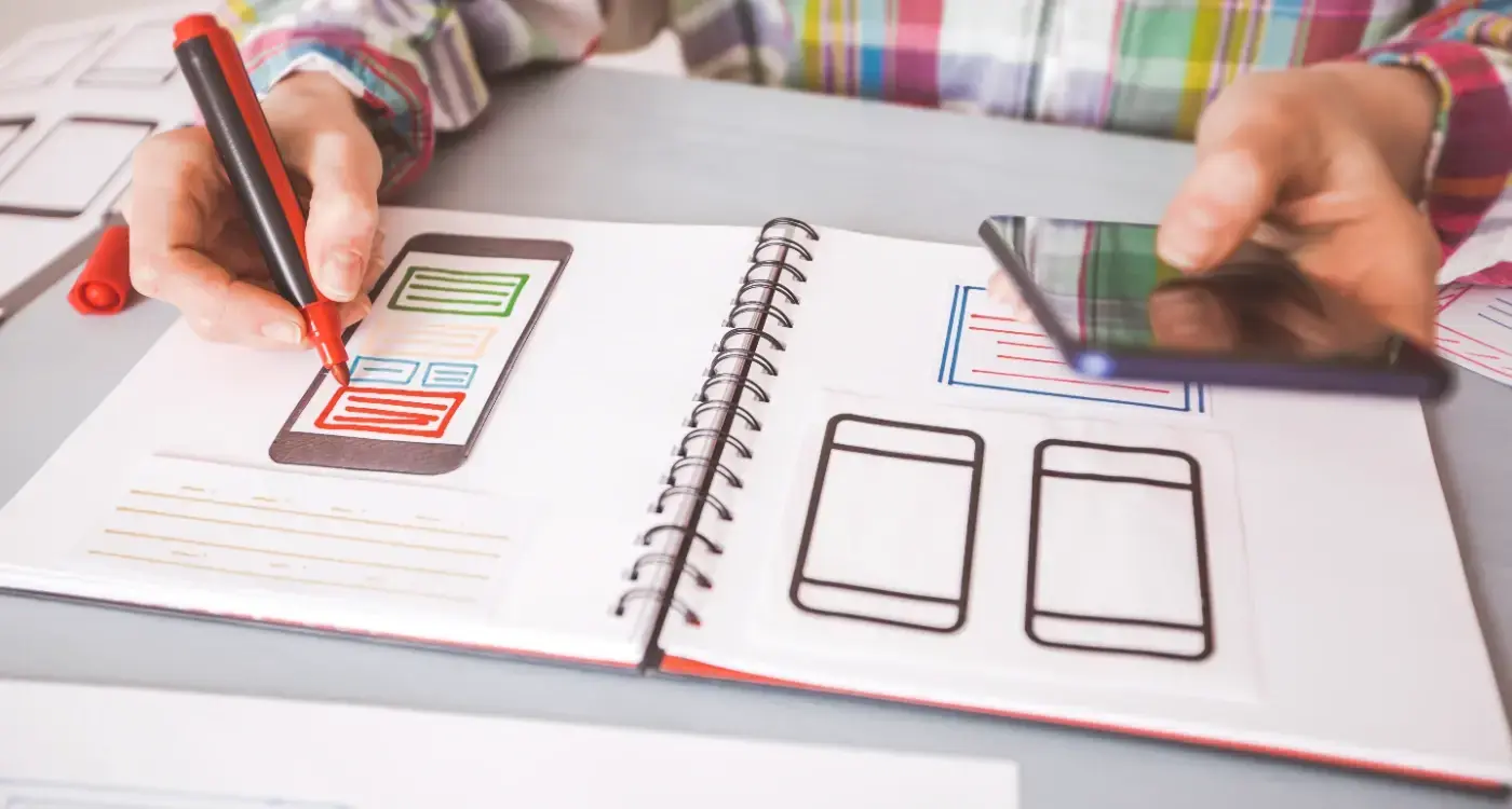
Understanding Micro-Interactions and Their Role in Mobile App Design
Micro-interactions are those tiny moments when you tap a button and it changes colour, or when you pull down to refresh a page and see a little spinning wheel. They're the small responses an app gives you when you do something—like when you favourite a post and a heart fills up with red, or when you type a wrong password and the login box shakes.
These little details might seem unimportant, but they're actually doing a lot of heavy lifting in your app. They tell users what's happening, confirm that their actions worked, and make the whole experience feel more natural. Without them, using an app would feel like pressing buttons on a machine that doesn't respond.
Why They Matter for Everyone
Here's the thing about micro-interactions—they need to work for everyone, not just people who can see perfectly or use their fingers easily. Someone using a screen reader needs to know when a button has been pressed. A person with shaky hands needs feedback that doesn't disappear too quickly. Someone with learning difficulties needs clear signals about what's happening.
The Building Blocks
Every micro-interaction has four parts: a trigger (what starts it), rules (what happens), feedback (what you see or hear), and loops (what happens next). Getting these right means your app works smoothly for everyone.
- Visual feedback like colour changes or animations
- Audio cues for screen reader users
- Haptic feedback through vibrations
- Clear timing that doesn't rush users
The Basics of Accessible Design for Mobile Applications
Building a mobile app that works for everyone isn't just nice to have—it's absolutely necessary. When we talk about accessible design, we're talking about creating apps that people with disabilities can use just as easily as anyone else. This means thinking about users who might be blind, have limited hand movement, or find it hard to process complex information.
The foundation of accessible mobile app design starts with understanding that disabilities come in many forms. Some are visible, others aren't. A user might have trouble seeing your app's text, struggle to tap small buttons, or need more time to understand what's happening on screen. The brilliant thing about designing for these users is that it often makes your app better for everyone.
Core Principles That Make Apps Work for Everyone
Good accessible design follows a few key rules, grounded in accessibility and interaction design standards. Your app should be perceivable, meaning users can see, hear, or feel what's happening. It should be operable, so people can actually use the controls and navigate around. Make it understandable, so users know what everything does and how to use it. And finally, keep it robust, so your app works reliably across different devices and assistive technologies.
Start with good colour contrast and large enough text. These two simple changes will immediately make your mobile app more accessible to millions of users.
The beauty of inclusive design is that when you solve problems for users with specific needs, you're actually solving problems for lots of other people too. Larger buttons help everyone, clearer instructions reduce confusion, and better navigation makes the whole experience smoother.
UX/UI design built around real psychology
We design app interfaces around how people actually think and behave. User research, psychology-driven UX/UI design and technical specs delivered as one complete package.
Common Accessibility Barriers in Micro-Interactions
The smallest details often create the biggest problems for users with disabilities. Micro-interactions—those tiny animations, feedback sounds, and visual cues—can turn into major roadblocks when they're not designed thoughtfully.
The most frequent issue encountered is timing. Many micro-interactions disappear too quickly for users who need more time to process information. Pop-up notifications that vanish after two seconds, loading animations that flash by, or confirmation messages that auto-dismiss can leave users wondering what just happened.
The Main Culprits
Here are the barriers most often seen in app projects:
- Animations that trigger seizures or vestibular disorders
- Touch targets smaller than 44x44 pixels that are difficult to tap
- Colour-only feedback that screen readers can't interpret
- Haptic feedback without visual alternatives
- Gesture-based interactions with no button alternatives
- Auto-playing content that interferes with assistive technology
The tricky part is that these barriers often seem minor during development. A subtle colour change might look elegant, but if it's the only way to show an error state, users with visual impairments will miss it completely. That's why we need to think beyond what looks good and consider how every interaction actually functions for different users.
Designing for Visual Impairments and Screen Readers
Visual impairments affect millions of people worldwide, and your mobile app needs to work for everyone. Screen readers are software programmes that convert text and interface elements into speech or braille—they're the primary way visually impaired users interact with apps. When designing micro-interactions for these users, you need to think beyond what things look like and focus on what they communicate.
The most important thing you can do is provide proper labels for every interactive element. Buttons need descriptive text that explains what happens when you tap them. A heart icon for liking a post should be labelled "Like this post" rather than just "Heart button". Screen readers announce these labels out loud, so users know exactly what they're interacting with.
Making Feedback Accessible
Visual feedback like colour changes or animations won't help screen reader users. You need to provide text-based feedback that the screen reader can announce. When someone likes a post, don't just change the heart colour—update the button label to say "Unlike this post" so the user knows their action worked.
Good inclusive design isn't about adding extra features for disabled users; it's about making your core experience work for everyone from the start
Focus order matters too. Screen readers navigate through your app in a logical sequence, so make sure your micro-interactions don't disrupt this flow or create confusion about where the user is in your interface.
Motor Disabilities and Touch Interface Considerations
When designing micro-interactions, it's essential to think about users who might have difficulty with precise touch movements. Motor disabilities can affect how people interact with mobile apps—from slight tremors that make tapping small buttons challenging to limited dexterity that makes complex gestures nearly impossible. These considerations aren't just nice-to-haves; they're requirements for creating truly accessible experiences.
Touch targets need to be large enough for everyone to use comfortably. The minimum recommended size is 44x44 pixels, but it's often beneficial to go bigger when possible. Spacing between interactive elements matters too—nothing's more frustrating than accidentally tapping the wrong button because everything's crammed together.
Key Design Principles for Motor Accessibility
- Make touch targets at least 44x44 pixels with adequate spacing
- Provide alternative input methods like voice commands or switch controls
- Allow users to adjust timing for time-sensitive interactions
- Avoid requiring complex gestures like pinch-to-zoom as the only option
- Include confirmation dialogs for destructive actions
Time-based interactions present another challenge. If your micro-interaction disappears after a few seconds, some users won't have enough time to respond. Always provide options to extend timing or disable auto-advancing content. Simple changes like these can transform an app from unusable to delightful for users with motor disabilities.
Cognitive Accessibility in Interactive Elements
Cognitive accessibility often gets overlooked—but it shouldn't. People process information differently, and what seems obvious to one user might be completely confusing to another. This includes users with dyslexia, ADHD, memory impairments, or simply those who get easily overwhelmed by complex interfaces.
The key is keeping micro-interactions simple and predictable. Users should never have to guess what will happen when they tap, swipe, or interact with an element. Animations should be smooth but not distracting; feedback should be clear but not overwhelming. Many apps have fancy effects that actually made the experience harder to understand.
Always provide clear visual feedback for user actions, but keep animations under 300ms to avoid confusion and maintain focus.
Making Interactive Elements Clear
Your interactive elements need to be immediately recognisable. Buttons should look like buttons, not mysterious shapes that users have to decipher. Here's what works well in inclusive design:
- Use consistent visual cues across your mobile app
- Provide clear labels and instructions
- Allow users to control animation speed or disable them entirely
- Keep error messages simple and helpful
- Give users enough time to complete actions
Remember, cognitive accessibility benefits everyone—not just users with specific needs. A clear, well-designed interface makes your app easier to use for all your users.
Testing and Implementing Inclusive Design Practices
Testing accessibility isn't something you do once at the end—it needs to happen throughout your entire design process. Trying to fix accessibility issues after everything's been designed is like trying to change the foundation of a house after you've already put the roof on!
Start by testing with real screen readers like VoiceOver on iOS or TalkBack on Android. Don't just read about how they work—actually turn them on and try using your app. You'll be amazed at what you discover. Those micro-interactions that seem perfectly smooth with your eyes might be completely confusing when you're relying on audio feedback.
User Testing with Real People
Here's where things get really interesting: test with actual users who have disabilities. People with visual impairments, motor difficulties, or cognitive differences will spot problems that you never would have thought of.
Automated Testing Tools
Tools like Accessibility Scanner for Android or the Accessibility Inspector for iOS can catch basic issues quickly. But remember—these tools won't catch everything. They're brilliant for finding obvious problems like missing labels or poor colour contrast, but they can't tell you if your micro-interaction actually makes sense to someone using assistive technology.
The key is making accessibility part of your regular workflow, not an afterthought. Test early, test often, and always test with real people—avoiding common testing mistakes that can derail your accessibility efforts.
Conclusion
Creating an accessible mobile app isn't just about ticking boxes—it's about opening doors. When we design micro-interactions with inclusivity in mind, we're building experiences that work for everyone, not just the majority. Beautiful animations and clever gestures can accidentally exclude users who need screen readers or have motor difficulties.
The techniques we've covered aren't complex; they just require thinking differently about how people interact with apps. Adding proper labels for screen readers, providing alternative ways to trigger actions, and considering timing preferences—these small changes make huge differences. What's remarkable is how these improvements often make apps better for everyone, not just users with specific needs.
At We Are Affective, we craft the psychology-based design, user research, and experience strategies that ensure accessibility is built in from the start—not bolted on as an afterthought. We create the emotional experiences and inclusive design patterns that any development team can then implement, whether you work with freelancers, an agency, or in-house developers. Because truly accessible micro-interactions aren't just about compliance—they're about creating moments of delight that work for every single user. Let's design experiences that open doors for everyone.
Frequently Asked Questions
What makes a micro-interaction accessible?
An accessible micro-interaction provides feedback through multiple senses, includes proper labels for screen readers, and gives users enough time to understand what's happening. It should work regardless of how someone interacts with your app—whether they use touch, voice commands, or assistive technology.
How long should micro-interactions last?
Keep animations under 300ms to avoid confusion and maintain focus. For feedback messages or notifications, provide user control over timing or ensure they stay visible long enough for all users to process—typically at least 5 seconds, with options to dismiss or extend.
What's the minimum touch target size for accessibility?
The minimum recommended size is 44x44 pixels, but larger is often better for users with motor disabilities. Ensure adequate spacing between touch targets so users don't accidentally tap the wrong element. This benefits everyone, not just users with accessibility needs.
Can animations cause accessibility problems?
Yes, animations can trigger seizures or vestibular disorders in some users. Always provide options to disable or reduce motion, respect system preferences for reduced motion, and avoid flashing content. Keep animations smooth and purposeful rather than decorative.
How do I test if my micro-interactions are accessible?
Use built-in screen readers like VoiceOver (iOS) or TalkBack (Android) to navigate your app. Try using your app without looking at the screen, test with different input methods, and most importantly, involve users with disabilities in your testing process.
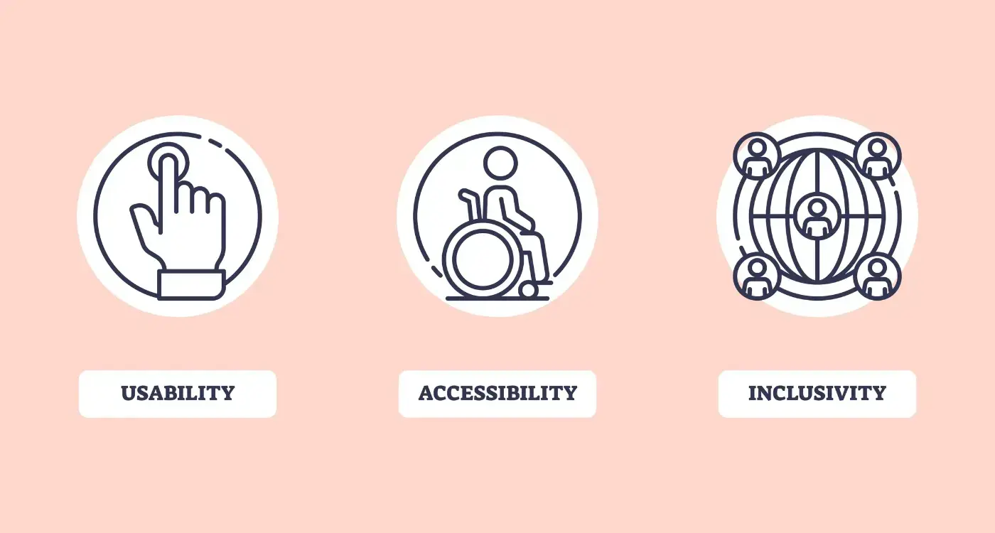
What's the difference between accessible and inclusive design?
Accessible design meets technical standards and works with assistive technologies, while inclusive design considers the full range of human diversity from the start. Inclusive design is broader—it's about creating experiences that work for everyone, not just meeting minimum accessibility requirements.
Should I provide alternatives to gesture-based interactions?
Absolutely. Never rely solely on gestures like swipe, pinch, or shake. Always provide button alternatives or other input methods. Some users can't perform complex gestures due to motor disabilities, and others may not discover gesture-based features at all.
Related Articles
How Do I Make My App Accessible for Users With Disabilities?
Making your mobile app work for everyone isn't just nice to have—it's absolutely necessary. We're...
by Simon Lee
What Is Accessibility in Mobile App Design and Why Does It Matter?
A student opens her favourite music app, ready to study with some background tunes. She's...
by Simon Lee