Expert Guide Series
What Happens To My App's Layout When Text Expands In Other Languages?
Building apps that work across different languages is one of those things that sounds simple until you actually try to do it. I've lost count of how many times I've seen perfectly designed apps fall apart the moment someone switches from English to German or French. The buttons break, text gets cut off, and what was once a beautiful interface becomes a jumbled mess.
The problem is that different languages take up different amounts of space. German words can be twice as long as their English equivalents; Arabic reads right to left; Chinese characters are completely different heights. Your app's layout needs to handle all of this without breaking or looking terrible.
Text expansion isn't just about making things bigger—it's about making your app truly accessible to users around the world
This isn't just a technical problem—it's a business one too. When users can't read your buttons or navigate your app properly, they'll delete it faster than you can say "localisation". The good news is that with proper planning and the right approach to typography and layout in app design, you can create layouts that flex and adapt beautifully no matter what language your users prefer. We'll walk through exactly how to do that in the chapters ahead.
Understanding Text Expansion in Different Languages
When I first started designing experiences, I made a rookie mistake that taught me an expensive lesson. I designed this beautiful interface with perfectly sized buttons and text fields, tested it thoroughly in English, and launched it globally. Within days, the German users were complaining that half the text was cut off—and they were absolutely right.
Different languages take up vastly different amounts of space when displayed on screen. German words tend to be longer than English ones; French often requires more characters to say the same thing; whilst languages like Chinese can actually be more compact. This isn't just about individual words either—entire sentences can balloon in size when translated.
How Much Extra Space Do You Need?
The expansion rates vary dramatically depending on your source language and target language. Here's what you should expect when translating from English:
- German: 20-35% longer text
- French: 15-25% longer text
- Spanish: 15-20% longer text
- Italian: 10-15% longer text
- Russian: 10-15% longer text
- Chinese: 10-20% shorter text
- Japanese: Variable, depends on character type used
Short phrases and button labels tend to expand even more dramatically than longer text blocks. A simple "Save" button might become "Speichern" in German—that's 75% more characters right there. This is why planning for text expansion from the very beginning of your design process will save you countless headaches later on.
How UI Design Responds to Longer Text
When text expands in your app, your UI design needs to be ready for it—and I mean really ready. The interface doesn't just magically adjust; it follows the rules you've set up during the design process. Think of buttons that suddenly become too small for their German labels, or navigation menus that overflow when 'Settings' becomes 'Konfigurationseinstellungen'. Your design system needs to handle these changes gracefully.
Most modern UI frameworks use flexible layouts that can stretch and adapt. Text containers expand vertically to accommodate longer content, whilst maintaining their visual hierarchy. But here's where it gets tricky—some elements like fixed-width buttons or precise spacing can break when text grows by 30% or more. The key is building flexibility into your design from day one.
Responsive Text Containers
Smart UI design uses responsive containers that grow with content. These containers have minimum and maximum sizes, preventing text from becoming too cramped or too spread out. Line height adjusts automatically, and text wrapping kicks in when needed. The best designs anticipate text expansion and build in breathing room.
Always test your UI with placeholder text that's 50% longer than your original English content—this simulates worst-case localisation scenarios and helps you spot potential layout issues early.
UX/UI design built around real psychology
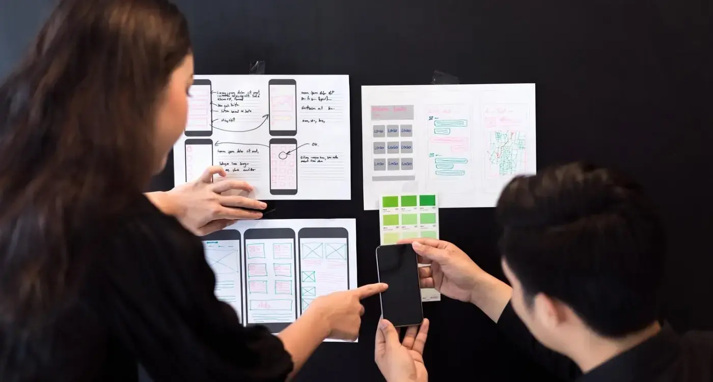
We design app interfaces around how people actually think and behave. User research, psychology-driven UX/UI design and technical specs delivered as one complete package.
Common Layout Problems When Text Grows
After years of designing experiences that break when translated, I can tell you the same problems crop up again and again. The most common issue? Text that gets cut off or disappears completely when it expands in other languages. You might have a button that says "Save" in English, but when it becomes "Enregistrer" in French, half the word vanishes because the button wasn't designed to handle longer text.
Overlapping Elements
Text expansion often causes elements to crash into each other like bumper cars. Labels push into input fields, buttons squash together, and headings can even overlap with the content below them. I've seen apps where German translations—which can be 30% longer than English—turn perfectly organised screens into messy, unreadable layouts.
Breaking Multi-line Layouts
Single-line text often wraps to multiple lines when translated, which can completely destroy your carefully planned layout. Navigation menus break apart; card designs stretch awkwardly; and worst of all, text can push other content right off the screen where users can't reach it.
The good news is that these problems are predictable and preventable. Once you know what to look for, you can design layouts that bend without breaking, no matter which language your users speak.
Planning Your App Layout for Multiple Languages
After years of working with clients who suddenly realise their app needs to work in Spanish, French, or Mandarin, I've learned that planning ahead saves everyone a massive headache. The secret isn't just making your UI design flexible—it's thinking about localisation from day one, not as an afterthought when you're already knee-deep in the design process.
Start by designing your layouts with extra breathing room. I always tell my team to add at least 30% more space than the English text needs. Sounds excessive? Trust me, German compound words will fill that space faster than you can say "Datenschutzgrundverordnung" (that's their word for data protection regulation, by the way).
Text Direction and Layout Flow
Don't forget about right-to-left languages like Arabic and Hebrew—they'll flip your entire interface. Your navigation, buttons, and text alignment all need to work in reverse. Plan your grid systems and component libraries to handle this from the start.
Good localisation isn't about squeezing text into spaces that are too small—it's about creating designs that breathe and adapt naturally
Consider using dynamic layouts that expand vertically rather than horizontally when possible. Buttons that grow taller instead of wider, and text containers that stack rather than squeeze. Your future self will thank you when the localisation team comes knocking.
Testing Your App Design in Different Languages
Right, so you've planned your layout for multiple languages—now comes the fun part: actually testing it. And I mean properly testing it, not just switching your phone to French and hoping for the best!
The biggest mistake I see designers make is testing with fake translations or using Google Translate. Don't do this. Real translations are completely different beasts; they use different sentence structures, different word lengths, and sometimes completely different ways of expressing ideas.
Getting Real Translation Content
You need actual translated content from real translators. Even if it's just placeholder text for now, make sure it's professionally translated. The way German constructs sentences is nothing like English—compound words can be ridiculously long, and sentence structure flips everything around.
Test your app in the most challenging languages first. German and Finnish will stretch your layouts horizontally; languages like Thai and Arabic will test your vertical spacing and text alignment.
Testing Methods That Actually Work
Here's what I do with every project:
- Load real translated content into every screen
- Test on actual devices, not just simulators
- Check different screen sizes with the same language
- Test with accessibility features turned on
- Get native speakers to actually use the app
That last point is crucial. Native speakers will spot issues you'll never notice—like text that's technically correct but sounds completely wrong in context.
Tools and Techniques for Flexible UI Design
Right, let's get practical. After years of dealing with text expansion headaches, I've built up quite a toolkit of techniques that actually work. The good news is that most modern design tools have caught up with the reality of global apps—you just need to know which buttons to press.
Auto Layout in Sketch and Figma has been a game-changer for UI design. These constraint-based systems let you create designs that automatically adjust when text grows. Instead of fixed widths, you set minimum and maximum sizes with rules about how elements should behave. It's like giving your design permission to breathe.
Design Tools for Flexible Layouts
- Figma's Auto Layout with flexible padding and spacing
- Sketch's Smart Layout for responsive components
- Adobe XD's Responsive Resize features
- Principle for prototyping dynamic text behaviour
Testing and Localisation Tools
For testing, tools like Pseudo-localization generators create fake translations that are longer than your original text. This lets you spot problems early. Apps like Lokalise and Phrase integrate directly with your design workflow, showing you exactly how real translations will look before you ship.
Use the "Double-Length Rule" when designing—assume your text might be twice as long in some languages and design accordingly. Your future self will thank you.
Conclusion
Building apps that work beautifully across different languages isn't just about making text fit—it's about creating experiences that feel natural to users wherever they are in the world. I've watched too many promising apps struggle because their teams assumed English would always be the shortest text option, only to discover German translations breaking their carefully crafted layouts.
The good news? You now know what causes these problems and how to prevent them. Start planning for text expansion early, build flexible layouts that can breathe, and test your designs with real translated content—not placeholder text. Those extra 30-50% longer German phrases won't catch you off guard anymore.
What I find fascinating after years of working on international experiences is how solving text expansion problems often makes your app better for everyone. Flexible layouts that handle long German words also work brilliantly for accessibility features like larger text sizes. Design systems that accommodate multiple languages tend to be more robust and maintainable too.
Your users won't notice when text expansion is handled well—and that's exactly the point. They'll simply enjoy using an app that feels like it was made for them, in their language, without any awkward cutoffs or cramped buttons. The psychology-based design, user research, and experience strategy we craft becomes the blueprint that any development team can then build from. Without this foundation, you're asking developers to guess what users need across different languages and cultures. Start with experiences designed by experts.
Frequently Asked Questions
How much extra space should I plan for text expansion?
Plan for at least 30% extra space when designing for German, French, or Spanish translations. Short button labels can expand by 75% or more, so use the "double-length rule" for critical interface elements like navigation and buttons.
Which languages cause the most layout problems?
German and Finnish create the most horizontal layout challenges due to compound words that can be extremely long. Right-to-left languages like Arabic and Hebrew require complete interface mirroring, whilst languages like Thai test vertical spacing due to complex character heights.
Should I test with Google Translate or professional translations?
Always use professional translations for testing layout behaviour. Google Translate often produces shorter, less natural text that won't reveal real-world layout issues. Professional translations use proper sentence structures and cultural context that machine translation misses.
How do I handle right-to-left languages in my design?
Plan your entire interface to mirror for right-to-left languages. Navigation flows reverse, buttons flip positions, and text alignment changes. Build your grid systems and component libraries with bidirectional support from the start rather than trying to retrofit later.
What's the biggest mistake designers make with multilingual layouts?
Treating localisation as an afterthought instead of planning for it from the beginning. Designers often create pixel-perfect layouts in English then try to squeeze longer translations into spaces that are too small, resulting in broken interfaces and poor user experiences.
Can flexible layouts handle any language expansion?
Well-designed flexible layouts can handle most language expansion challenges, but they still need proper planning and constraints. Set minimum and maximum sizes for components, test with extreme cases, and always validate with native speakers to ensure the experience feels natural.
Do I need to redesign my entire interface for each language?
No, you shouldn't need separate designs for each language if you've built flexible, constraint-based layouts from the start. The same design system should adapt naturally to different text lengths and reading directions with proper responsive components and cultural considerations.
Related Articles

Why Do Certain Apps Go Viral While Others Fail to Launch?
Over 99% of mobile apps never make it past their first month in the app stores. That's right—nearly...
by Simon Lee
What Spacing Rules Create Better Mobile App Layouts?
You download a new app that looks promising, open it up, and immediately feel overwhelmed. Text is...
by Simon Lee