Expert Guide Series
What is emotional app design?
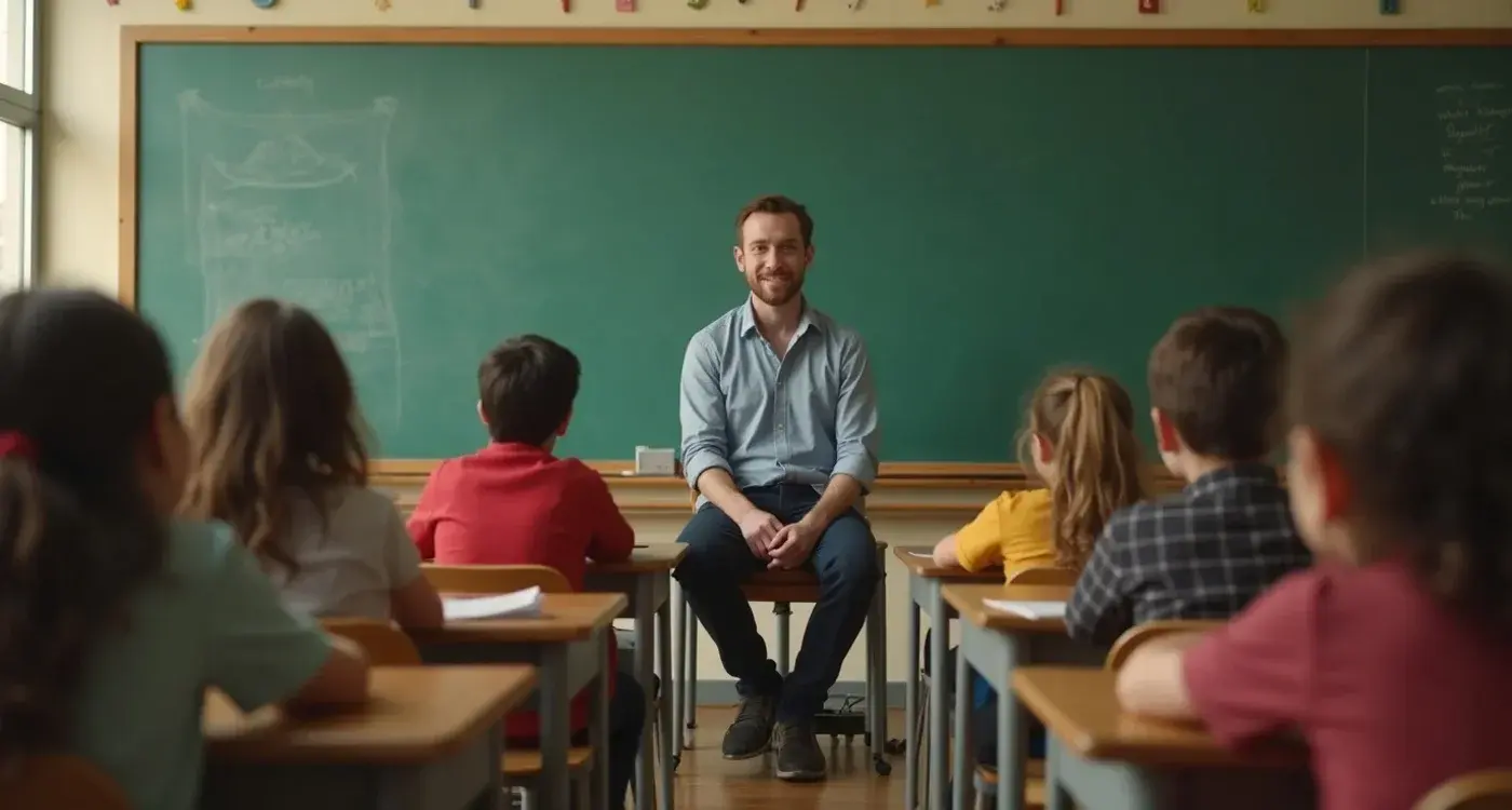
Most app designers focus on what users do rather than how they feel while doing it. We measure clicks, conversions, and session time, but we often miss the emotional journey that determines whether someone actually wants to return. Emotional app design changes this dynamic by putting feelings first and functionality second.
When we talk about emotional design, people often think about calming colours and fluffy language. The reality runs much deeper. Emotional app design recognises that every interaction triggers a psychological response, and these responses shape whether users trust your product, understand its value, or abandon it within seconds.
Every interaction in your app triggers a psychological response that shapes whether users trust or abandon your product.
The difference between functional and emotional design lies in the questions we ask. Functional design asks "How do we help users complete this task?" Emotional design asks "How do we want users to feel when completing this task, and what emotional state are they already in when they arrive?" This shift changes everything from information architecture to micro-interactions.
The Psychology of User Experience
Human decision-making operates on two levels. We make conscious, rational choices based on features and benefits. But underneath, we make subconscious emotional decisions that often override our logical thinking. Apps that understand this dual process create experiences that feel right, not just work right.
Consider how stress affects information processing. When someone feels anxious about using a new financial app, they can't absorb complex information effectively. Their cognitive load is already maxed out managing their emotional state. Stressed users need different interaction patterns and educational content to reduce anxiety, whilst excited users want minimal information that allows them to progress quickly.
The key insight here is that emotional state should dictate information layering design. Rather than showing everything that makes sense from a product perspective, we layer information based on what makes sense from a human and emotional perspective. This means understanding what leads up to somebody using your product and their emotional state when they first open the app.
Design your information hierarchy based on users' emotional states, not just logical information flow. Anxious users need simplification and reassurance before detailed features.
Behavioural Emotion Indicators
Emotions leave digital footprints. Users don't explicitly tell us they're confused or stressed, but their behaviour reveals these states clearly. Understanding how to read these signals allows apps to respond appropriately to emotional needs.
Dwell time patterns reveal emotional engagement levels. When users spend excessive time on simple screens, they're likely experiencing confusion or hesitation. When they rush through content that should require consideration, they might be in an excited state that needs channelling rather than additional information.
Navigation patterns also indicate emotional states. Users who repeatedly return to previous screens show uncertainty or lack of confidence. Those who skip optional content might be eager to progress but could miss critical information they'll need later. Progressive disclosure for emotional management focuses on the order of communication rather than complexity.
UX/UI design built around real psychology
We design app interfaces around how people actually think and behave. User research, psychology-driven UX/UI design and technical specs delivered as one complete package.
Responding to Real-Time Emotional States
The most sophisticated emotional design systems adapt to users' current emotional states rather than assuming a single user journey. This requires building flexibility into the experience that allows for different emotional pathways through the same functionality.
Sophisticated emotional design systems adapt to users' current emotional states rather than assuming a single user journey.
For anxious users, the system might emphasise educational content and reassurance. Small wins become crucial. Messages like "keep going, well done, you've taken a small step" work better than ambitious goals that might increase worry about potential failure. Daily streaks and process-focused achievements resonate more than results-based rewards.
Excited users need a different approach entirely. They want to skip introductory content and dive into core functionality. However, they still need to absorb critical information without realising they're being educated. The solution involves fast-track options that still deliver essential knowledge through streamlined interactions.
Create parallel pathways for different emotional states. Anxious users need education and reassurance, whilst excited users want quick progress with embedded learning.
Information Architecture for Emotional Intelligence
Traditional information architecture organises content logically. Emotional information architecture organises content psychologically, considering how emotions affect information processing and decision-making capabilities.
Cognitive Load Management
When users enter an app in a high-stress state, their cognitive load is already elevated. Additional complexity feels overwhelming rather than comprehensive. In high stress or anxiety situations, we need to simplify and reduce heightened emotional levels through education and simplification.
This doesn't mean removing functionality. It means sequencing information revelation based on emotional readiness. Users become more receptive to learning complex information once their initial anxiety and stress levels have dropped through clear understanding of core functionality.
Emotional Progression Planning
Effective emotional architecture maps the desired emotional journey alongside the functional journey. Where do we want users to feel confident? Where might they naturally feel uncertain? How do we design transitions between these emotional states?
This approach recognises that the user journey begins before someone actually uses the app. Understanding what leads up to product usage and the emotional context surrounding that need becomes absolutely critical for effective design decisions.
The Language of Micro-Interactions
Micro-interactions function as the body language of digital products. Just as we subconsciously read visual cues like raised eyebrows or slight smirks to gain extra richness in conversations, micro-interactions convey additional meaning and emotion between obvious product communications.
The timing of feedback matters enormously. Immediate responses feel responsive and confident. Delayed reactions suggest hesitation or processing difficulties. Loading states communicate personality. A playful animation suggests approachability, whilst a minimal progress bar conveys efficiency and professionalism.
Colour psychology plays a significant role in micro-interaction design. Different colours psychologically evoke different emotions. Green feels calming, blue appears clinical, and red communicates passion and urgency. Strategic colour usage in interactive elements can evoke specific psychological feelings without users realising what's happening.
- Animation timing that matches natural human rhythms feels more intuitive
- Sound design can reinforce emotional states through audio cues
- Haptic feedback creates physical emotional connections with digital actions
- Error states that feel helpful rather than punitive maintain positive emotional flow
Design micro-interactions as emotional conversations. Every animation, sound, and visual response should reinforce the feeling you want users to experience.
Measuring Emotional Engagement Beyond Functionality
Traditional analytics miss emotional engagement entirely. We need metrics that reveal how users feel, not just what they do. This requires combining behavioural data with emotional intelligence to understand the complete user experience.
Sentiment tracking through user feedback patterns reveals emotional trajectories. Users who start with negative language but shift to positive terms show successful emotional design. Those who maintain neutral or increasingly negative sentiment indicate emotional friction points.
Session quality metrics become more revealing than session quantity. A user who completes fewer tasks but shows increased engagement over time demonstrates growing emotional comfort and trust. Introverts and extroverts respond differently to engagement mechanisms, with introverts focusing more on behavioural change and process, whilst extroverts prefer competitive elements and comparison to others.
Retention patterns connected to emotional states show the long-term impact of emotional design decisions. Users who return voluntarily rather than through notification prompts demonstrate genuine emotional connection to the product experience.
Conclusion
Emotional app design transforms products from functional tools into meaningful experiences that users genuinely want to engage with. When emotions guide design decisions from day one, everything becomes more purposeful. Rather than using colours and interactions simply because they look good, there's a real reason behind each choice.
The shift requires thinking beyond what users do to consider how they feel while doing it. This means understanding emotional states before users even open the app, designing information architecture that responds to psychological needs, and creating micro-interactions that communicate emotional intelligence.
Most importantly, emotional design recognises that people don't just use apps to complete tasks. They use them to feel capable, confident, and understood. Apps that acknowledge and design for these emotional needs create lasting relationships rather than temporary solutions.
We believe emotional design represents the future of meaningful digital experiences. If you're ready to explore how emotional intelligence can transform your app's impact, let's talk about your emotional design strategy.
Frequently Asked Questions
What exactly is emotional app design and how does it differ from traditional design?
Emotional app design prioritises how users feel whilst using an app rather than simply focusing on what they do. Unlike traditional design that asks 'How do we help users complete this task?', emotional design asks 'How do we want users to feel when completing this task?' This fundamental shift changes everything from information architecture to micro-interactions.
Why should app designers care about users' emotions rather than just functionality?
Every interaction in an app triggers a psychological response that determines whether users trust your product or abandon it within seconds. Human decision-making operates on both conscious rational choices and subconscious emotional decisions, with emotions often overriding logical thinking. Apps that understand this dual process create experiences that feel right, not just work right.
How do different emotional states affect how users interact with apps?
When users feel anxious, they can't absorb complex information effectively because their cognitive load is already maxed out managing their emotional state. Stressed users need different interaction patterns and simplified content to reduce anxiety, whilst excited users prefer minimal information that allows them to progress quickly. This is why emotional state should dictate information layering design rather than logical information flow alone.
How can I tell what emotional state my users are in if they don't explicitly tell me?
Emotions leave digital footprints through user behaviour patterns that you can track and analyse. Excessive dwell time on simple screens typically indicates confusion or hesitation, whilst rushing through content that should require consideration suggests excitement that needs channelling. Navigation patterns, such as repeatedly returning to previous screens, reveal uncertainty or lack of confidence.
What should I do when users spend too much time on simple screens?
Excessive dwell time on simple screens usually indicates that users are experiencing confusion or hesitation. In these cases, you should focus on simplification and providing reassurance before presenting detailed features. Consider reducing cognitive load and offering clearer guidance or support to help users feel more confident about proceeding.
How should I design information architecture based on emotional states rather than logical flow?
Instead of showing everything that makes sense from a product perspective, layer information based on what makes sense from a human and emotional perspective. This means understanding what leads up to somebody using your product and their emotional state when they first open the app. Anxious users need simplification and reassurance first, whilst confident users can handle more complex information upfront.
What does progressive disclosure for emotional management mean?
Progressive disclosure for emotional management focuses on the order of communication rather than just managing complexity. It's about revealing information in a sequence that supports users' emotional journey, ensuring they receive the right type of content when they're in the right emotional state to process it effectively. This approach recognises that timing of information delivery is as important as the information itself.
Is emotional design just about using calming colours and gentle language?
No, emotional design runs much deeper than surface-level aesthetics like calming colours and gentle language. Whilst these elements can play a role, true emotional design recognises that every interaction triggers a psychological response and focuses on designing entire user journeys around emotional states. It's about understanding the complete emotional context of how and why people use your app.
Related Articles

AI development tools impact on mobile teams
Mobile development teams work faster than ever, yet burnout rates continue climbing. Productivity...
by Simon Lee

The limitations of touch interfaces
When we tap a screen to complete a purchase, we receive only the slightest vibration in return. Our...
by Simon Lee