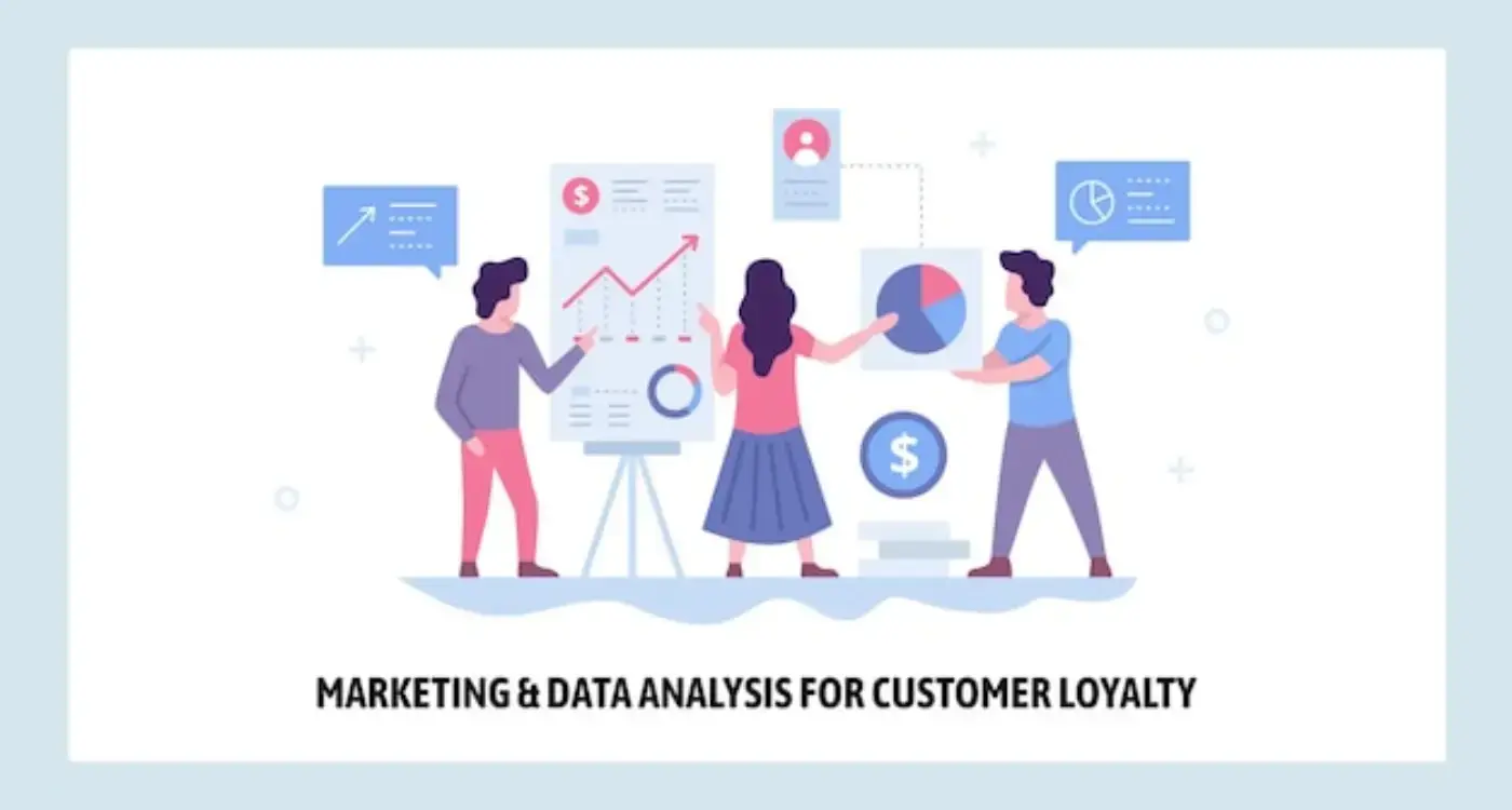
Expert Guide Series
Why are my app users leaving bad reviews instead of contacting support?
Your app has thousands of downloads, solid functionality, and regular updates. Yet your App Store reviews tell a different story. Users complain about bugs you could fix in minutes, features they can't find that are clearly in your menu, and problems your support team handles daily. The frustrating part? These same users never contacted your support team before leaving those damaging reviews.
This pattern repeats across countless apps. Users encounter a problem, skip the support channels entirely, and head straight to the App Store to vent their frustration. The result damages your app's reputation and pushes away potential users who might have become loyal customers.
Understanding why users choose public complaints over direct support requires looking at the psychological forces at play. When someone feels frustrated with your app, their decision-making process involves emotional responses, cognitive shortcuts, and subconscious assessments that happen faster than rational thought.
Users make emotional decisions about support within thirty seconds.
The path from problem to public review feels easier than finding and using your support system. This choice reflects how your app's design either supports users in their moment of need or pushes them toward public forums where their frustration becomes visible to everyone.
The Psychology Behind Public Complaints
When users encounter problems, they shift from engagement to protection mode. Their brain prioritises getting back to a comfortable state quickly, and public reviews often feel like the fastest path to relief. Leaving a review provides immediate emotional release without the perceived effort of navigating support systems.
Reviews also serve a social function that private support cannot. Users feel they're warning others about potential problems, positioning themselves as helpful community members rather than just frustrated customers. This transforms their negative experience into something socially valuable.
Make support feel like helping your team improve the app, not just solving individual problems. Frame it as collaboration rather than complaint handling.
The anonymity of reviews creates psychological safety. Users can express frustration without fear of confrontation or having to explain themselves to another person. They avoid the social anxiety that comes with direct communication, especially when they're already feeling negative about your product.
Public platforms also provide a sense of power that private support channels lack. Users know their review will be seen by potential customers and the company itself. This visibility gives them leverage they don't feel they have in private conversations with support teams.
When Support Feels Inaccessible
Most apps bury their support options deep in settings menus or help sections. When users need help, they're already frustrated, and having to hunt for support contact information amplifies that frustration. The harder you make it to find support, the more likely users are to choose the visible, accessible App Store review section instead.
Support forms often feel overwhelming. They ask for detailed information about device models, operating system versions, and step-by-step recreations of problems. For users who just want their issue fixed quickly, this feels like work rather than help.
Design that understands your users
We build app experiences around real user behaviour, not assumptions. Research, psychology-driven design and technical specs that turn users into loyal advocates.
Cognitive Overload and User Frustration
When your app creates cognitive overload, users lose patience quickly. In the first thirty seconds of encountering a problem, they're subconsciously assessing multiple factors at once. They're evaluating whether your app is trustworthy, how much effort fixing this issue will require, and whether they have time to deal with it properly.
Frustrated users make quick decisions based on immediate emotional responses.
Complex navigation during problem-solving compounds the original frustration. If users can't quickly understand how to get help, they assume the entire support process will be equally confusing. This drives them toward the familiar territory of app store reviews where the process is straightforward.
The mental load of explaining technical problems to support teams feels daunting when users are already overwhelmed. Writing a review requires less precision and technical knowledge than filing a proper support ticket.
The Emotional Journey to App Store Reviews
Users don't wake up planning to leave bad reviews. They start with expectations about how your app should work, encounter problems that disrupt those expectations, and then seek the path of least resistance to express their frustration.
The Escalation Pattern
First, users try to solve problems themselves. They tap around, restart the app, or search for obvious solutions. When these attempts fail, frustration builds. This is the critical moment where your app's design either guides them toward helpful resources or leaves them feeling abandoned.
The Review Decision Point
By the time users consider leaving reviews, they've already decided your app has failed them. The review becomes their way of regaining control and warning others. This feels more empowering than asking for help from the company that created their problem.
Add contextual help options that appear automatically when users show signs of struggle, like repeated tapping or backtracking through menus.
The App Store review section is always visible and accessible. Users know exactly where to find it, understand how it works, and feel confident their message will be seen. This predictability makes reviews feel safer than exploring unknown support channels.
Design Patterns That Drive Users Away
Hidden help buttons create immediate friction when users need support most. Placing support options in hamburger menus or secondary navigation makes them feel secondary to your priorities. Users interpret this as your company caring more about acquisition than customer service.
Generic help pages filled with FAQ sections force users to search for their specific problem among dozens of irrelevant questions. This scavenger hunt mentality pushes frustrated users toward the simpler option of writing their problem in their own words via reviews.
Place contextual help buttons on screens where users commonly get stuck, making support feel integrated rather than separate from the main experience.
Requesting detailed information upfront for support contact creates a barrier that feels disproportionate to simple problems. Users want to say "this button doesn't work" without providing system specifications and reproduction steps.
Long response time warnings ("we'll get back to you within 2-3 business days") make reviews feel faster, even though they're not actually getting immediate solutions either. The perception of speed matters more than actual speed when users are frustrated.
Creating Emotionally Supportive Experiences
Emotional design in support systems starts with acknowledging user frustration rather than ignoring it. When users encounter problems, they need to feel heard and understood before they need technical solutions. Your app's response to problems shapes whether users see you as helpful or indifferent.
Progressive disclosure works well for support options. Start with simple, common solutions and gradually reveal more detailed options if users need them. This prevents overwhelming users while still providing comprehensive help for complex issues.
- Add "Quick help" buttons on screens where users typically get confused
- Use plain language in error messages that explains what happened and what to do next
- Provide immediate acknowledgment when users submit support requests
- Show estimated response times clearly upfront
- Include links to relevant help articles in error states
Frame support requests as helping your team improve the app for everyone, not just solving individual problems. This makes users feel like collaborators rather than complainants.
In-app messaging feels more immediate and personal than email forms. When users can start conversations directly within your app, support feels integrated into the experience rather than separate from it. This integration reduces the psychological barrier between problem and solution.
Proactive support works better than reactive support. If your analytics show users struggling with particular features, reach out with helpful tips before they give up. This transforms potential negative experiences into positive ones and builds loyalty rather than frustration.
The goal isn't eliminating all negative reviews but reducing reviews that stem from solvable problems and poor support experiences. Focus on making support feel accessible, human, and genuinely helpful rather than bureaucratic or defensive.
Bad reviews will always exist, but many of them are preventable through thoughtful design and accessible support systems. When users feel supported by your app's design and confident in your team's responsiveness, they're more likely to reach out directly rather than venting publicly. This creates opportunities for relationship building rather than reputation damage.
Understanding the emotional journey from problem to public complaint helps you design interventions that redirect frustrated users towards constructive solutions. The result is better user relationships, improved app store ratings, and valuable feedback that helps you improve your product continuously. If you're ready to transform your support experience and reduce negative reviews through emotional design, let's talk about your app's user journey.
Frequently Asked Questions
Why do users leave bad reviews instead of contacting support directly?
Users make emotional decisions within thirty seconds of encountering a problem, and leaving a review feels like the quickest path to relief. They also perceive public reviews as easier than navigating support systems, plus reviews provide immediate emotional release and a sense of power through public visibility.
What psychological factors drive users to post public complaints?
When frustrated, users shift into protection mode and seek the fastest way back to comfort, which often feels like leaving a review. Public reviews also serve a social function, allowing users to feel helpful by warning others, whilst the anonymity provides psychological safety without fear of confrontation.
How does app design influence whether users contact support or leave reviews?
Apps that bury support options deep in settings menus push frustrated users towards easily accessible review sections instead. When support feels hard to find or use, the visible App Store review option becomes the more attractive choice for venting frustration.
Why do support forms discourage users from seeking help?
Support forms often feel overwhelming because they request detailed technical information like device models and step-by-step problem recreations. For users wanting quick fixes, this feels like additional work rather than helpful assistance, deterring them from using support channels.
How can I make support feel more appealing to users?
Frame support as collaboration to improve the app rather than just complaint handling. Make users feel like they're helping your team enhance the product for everyone, rather than simply solving individual problems.
What role does cognitive overload play in user decisions about support?
When apps create cognitive overload, users lose patience very quickly and make snap decisions about where to seek help. In their frustrated state, they're more likely to choose what appears to be the simplest option, which is often leaving a public review rather than navigating complex support systems.
How do public reviews give users a sense of power that private support doesn't?
Public reviews provide visibility and leverage that users don't feel they have in private support conversations. They know their review will be seen by both potential customers and the company, giving them influence over the app's reputation and business success.
Can fixing easily solvable problems prevent bad reviews?
Yes, many bad reviews stem from bugs that could be fixed in minutes or features users simply can't locate in the interface. By making support more accessible and addressing these common issues proactively, you can prevent frustrated users from turning to public complaints.
Related Articles
How Do You Create an Effective App Onboarding Experience for New Users?
Nine out of ten people will abandon an app if they can't figure out how to use it within the first...
by Simon Lee
Should My App Require Sign-Up Before Users Can Explore Features?
Nine out of ten mobile apps lose 77% of their users within the first three days after download....
by Simon Lee