
Expert Guide Series
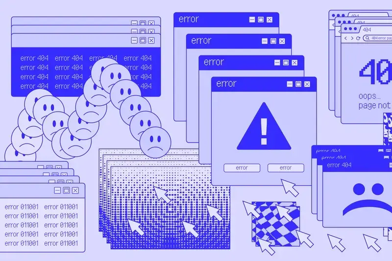
Why do users ignore our important warnings and notifications?
Your security team has crafted what they believe is the perfect warning message. It's clear, direct, and explains exactly why users should stop and pay attention. Yet somehow, most people still click straight through it, seemingly blind to the carefully worded alert that should have made them pause.
This isn't a failure of intelligence or carelessness. When we study cognitive biases and attention in design, we see something more complex happening. The human brain processes information differently depending on our emotional state, cognitive load, and the context we're operating in. A warning that appears at the wrong moment might as well be invisible.
Users don't ignore warnings because they're reckless or careless, but because their brain is focused elsewhere entirely.
Understanding why warnings fail means understanding the psychological state of people when they encounter them. Are they stressed and rushing through a task? Are they in a focused flow state where interruptions feel jarring? Are they overwhelmed with too much information already? Each of these states requires a completely different approach to communication.
The most effective warnings work with human psychology rather than against it. They appear when people can actually process the information, use language that matches the user's emotional state, and provide clear next steps that feel manageable rather than overwhelming.
The Flow State Phenomenon
When people are deeply engaged with a task, their brain enters what psychologists call a flow state. In this focused mode, anything that doesn't directly relate to their immediate goal gets filtered out automatically. This includes warnings, notifications, and even important security alerts.
Think about when you're completely absorbed in writing an email or filling out an online form. Your attention narrows to just the task at hand. Interruptions during these moments feel jarring and unwelcome, even if they contain important information. The brain essentially puts up barriers to protect the focused state.
Recognising Flow State Behaviour
We can identify when users are in flow states through their behaviour patterns. They move quickly through familiar interfaces, spend longer periods on individual tasks, and show consistent interaction patterns. Their dwell time on pages increases, but their tolerance for interruptions decreases significantly.
Watch for rapid, consecutive actions in your analytics. When users are clicking through multiple steps quickly, they're likely in a flow state and less receptive to warnings.
The challenge becomes timing warnings appropriately. Interrupting flow state creates frustration and often leads to people dismissing alerts without reading them. But waiting too long might mean the warning comes after the risky action has already been taken.
Cognitive Load and Warning Blindness
Our brains can only process so much information at once. When people are already dealing with complex tasks or multiple pieces of information, additional warnings often get ignored simply because there's no mental capacity left to process them.
This explains why security warnings on checkout pages are frequently dismissed. Users are already juggling payment details, shipping addresses, and product choices. Adding another layer of security information often pushes them beyond their cognitive threshold, so they default to the quickest action that lets them continue.
Reduce the cognitive load before presenting warnings by simplifying other elements on the page. Remove unnecessary text, streamline the interface, and eliminate non-essential choices.
The position and presentation of warnings also affects whether people can process them. Warnings buried in walls of text or presented alongside multiple other alerts create competition for attention. The brain tends to ignore information that requires significant effort to parse when it's already working hard on other tasks.
UX/UI design built around real psychology
We design app interfaces around how people actually think and behave. User research, psychology-driven UX/UI design and technical specs delivered as one complete package.
Emotional Context in Security Decisions
Security warnings often appear during stressful moments. People might be rushing to complete a purchase, worried about deadlines, or frustrated by technical difficulties. In these heightened emotional states, the brain's ability to process complex information actually decreases.
When stress levels rise, people forget well-learned behaviours and struggle with tasks that would normally be incredibly simple.
Stressed users need different types of communication than calm, focused users. They respond better to simple, direct language and clear next steps rather than detailed explanations of potential risks. The emotional tone of the warning becomes just as important as the information it contains.
Stress-Responsive Warning Design
When designing warnings for stressed users, we focus on reducing anxiety rather than increasing it. This means avoiding alarmist language, providing reassurance about what happens next, and offering simple, clear choices. The goal is to guide people through the decision rather than forcing them to figure it out themselves.
Conversely, users in positive emotional states can process more complex information and are more willing to engage with detailed explanations. Understanding the emotional context helps determine not just what to say, but how much information to include.
Timing: When Users Can Actually Process Information
The timing of warnings often matters more than their content. Presenting a security alert at the exact moment someone is trying to complete a task creates an unwelcome interruption. But showing it too early means it might be forgotten by the time it becomes relevant.
Natural pause points in user journeys offer the best opportunities for warnings. These might be after completing a form section, before a final confirmation step, or during brief loading periods. At these moments, people's attention isn't fully committed to another task, making them more receptive to new information.
Identify transition moments in your user journey where people naturally pause or reflect. These breaks in activity provide ideal opportunities for presenting important information.
Progressive Disclosure of Risk Information
Rather than presenting all security information at once, progressive disclosure allows people to receive warnings when they can best process them. Start with essential information and provide paths to more detailed explanations for users who want them.
This approach respects different user needs. Some people want comprehensive information before making security decisions, while others prefer quick, clear guidance that lets them move forward confidently. Progressive disclosure accommodates both preferences without overwhelming anyone.
Behavioural Signals That Reveal Readiness
User behaviour provides clear signals about when people are ready to engage with warnings and security information. Slow, deliberate movements suggest careful consideration, while rapid clicking indicates urgency or frustration that makes interruptions unwelcome.
Dwell time on pages reveals attention levels. Users who spend time reading content are more likely to engage thoughtfully with warnings than those rushing through steps. Similarly, return visitors often show different patterns than first-time users, suggesting varying levels of familiarity and confidence.
- Slow cursor movement and longer page dwell times indicate receptiveness to detailed information
- Rapid progression through familiar interfaces suggests flow state focus
- Multiple attempts at the same action often signal confusion or stress
- Pause-and-return patterns show users actively considering their options
These behavioural patterns help determine not just when to show warnings, but what type of information will be most effective. Users showing stress signals need simpler, more reassuring communications, while confident users might appreciate more detailed explanations.
Designing Warnings That Work With Human Psychology
Effective warnings feel like helpful guidance rather than obstacles. They acknowledge the user's goal and explain how the security measure supports rather than hinders that objective. This framing transforms warnings from interruptions into collaborative tools.
Language choice significantly affects how warnings are received. Instead of focusing solely on risks and negative outcomes, effective warnings explain the positive benefits of taking security seriously. They help users understand what they're protecting rather than just what they're avoiding.
Contextual Adaptation
The most sophisticated warning systems adapt their approach based on user behaviour and context. They might present detailed explanations to users showing signs of uncertainty, while offering streamlined confirmations to those demonstrating confidence and familiarity.
Test different warning approaches with actual user behaviour data. What works for stressed, first-time users might be completely wrong for confident, returning customers.
Visual design also plays a role in warning effectiveness. Warnings that feel integrated into the interface rather than imposed upon it create less resistance. They should guide attention naturally rather than demanding it forcefully, making the security decision feel like a normal part of the process.
Success comes from recognising that security isn't just about protecting systems and data. It's about helping people make confident decisions that align with their goals and values. When warnings support rather than obstruct user objectives, they become much more effective at actually improving security outcomes.
Rather than fighting against human psychology, the most effective security communications work with our natural decision-making processes. They appear when people can process them, speak in language that matches emotional states, and provide clear paths forward that feel manageable and purposeful.
Conclusion
Effective security warnings require understanding that users encounter them in different psychological states. Rather than applying uniform alert systems, successful products adapt their approach based on cognitive load, emotional context, and behavioural patterns.
The most practical steps involve identifying natural pause points in user journeys, matching warning language to the user's emotional state, and using progressive disclosure so people receive the right depth of information at the right moment. Reading behavioural signals like dwell time and progression speed ensures warnings feel supportive rather than obstructive.
When security communication feels built around how people actually think and behave, it becomes a natural part of the experience rather than an interruption forced on top of it. This thoughtful approach creates warnings that genuinely protect users while respecting their goals.
Ready to design security communications that work with human psychology rather than against it? Let's talk about your warning systems and how psychology-based design can transform your user experience.
Frequently Asked Questions
Why do people ignore security warnings even when they're clearly written?
Users don't ignore warnings because they're careless, but because their brain is often focused elsewhere entirely. The human brain processes information differently depending on emotional state, cognitive load, and context, so a warning that appears at the wrong moment might as well be invisible.
What is flow state and how does it affect warning effectiveness?
Flow state is when people are deeply engaged with a task, causing their brain to automatically filter out anything that doesn't relate to their immediate goal. During these focused periods, interruptions like warnings feel jarring and unwelcome, even if they contain important information, leading users to dismiss them without reading.
How can I tell if users are in a flow state?
You can identify flow state through behaviour patterns in your analytics, such as rapid consecutive actions and users clicking through multiple steps quickly. Look for increased dwell time on pages combined with decreased tolerance for interruptions.
What is cognitive load and why does it make warnings less effective?
Cognitive load refers to the amount of mental effort being used, and our brains can only process so much information at once. When users are already dealing with complex tasks or multiple pieces of information, additional warnings often get ignored because there's no mental capacity left to process them.
Why are security warnings on checkout pages often ignored?
Users on checkout pages are already juggling payment details, shipping addresses, and product choices, which pushes them near their cognitive threshold. Adding security warnings often exceeds their mental capacity, so they default to the quickest action that lets them continue with their purchase.
How can I reduce cognitive load to make warnings more effective?
Reduce cognitive load before presenting warnings by simplifying other elements on the page. Remove unnecessary text, streamline the interface, and eliminate non-essential choices to free up mental capacity for processing important alerts.
When is the best time to show warnings to users?
The most effective warnings appear when people can actually process the information, rather than during flow states or high cognitive load periods. Timing is crucial - interrupting flow creates frustration, but waiting too long might mean the warning comes after the risky action has been taken.
What makes a warning psychologically effective?
Effective warnings work with human psychology by using language that matches the user's emotional state and providing clear next steps that feel manageable rather than overwhelming. They also appear at moments when users can actually process the information properly.
Related Articles
How Do I Add Micro-Interactions To My Mobile App Without Overdoing It?
Every tap, swipe, and scroll on your mobile app is an opportunity to delight users—or completely...
by Simon Lee

How do I find out what price users will pay for my app?
The clues to pricing your app correctly are already there in how your users behave. Every tap,...
by Simon Lee