Expert Guide Series
5 essential app marketing mistakes to avoid
App stores are graveyards. Millions of apps sit abandoned, downloaded once and deleted within hours. The survivors share something the failures missed: they understood that a solid app launch and marketing strategy means launching a relationship, not just releasing software.
We see this pattern repeatedly in our work with digital products. Teams pour months into development, perfecting features and polishing interfaces. Then they stumble on the simplest things. A permission request that feels invasive. An onboarding flow that confuses rather than welcomes. A notification system that annoys instead of delights.
App marketing begins before download and continues long after installation.
These mistakes happen because teams think about apps as isolated products rather than part of someone's life. They forget that their app competes with everything else demanding attention on a user's phone. The winners understand that every interaction shapes how people feel about their product.
Five common mistakes kill apps before they find their audience.
Ignoring Pre-App Context
Most teams start thinking about user experience when someone opens their app. This misses everything that happened before. The moment someone searches for your app, they're already carrying expectations, frustrations, and specific needs that brought them to you.
Consider someone downloading a meditation app at 11 PM after a stressful day. They arrive tired, overwhelmed, seeking immediate relief. Yet many apps greet them with lengthy tutorials, account creation forms, and feature demonstrations. The disconnect between their emotional state and the app's demands creates instant friction.
Map the real-world situations that lead people to your app. What just happened in their life? What are they hoping to accomplish? Design your first impression around their emotional context, not your product features.
Understanding pre-app context changes everything. A fitness app downloaded on January 2nd serves someone with fresh motivation but limited knowledge. The same app downloaded in July might reach someone frustrated with previous attempts who needs encouragement rather than instruction.
The best apps acknowledge this context immediately. They show they understand where users are coming from and meet them there, rather than forcing everyone through the same generic experience.
Demanding Too Much Too Soon
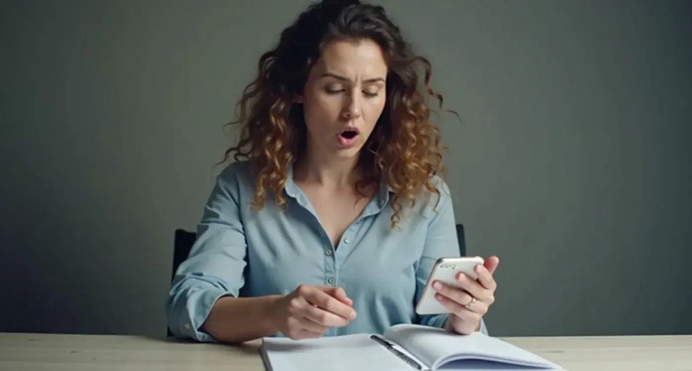
Users make critical decisions about your app's value within the first 60 to 120 seconds. This is when many products accidentally sabotage themselves by asking for too much commitment upfront.
Forced registration before users see any value causes 15-20% of people to abandon immediately. They haven't experienced what your app offers, yet you're asking for email addresses, permissions, and personal information. From their perspective, this feels presumptuous.
Let people experience value before asking for commitment. Show them what your app does, then invite them to create an account to save their progress or unlock additional features.
The same principle applies to permissions. Asking for camera access, location data, or push notifications without context triggers psychological resistance. Users assume you're collecting data for your benefit, not theirs.
Neglecting Emotional Feedback
Apps communicate constantly through micro-interactions, loading states, and interface responses. These small moments shape how people feel about your product, yet many teams treat them as technical afterthoughts rather than emotional opportunities.
When someone taps a button and nothing happens immediately, they start doubting. Did the tap register? Is the app broken? Without feedback, users fill the silence with negative assumptions. A simple loading animation or button state change prevents this anxiety.
Micro-interactions are digital body language, conveying meaning beyond obvious communications.
Think about the difference between a harsh error sound and a gentle notification chime. Both communicate that something needs attention, but they create entirely different emotional responses. One feels punitive, the other helpful.
Audit every interaction in your app for emotional tone. Does this animation feel playful or clinical? Does this transition feel smooth or jarring? These details accumulate into overall impressions of quality and care.
The most successful apps use emotional feedback to build trust gradually. Each smooth animation, helpful micro-copy message, and thoughtful interaction reinforces that this product was crafted with attention to user experience.
UX/UI design built around real psychology
We design app interfaces around how people actually think and behave. User research, psychology-driven UX/UI design and technical specs delivered as one complete package.
Overwhelming Users with Features
Teams often believe more features equal more value. This leads to apps that showcase every capability upfront, overwhelming users with choices they're not ready to make. The result feels more like software documentation than a welcoming experience.
Progressive disclosure solves this problem by layering information based on user readiness. Show essential features first, then reveal advanced capabilities as people become more comfortable with your app. This respects cognitive limits while ensuring important functionality remains accessible.
Consider how email apps handle complexity. They don't show every formatting option, filter rule, and organization feature immediately. Basic compose and send functions appear first. Advanced features emerge as users explore or specifically seek them out.
Identify your app's core function and make that effortless to accomplish. Everything else should feel optional, discoverable when needed but never mandatory to understand upfront.
Help users accomplish something meaningful quickly, then gradually expand their understanding of what's possible. This builds confidence and encourages exploration rather than creating immediate overwhelm.
Mishandling Risk Communication
Every app involves some form of risk. Data collection, subscription costs, permission requirements, or simply time investment. How you communicate these risks dramatically affects user trust and adoption.
Transparency about risks is critical, but risks must be presented alongside benefits. If you only highlight what users might lose or what data you'll collect, without explaining why this exchange benefits them, transparency becomes counterproductive. People switch off when they see only downsides.
Effective risk communication frames necessary permissions, costs, or data sharing in terms of value creation. Location access enables personalised recommendations. Push notifications deliver timely, relevant updates. Subscription fees support ongoing development and feature improvements.
- Explain the specific benefit each permission provides
- Show how data collection improves user experience
- Frame costs as investments in ongoing value
- Provide granular control over privacy settings
The best apps make users feel informed rather than exploited. They show respect for user agency while clearly communicating mutual benefits of the relationship.
Forgetting the Human Touch
Digital products can feel mechanical, especially when they follow rigid rules about user flows and conversion optimization. This mechanical feeling creates distance between users and products, making apps feel like tools rather than helpful companions.
Human touches appear in copywriting tone, error message personality, and how your app responds to user behavior. Instead of "Error 404: Page not found, " try "Hmm, we can't find that page. Let's get you back on track." The information is identical, but the feeling is completely different.
Personalisation adds humanity when done thoughtfully. Acknowledging user milestones, remembering preferences, or adjusting interface elements based on usage patterns shows your app pays attention to individuals rather than treating everyone identically.
Write every piece of app copy as if you're speaking to a friend who needs help. Avoid corporate language, technical jargon, and formal tone. Aim for clarity, warmth, and genuine helpfulness.
The human touch also appears in how your app handles mistakes. When users enter invalid information or make errors, does your app feel judgmental or supportive? Does it explain what went wrong and how to fix it, or just flag problems without guidance?
Conclusion
App marketing succeeds when it stops feeling like marketing. The most effective promotion happens through user experience itself. People recommend apps that make them feel understood, respected, and successful.
These mistakes share a common thread: they prioritize product needs over user needs. Registration serves your analytics, not their immediate goals. Feature showcases serve your development pride, not their learning curve. Risk disclosure serves your legal requirements, not their decision-making process.
The flip side creates opportunity. Apps that understand pre-download context, respect user readiness, provide emotional feedback, manage complexity thoughtfully, communicate risks fairly, and maintain human warmth build lasting relationships with their audience.
Every interaction becomes a chance to demonstrate care, competence, and respect for user time. This approach takes more effort upfront but creates sustainable growth through genuine user satisfaction rather than aggressive acquisition tactics.
Building apps that people love requires understanding psychology as much as technology. When you need help crafting experiences that connect emotionally while delivering functionally, let's talk about your app's emotional design.
Frequently Asked Questions
What's the biggest mistake app developers make when launching their product?
The biggest mistake is thinking of app launch as releasing software rather than starting a relationship with users. Most teams focus entirely on perfecting features and interfaces whilst ignoring how their app fits into people's daily lives and emotional contexts.
Why do so many apps get deleted shortly after download?
Apps get deleted because they fail to understand the user's emotional state and immediate needs when they download the app. They often greet users with lengthy tutorials, account creation forms, and irrelevant features instead of addressing why the person sought out the app in the first place.
Should I require users to register before they can use my app?
No, forced registration before users experience any value causes 15-20% of people to abandon your app immediately. It's better to let people try your app first, then invite them to create an account to save progress or unlock additional features once they've seen the value.
When should I ask for app permissions like camera or location access?
Ask for permissions only when you can clearly explain why you need them and how they benefit the user. Requesting camera access, location data, or push notifications without context triggers resistance because users assume you're collecting data for your own benefit rather than theirs.
What does 'pre-app context' mean and why is it important?
Pre-app context refers to the real-world situation and emotional state that led someone to download your app. Understanding whether they're stressed, motivated, frustrated, or seeking immediate help allows you to design a first impression that meets them where they are emotionally, rather than forcing everyone through the same generic experience.
How long do I have to convince users that my app is valuable?
You have just 60 to 120 seconds for users to make critical decisions about your app's value. During this crucial window, it's essential that users can quickly see and experience what your app offers rather than being bogged down with registration forms or lengthy tutorials.
What are micro-interactions and why do they matter for app success?
Micro-interactions are the small interface responses like button taps, loading states, and visual feedback that happen throughout your app. These seemingly minor moments significantly shape how people feel about your product, yet many teams treat them as technical afterthoughts rather than important emotional opportunities.
How can I better understand my users' needs when they download my app?
Map out the real-world situations that lead people to your app by asking what just happened in their life and what they're hoping to accomplish. Consider the timing of downloads and the emotional context - someone downloading a meditation app at 11 PM has very different needs than someone downloading it at 7 AM.
Related Articles

How Do Mental Models Guide Mobile Interface Design?
Apps that align with users' natural mental models see engagement rates that are three times higher...
by Simon Lee

How do you show your app will make money?
Investors ask the same question every time. "How will this make money?" They want numbers,...
by Simon Lee