Expert Guide Series
8 tips for better app development
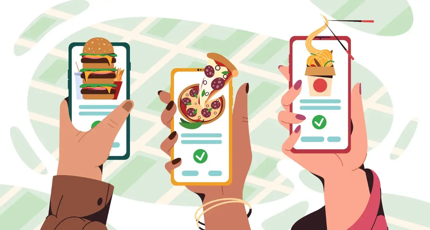
Your app lives or dies in those first few seconds. Users make snap decisions about whether to stay or leave based on feelings they can't even articulate. They might describe an app as "confusing" or "slow, " but often they're responding to something deeper. The way an interface makes them feel about themselves, their capabilities, and their control over the situation.
App development teams typically focus on functionality first, and understanding where most app builds go wrong often reveals that the emotional layer is what gets overlooked. Features get built, bugs get fixed, and performance gets optimised. These technical foundations matter enormously, but they only solve half the problem. The other half lives in the emotional layer of your product.
When someone opens your app, they bring their current mood, their stress levels, and their expectations with them. They're not just using your product in isolation. They're fitting it into their day, their goals, and their emotional state. Understanding this changes everything about how you build.
Users make snap decisions about apps based on feelings they can't even articulate.
We've worked with hundreds of apps across different industries, from healthcare to finance to entertainment. The patterns are consistent. Apps that succeed emotionally retain users longer, generate more engagement, and create genuine loyalty. The ones that ignore the emotional layer struggle with retention, regardless of how well they function technically.
Understanding User Psychology
People don't use apps in perfect conditions. They're distracted, stressed, multitasking, or dealing with emotions related to the task at hand. A banking app might catch someone worried about their finances. A healthcare app might serve someone anxious about symptoms. Even entertainment apps compete with whatever mood brought someone to seek distraction.
Psychological profiling happens naturally through behavioural data. How quickly someone moves through your app, where they pause, what they skip, and when they return all signal their emotional state. Someone dwelling on a screen might be confused or anxious. Someone rushing through might be confident or impatient. These patterns help you adapt your approach.
Reading Emotional Cues
Dwell time reveals more than technical metrics suggest. When users linger on a screen, they're often processing information emotionally rather than just reading it. They might be building confidence for a financial decision or working through anxiety about a health concern.
Return patterns tell stories too. Users who visit multiple times daily but complete different tasks each time show confidence and control. Users who struggle repeatedly with the same task signal friction or anxiety around that specific area.
Designing for Emotional States
Different emotional states require different design approaches. Anxious users need reassurance and clear next steps. Confident users want efficiency and control. Overwhelmed users benefit from progressive disclosure that reveals information gradually.
Visual consistency reduces cognitive load during stressful moments. When typography, spacing, and iconography remain predictable throughout your app, users spend less mental energy figuring out how things work. This frees up capacity for their actual task.
Use the same phrasing and tone across your entire product. Inconsistent language forces users to reinterpret your meaning in different sections.
Adapting to Context
High-stress situations reveal themselves through user behaviour. Comprehension drops significantly when people operate on an emotional rather than logical level. They might understand individual interface elements but lose track of the overall process they're completing.
During these moments, simplifying isn't always the answer. Hiding important information can increase anxiety. Instead, layer information thoughtfully so users can access the detail level that matches their current emotional needs.
UX/UI design built around real psychology
We design app interfaces around how people actually think and behave. User research, psychology-driven UX/UI design and technical specs delivered as one complete package.
Reducing Digital Anxiety
App abandonment follows predictable patterns tied to emotional responses. Within the first three to four seconds, technical issues like slow loading or crashes create immediate frustration. Users expect responsive interactions, and sluggish performance signals unreliability before they've even started.
The sixty to one hundred and twenty second window presents different challenges. Users evaluate whether your app understands their needs. Forced early registration feels invasive. Confusing onboarding suggests the app will always be difficult. Excessive permission requests without explanation create suspicion.
Transparency must present risks alongside benefits, not risks in isolation.
Beyond the first few minutes, anxiety creeps in through hidden costs, unclear value propositions, and resource drain. Apps that consume excessive storage or battery life feel parasitic. Users need to understand what they're getting in return for what they're giving up.
Ask for permissions with context. Explain why you need camera access or location data before requesting it, not after users have already declined.
Crafting Meaningful Micro-Interactions
Small interface animations and responses convey meaning beyond their obvious function.
These playful interactions serve practical purposes too. A button that responds to touch with subtle animation confirms the action registered. A form field that highlights differently when completed provides immediate feedback. Loading animations reduce perceived wait time by showing progress.
Building Emotional Connection
The right micro-interactions create personality without overwhelming functionality. A gentle bounce when completing a task feels celebratory. A smooth transition between screens maintains flow. Subtle sound effects can reinforce positive actions without becoming intrusive.
Timing matters enormously in micro-interactions. Animations that feel too slow frustrate efficient users. Animations that feel too fast can seem jarring or cheap. The sweet spot usually falls between 200 and 500 milliseconds for most interface responses.
Building Trust Through Transparency
Trust builds through consistent small actions rather than grand promises. When your app behaves predictably, explains its processes, and respects user control, people feel safer engaging more deeply with your product.
Transparency about risks proves critical, but risks need context. Presenting potential problems without explaining why the task remains worthwhile can backfire. People switch off when transparency becomes overwhelming rather than informative.
Show users exactly what data you collect and how you use it. Vague privacy policies create more suspicion than detailed explanations.
Giving Users Control
Asking for permission changes everything psychologically, even when the end result stays the same. Users who feel they control their experience engage more deeply and return more frequently. This applies to notifications, data sharing, feature introductions, and account setup processes.
The framing shift from "We will send you notifications" to "Would you like us to send you helpful updates?" costs nothing technically but dramatically improves user buy-in. People want to feel they're choosing their level of engagement.
Optimising the Emotional Journey
User journeys aren't just functional paths through your app. They're emotional experiences that should feel intentionally designed. Consider what emotional state someone brings to each screen and what state you want them to reach by the end.
The eulogy game provides useful perspective here. Imagine your app no longer exists twenty years from now. What would users say about how it made them feel? What lasting impression would it leave? This forward-looking exercise helps identify the emotional legacy you want to build from the start.
Progressive disclosure prevents overwhelming users while maintaining access to detailed information. Different users need different levels of complexity based on their expertise, emotional state, and current goals. Layer your interface so people can dive deeper when ready.
Map the emotional journey alongside the functional one. Identify where users might feel anxious, confused, or frustrated, then design specifically to address those moments.
- Start with reassurance during onboarding to build initial confidence
- Provide clear progress indicators during complex processes
- Celebrate completions with appropriate positive reinforcement
- Offer easy recovery options when things go wrong
- End interactions with clear next steps or natural stopping points
Conclusion
Successful app development balances technical excellence with emotional intelligence. Users abandon apps for poor design and weak emotional connections almost as frequently as they abandon them for bugs and slow performance. The gap between these numbers continues shrinking as technical baseline expectations rise.
Every interface decision carries emotional weight. The words you choose, the visual hierarchy you create, the timing of your animations, and the way you handle errors all contribute to how people feel about your product. These feelings determine whether users trust your app enough to return and engage deeply.
Building emotionally intelligent apps requires ongoing attention rather than one-time fixes. User emotional states change based on context, experience level, and external factors. Apps that adapt to these changing needs create stronger relationships with their users over time.
The most successful apps feel like they understand their users as people rather than just as sources of data. They respond appropriately to different emotional states, provide control and transparency, and create positive experiences even during difficult tasks.
Creating these emotional connections starts with understanding your users' psychology and designing specifically for their emotional needs. When you get this right, technical excellence and emotional design work together to create products people genuinely want to use. Let's talk about your app development project.
Frequently Asked Questions
Why do users abandon apps so quickly after downloading them?
Users make snap decisions within the first few seconds based on emotional responses they often can't articulate. They might describe an app as "confusing" or "slow," but they're actually responding to how the interface makes them feel about their own capabilities and control. These emotional reactions happen before users even fully evaluate the app's functionality.
How can app developers tell what emotional state their users are in?
Psychological profiling happens naturally through behavioural data such as how quickly users move through your app, where they pause, and what they skip. For example, users who dwell on screens might be confused or anxious, whilst those rushing through could be confident or impatient. Return patterns also reveal stories about user confidence and areas of friction.
What's the difference between technical functionality and emotional design in apps?
Technical functionality focuses on features, bug fixes, and performance optimisation - essentially making the app work properly. Emotional design addresses how users feel when using the app, considering their mood, stress levels, and expectations. Both are crucial, as apps need solid technical foundations but also must create positive emotional experiences to retain users.
How should app design differ for anxious versus confident users?
Anxious users need reassurance and clear next steps to feel secure whilst using your app. Confident users want efficiency and control over their experience. Overwhelmed users benefit from progressive disclosure that reveals information gradually rather than presenting everything at once.
Why does visual consistency matter for user emotions?
Visual consistency reduces cognitive load during stressful moments by making the interface predictable. When typography, spacing, and iconography remain consistent throughout your app, users spend less mental energy figuring out how things work. This frees up their mental capacity to focus on their actual task rather than learning your interface.
How do external factors affect how people use apps?
Users don't interact with apps in isolation - they bring their current mood, stress levels, and life circumstances with them. For instance, someone using a banking app might be worried about their finances, whilst someone using a healthcare app could be anxious about symptoms. Understanding this context is crucial for creating appropriate user experiences.
What behavioural patterns indicate user confidence versus struggle?
Users who visit multiple times daily but complete different tasks each time typically show confidence and control over the app. Conversely, users who struggle repeatedly with the same task signal friction or anxiety around that specific area. These patterns help developers identify where emotional design improvements are needed.
Do emotionally successful apps actually perform better in business terms?
Yes, apps that succeed emotionally consistently retain users longer, generate more engagement, and create genuine loyalty. In contrast, apps that ignore the emotional layer struggle with retention, regardless of how well they function technically. This pattern has been observed across hundreds of apps in various industries from healthcare to finance.
Related Articles
What Typography Choices Make Mobile Apps More Readable?
Typography in mobile apps isn't just about making text look pretty, it's about making sure people...
by Simon Lee

How do you handle data sync between wearables and phones?
Fitness trackers and phones often display conflicting data about the same workout, creating...
by Simon Lee