
Expert Guide Series
Why Beautiful Apps Fail: The UX Lessons Every Founder Needs
An app can look stunning in screenshots and fail completely when people actually use it. The design process optimised for portfolio pieces rather than real behaviour patterns. This creates a specific failure mode that catches even experienced teams off guard.
The problem occurs when visual design decisions override experience design principles. Teams invest heavily in making their app look impressive but underinvest in understanding how users actually navigate, learn, and form habits with digital products. The result is beautiful apps that get deleted.
Most apps lose the majority of users in the first session, regardless of visual polish.
Why beautiful apps fail comes down to a fundamental misunderstanding about what keeps users engaged. Visual appeal opens doors, but behavioural design keeps them open. When aesthetics take priority over usability, even the most polished interface becomes a barrier to the value users actually want.
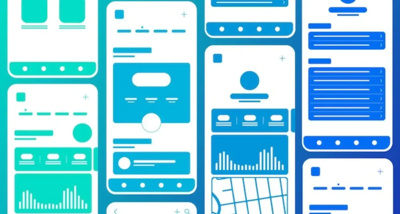
The difference between UI and UX
UI is what your app looks like in static mockups. UX is what it feels like when someone tries to complete a task at 8pm on a Tuesday while distracted. The distinction matters because one photographs well and the other determines whether people return.
User interface design focuses on visual elements, colour palettes, typography, and spacing. These elements create first impressions and establish brand perception. They influence whether users perceive your app as professional, premium, or competent within those critical first three seconds.
User experience design focuses on flow, cognitive load, and behaviour patterns. This includes how quickly users find key features, whether they understand what actions are available, and how the app responds to their mental model of how similar products should work.
Why beautiful app poor ux happens
The gap between UI and UX creates predictable failure patterns. Teams polish visual elements until they look perfect in design tools, then discover users struggle with basic tasks. Beautiful design can actually mask fundamental experience problems until it's too late to fix them without starting over.
Test your app's core flows with users who have never seen it before. If they struggle to complete basic tasks, visual polish will not save you.
Aesthetics that get in the way of usability
Certain design choices look impressive in portfolios but create friction for actual users. These aesthetic decisions often contradict established usability principles, forcing users to work harder to achieve their goals.
Low contrast text exemplifies this problem. Subtle grey text on white backgrounds looks sophisticated and minimal, but becomes difficult to read in poor lighting conditions or for users with visual impairments. The aesthetic choice actively prevents people from accessing your content.
Custom UI patterns present another common issue. Unique navigation styles or unconventional interaction patterns can look distinctive and branded, but they break the mental models users have developed from other apps. When button design principles prioritise visual uniqueness over recognition, completion rates drop.
The animation problem
Elaborate animations and transitions often delight first-time users but frustrate experienced ones. Motion that serves no functional purpose becomes a time tax on every interaction. Users who initially praised the polished feel eventually find these same animations slow and unnecessary.
UX/UI design built around real psychology
We design app interfaces around how people actually think and behave. User research, psychology-driven UX/UI design and technical specs delivered as one complete package.
The onboarding trap
Beautiful onboarding sequences frequently fail to actually onboard users. They look impressive during stakeholder presentations but do not create understanding or habits. The visual polish distracts from the fundamental job onboarding needs to do.
Feature tours that explain everything before users care about anything consistently produce poor retention.
Splash screens and intro animations delay users from reaching actual value. While these elements establish brand tone and visual identity, they also create barriers between users and the core functionality they downloaded the app to access. Time spent on branded loading screens is time not spent discovering whether your app solves their problem.
Tutorial screens that showcase every feature miss the psychological reality of learning. Users need context before they can absorb information about capabilities. Showing advanced features before users understand basic ones creates cognitive overload rather than confidence.
Design onboarding that gets users to their first success as quickly as possible, then introduce additional features when they are relevant to completing tasks.
When navigation prioritises elegance over clarity
Hidden navigation patterns create elegant, minimal interfaces that confuse first-time users. Gesture-only interactions and icon-only menus look clean but remove the visual cues people need to understand available actions.
Hamburger menus exemplify this problem. While they create clean header designs, they hide important navigation options behind an additional tap. Users must remember what options exist rather than scanning visible choices. The cognitive load increases with every hidden interaction.
Custom iconography compounds navigation problems. Icons designed for brand consistency rather than recognition force users to learn a new visual language. When icons look artistic but convey no meaning, users resort to trial-and-error navigation.
Platform conventions exist because they reduce learning curves. Following the core UX design principles for apps means prioritising familiar patterns over visual distinctiveness, so users spend mental energy on their actual goals rather than interface mechanics.
Use standard platform navigation patterns as your starting point, then customise only the visual styling rather than the interaction model.
The first session problem
First session abandonment reveals the gap between aesthetic appeal and functional value. Users might install an app because screenshots look promising, but they delete it if the first experience feels confusing or slow.
Time to first value determines retention more than visual design quality. Users form judgements about an app's usefulness within minutes of opening it. If core functionality feels buried behind beautiful but unnecessary interface elements, users assume the app will not meet their needs.
Cognitive load in those first few minutes compounds the problem. When users must decode custom interface patterns, navigate unclear information hierarchies, or wait through polished animations, they invest mental energy without receiving value. This creates negative associations with the entire experience.
Why good looking apps get deleted often comes down to the mismatch between marketing promises and actual experience. Beautiful app store screenshots set expectations that the interface design cannot fulfil when measured against practical task completion.
- Loading times that prioritise visual effects over speed
- Complex signup processes that look sophisticated but feel tedious
- Information architecture optimised for visual balance rather than user goals
- Feature discovery that requires exploration rather than providing clear pathways
How to test whether your design is working or just looking good
Separating aesthetic approval from actual usability requires observing user behaviour rather than collecting opinions. Users often praise visual design while struggling with basic functionality, creating misleading feedback about your app's effectiveness.
Watch users navigate without guidance during initial sessions. Time how long it takes them to find key features or complete primary tasks. If users hesitate, backtrack, or express confusion despite saying the app looks great, your visual design may be interfering with usability.
Measure abandonment points during critical flows. When users consistently drop off at specific screens, examine whether design choices create unnecessary friction. Beautiful interfaces should guide users forward, not create decision paralysis.
Behaviour over opinions
Progressive disclosure techniques can reveal whether your information hierarchy serves users or aesthetics. If users cannot find important features without extensive searching, your clean design may be hiding critical functionality.
Micro-interactions provide another testing opportunity. Observe whether users notice and respond to subtle interface feedback, or whether they seem disconnected from the system's responses to their actions.
Track task completion rates and times for key user flows, then compare these metrics before and after design changes to measure actual impact on usability.
Conclusion
Beautiful apps fail when teams optimise for visual impact rather than user success. The most polished interface becomes a barrier when it prioritises aesthetic goals over behavioural reality. Visual design should support user flows, not obstruct them.
Why apps fail ux comes down to misunderstanding the relationship between appearance and function. Users judge visual design within seconds, but they judge utility over weeks of repeated use. Long-term engagement depends on how well the app fits into users' mental models and task flows.
Successful apps start with understanding user psychology and behaviour patterns, then apply visual design that reinforces rather than contradicts these insights. Engaging your audience requires designing experiences around how people actually think and behave, not how they should behave.
The foundation of effective app design lies in research-driven decisions about interaction patterns, information architecture, and user flows. Visual polish becomes powerful when it serves behavioural goals rather than replacing them. Experience design that understands human psychology creates apps that work as well as they look.
Before investing in visual refinement, invest in understanding how your users actually navigate, learn, and form habits with your product. Let's talk about your app's user experience.
Frequently Asked Questions
What's the main difference between UI and UX design?
UI design focuses on how your app looks in static mockups - the visual elements, colours, and typography that create first impressions. UX design focuses on how it actually feels to use when someone's trying to complete a task whilst distracted, including flow, cognitive load, and whether users can easily find key features.
Why do beautiful apps often fail despite looking polished?
Beautiful apps fail when visual design decisions override user experience principles, creating barriers to the value users actually want. Teams invest heavily in making apps look impressive but underinvest in understanding how users actually navigate and form habits with digital products. Most apps lose the majority of users in the first session, regardless of visual polish.
How can aesthetic choices actually harm usability?
Certain design choices that look sophisticated can create friction for users, such as low contrast text that's difficult to read in poor lighting. Custom UI patterns might look distinctive but break users' mental models developed from other apps, forcing them to work harder to achieve their goals.
What's wrong with elaborate animations in apps?
Whilst elaborate animations often delight first-time users, they tend to frustrate experienced ones over time. Motion that serves no functional purpose becomes a time tax on every interaction, with users eventually finding these polished animations slow and unnecessary.
How can I tell if my app prioritises looks over usability?
Test your app's core flows with users who have never seen it before - if they struggle to complete basic tasks, visual polish won't save you. The key warning sign is when teams polish visual elements until they look perfect in design tools, then discover users struggle with fundamental functionality.
What should founders focus on instead of just visual appeal?
Founders should focus on behavioural design alongside visual appeal, as aesthetics open doors but usability keeps them open. This means understanding how users actually navigate, learn, and form habits with your product, rather than optimising the design process for portfolio pieces.
Why do beautiful onboarding sequences often fail?
Beautiful onboarding sequences frequently fail because they prioritise looking impressive over actually helping users understand how to use the app effectively. They may look polished but don't successfully guide users through the key actions they need to take to get value from the product.
When does visual design become a barrier rather than a benefit?
Visual design becomes a barrier when it masks fundamental experience problems or forces users to work against established interaction patterns. This happens when teams focus on making apps photograph well rather than ensuring they work intuitively for real-world usage scenarios.
Related Articles

How Do I Turn User Frustration Into Valuable App Insights?
Your app has thousands of downloads, decent ratings, and yet something feels off. Users install it,...
by Simon Lee
How Should I Structure Navigation for Complex Mobile Apps?
A homeowner opens a plumbing service app looking for emergency repair—but gets lost trying to find...
by Simon Lee