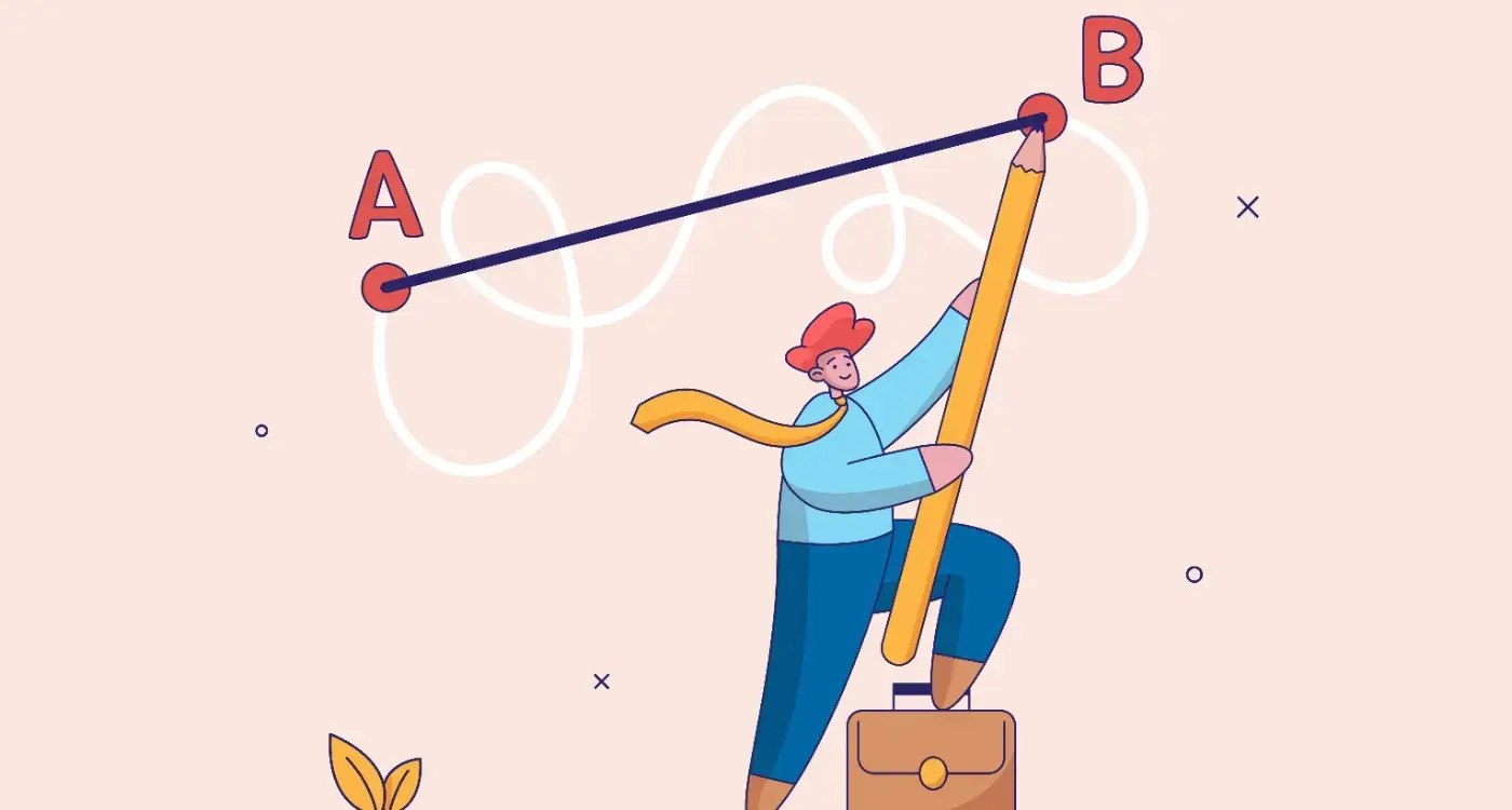
An audit that measures how your app feels, not just whether it works.
Downloads are a marketing metric. Retention is an experience metric. When users leave and do not come back, the answer is rarely in the data. It is in the feeling the product created.
A Feel Factor audit, scored across five emotional dimensions, with recommendations across UX, UI, and technology.
WAA’s app experience audit assesses every core flow and interaction across five emotional dimensions. The findings do not stop at identifying what is wrong. They identify whether the fix sits in the UX, the UI, or the underlying technology, and what to prioritise to move the retention needle first.
It is a UX audit in the sense that UX is one of the streams the report produces. But the framing is different. A standard UX review asks whether an app works. We ask how it feels, and we trace each emotional finding to its root cause, wherever that root cause lives in the product.

Retention is an emotional problem dressed up as a data problem.
There is a gap between an app that works and an app that gets opened again tomorrow. Plenty of products clear the first bar and fail at the second. Users complete the flow, log in successfully, see the screen the designer intended, and still do not come back. The product is usable. It is not returnable.
Users almost never articulate that gap in UX terms. They do not say “the information architecture is flawed” or “the onboarding has three friction points”. They say “it’s confusing”. They say “it feels slow”. They say “I don’t trust it”. Those are emotional descriptions. They are also the descriptions that end up in App Store reviews and in the messages that get sent to friends when an app is being recommended, or quietly not recommended.
Retention curves are emotional signatures. The point at which users drop off corresponds directly to the point at which the emotional experience broke down. A cliff at day three is rarely about a feature. It is about a feeling, a frustration, a small breach of trust, a moment of confusion the product never recovered from.
Fixing retention requires diagnosing the emotional failure underneath the functional one. Analytics will show you where users left. They will not tell you why those users felt what they felt at the moment they left. That is what an emotional audit is for, and that is the question this engagement is built to answer.


The Feel Factor®: five emotional dimensions that decide whether your app gets opened again.
The Feel Factor® is our proprietary framework for measuring emotional experience inside a product. Every screen and interaction is assessed against the five dimensions below. Each one shapes a different part of the retention picture, and each one shows up differently in the data when it fails.
Does the app earn confidence from the first interaction? Trust shapes whether users complete onboarding, share personal data, and make purchases. It is built through visual consistency, transparent data handling, and the absence of patterns that feel manipulative. An app that does not earn trust early loses users before they have experienced its value.
Are there moments in the product that exceed expectation? Delight drives repeat use and word of mouth. It is the product of small, considered details, micro-interactions, responsive feedback, moments of personality, that make an app feel crafted rather than assembled. Delight is rare because most products are designed to function, not to surprise.
Where does the product create uncertainty, hesitation, or stress? Anxiety appears in unclear calls to action, ambiguous error states, destructive actions without confirmation, and forms that ask for more than users feel comfortable sharing at that point in the relationship. Most products generate anxiety in their users without ever knowing it.
Where does the product fail to communicate clearly? Navigation that requires learning, labels that assume familiarity, and flows that contradict user mental models all create confusion. Confusion is the single largest driver of abandonment in the first two weeks of use. It is also the most fixable, and the most frequently overlooked.
Does the user feel good about using this product? Pride, the sense that this app reflects well on the person using it, or that it has delivered genuine value, is what drives loyalty and advocacy. Most products never design for it. The ones that do become habitual.
Want to know how your app scores across all five dimensions?
An audit starts with a short conversation about the product and the problem. We scope it from there.


One audit. Three recommendation streams. UX, UI, and technology.
This is what separates the Feel Factor audit from a standard UX review. Emotional experience is shaped by all three layers of a product, so the findings span all three. Each finding is traced to where the fix actually sits, and assigned to its stream.
UX recommendations
Findings that relate to flows, information architecture, navigation, onboarding, and interaction logic. Where anxiety and confusion are produced by how the product is structured, the fix is UX. These recommendations address the decisions that shape how users move through the product.
UI recommendations
Findings that relate to visual design, hierarchy, typography, colour, motion, and component behaviour. Where trust is undermined by inconsistency, or delight is absent because the interface lacks personality, the fix is UI. These recommendations address the surface the user actually sees and responds to emotionally.
Technical recommendations
Findings that relate to performance, load times, error handling, notification design, and data handling transparency. Where anxiety is produced by slow responses, confusing error messages, or unclear data requests, the fix is often technical. These recommendations address the parts of the experience that no design change can resolve.


How the audit works.
Four stages, run as a single engagement. The work begins inside the product itself, not with a survey or a kickoff slide deck.
Product immersion and data review
WAA spends time inside the product, every core flow, every edge case, every error state. Where analytics are available, we incorporate them. Session recordings, user feedback, and App Store reviews are all read and contextualised. The audit begins with genuine understanding before any assessment is made.
Feel Factor assessment
Every screen and interaction is assessed across the five dimensions. WAA produces a scored picture of where the product performs well emotionally and where it does not, with specific evidence and annotated screenshots for each finding.
Recommendation prioritisation
Not all findings carry equal weight. WAA distinguishes between the changes that will move retention and engagement immediately, the changes that build long-term loyalty, and the refinements that improve craft. Each recommendation is assigned to its appropriate stream, UX, UI, or technical.
Presentation and handoff
The report is presented in a working session, not sent as a PDF. Findings are walked through, questions answered, and next steps agreed. Where the audit leads to a WAA redesign engagement, the findings feed directly into the brief.


What you get.
A full Feel Factor report plus prioritised recommendation sets across all three streams. Not a deck of opinions. An evidence-based plan for where to spend the next round of build budget.

The trigger points where an app experience audit is the right first step.
Not sure if an audit is the right first step?
A short call is usually enough to work out whether a Feel Factor audit is what you need, or whether something else makes more sense first.


Frequently asked questions.
How is this different from a standard UX audit?
A standard UX audit identifies functional and usability problems. The Feel Factor audit measures emotional experience and traces each finding to its root, UX, UI, or technical. The output is a prioritised improvement plan across all three, not a list of usability issues.
How long does the audit take?
Typically two to three weeks for a mid-complexity product. WAA scopes each engagement individually and provides a clear timeline before starting.
Do you need access to our analytics?
Preferred but not required. Analytics help contextualise emotional findings, confirming where drop-off corresponds to a specific experience failure. WAA can conduct the assessment without them, though the findings will carry more certainty with data to support them.
Can the audit lead into a redesign?
Yes, and it often does. Audit findings feed directly into WAA’s UX, UI, and architecture engagements. Clients who commission an audit first begin any subsequent design work with a clear, evidence-based understanding of what needs to change. You can read more about the follow-on engagements in App UX Design and App UI Design.
Ready to find out how your app really feels to the people using it?
Three ways to start the conversation. Pick the one that suits where you are.
Tell us about your app.
Share the product, the problem you’re seeing, and what you’ve already tried. We’ll come back with a view on whether an audit is the right first step and what it would cover.
Send project details →Book a discovery call.
Thirty minutes with Simon to talk through where the product is, where it’s struggling, and what would actually help. No prep needed.
Book a call →See pricing.
A clear view of how WAA engagements are scoped and priced, including the App Experience Audit and the design work it commonly leads into.
See pricing →