The visual layer is where users decide whether to trust your product.
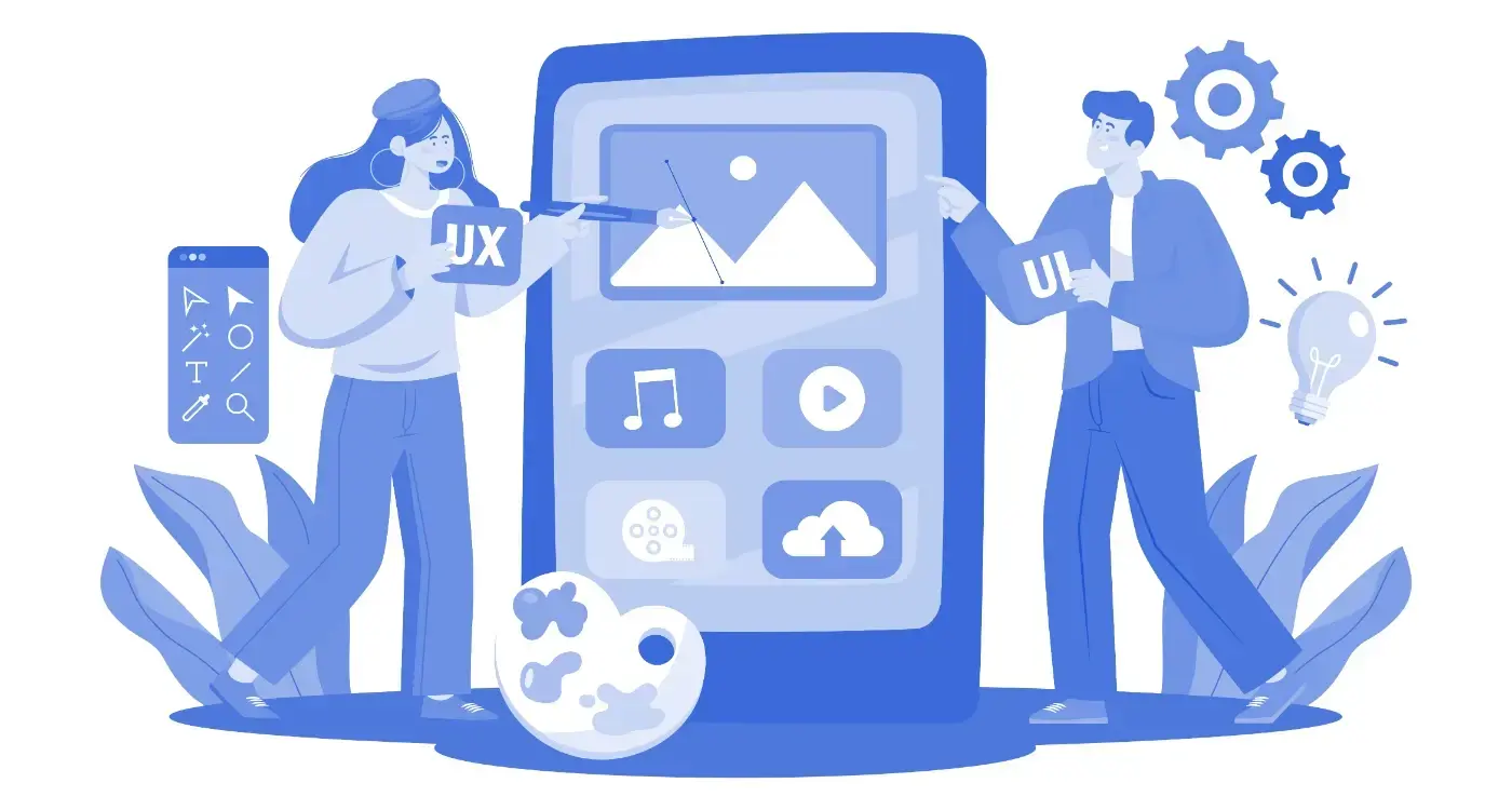
We design app interfaces that sit on top of thoroughly considered UX foundations. The visual layer feels coherent because the thinking underneath it is. UI is where a product acquires its personality, and where users form the judgement that decides whether they come back.
What is app UI design?
UI design is the visual and interactive surface of a product. It is the layer users actually see, touch, and judge the product by. Where UX defines the structure, the flows, the information architecture, and the logic of how a product works, UI is the surface that turns that structure into something a person can use and feel something about.
The two are often spoken about as one thing. They are not. UX is the floor plan of a building. UI is the materials, the light, the proportions of the rooms, and the way the front door feels when you push it open. A building can have a thoughtful floor plan and still feel cold. It can have beautiful finishes and still be impossible to navigate. The work of UI design begins where UX work ends, and the quality of one is bounded by the quality of the other. You can read more about how we approach that underlying structure on our App UX Design page.
App UI design covers colour systems, typography, layout and spacing, iconography, components, states, and motion. It covers what the product looks like in light mode and dark mode, on small screens and large ones, in the first second a user opens it and in the thousandth. It defines the visual rhythm that holds a product together across hundreds of screens.
App UI design is different from web UI design. Touch targets, gesture conventions, platform patterns, system fonts, dynamic type, safe areas, and the simple fact that a phone is held in one hand at arm’s length all shape what works and what doesn’t. The web does not have these constraints. A web designer working on an app for the first time will often produce work that looks correct in Figma and feels wrong on a device.
The difference between generic UI and considered interface design is not taste. It is whether every decision has a reason behind it that the team can articulate. Why this colour, why this corner radius, why this spacing, why this animation curve. Generic UI is what happens when those questions go unasked.


What makes app interface design work?
Effective mobile interface design is the sum of six things working together. Each one is a discipline in its own right. Each one can quietly undermine the product when it is not properly considered.

How we approach app UI design.
The process is sequential and deliberate. Every step builds on the one before it. Nothing is done in parallel that should be done in order, and nothing is left to be figured out in handoff.
Building on UX foundations
Our UI design begins where UX ends. The visual layer is applied to a tested, approved information architecture and set of user flows. The sequence matters. UI applied to poor UX is expensive to reverse. UI applied to solid UX compounds the investment.
Visual design and brand expression
We design interfaces that express a product’s character while serving its users. Colour systems, typography scales, iconography, and imagery guidelines, all developed as a coherent system rather than a collection of individual decisions made screen by screen.
Design systems and component libraries
Every Our UI engagement produces a design system. A set of reusable components, documented and consistent, that development teams can build from and future design iterations can extend. This is what makes handoff reliable and updates coherent six months and two years from launch.
Accessibility and inclusive design
Contrast ratios, touch target sizes, screen reader compatibility, and motion sensitivity. Accessibility is built into the design process from the first decision, not bolted on at the end as a compliance pass. It is standard practice with us, not a badge to display.
Development-ready handoff
Figma files with correct naming conventions, spacing tokens, component documentation, and motion specifications. Developers receive a specification they can build from rather than a visual reference they have to interpret. The fewer judgement calls passed to the build team, the closer the built product matches the designed one.
Considered every decision
Why this corner radius. Why this colour at this opacity. Why this transition curve. Every choice in one of our design files can be explained and defended because the thinking has been done properly before the file was made. Read about how this prevents design ageing badly and why small details like rounded corners change how a product feels.
Want to see our design work?
The case studies show the process in practice, including how each stage of the work produced the final product.
Deliverables, defined precisely.
A UI engagement with us produces a specific set of outputs. Each is defined before work begins, so there is no ambiguity at handoff about what has been delivered and what has not.
Ready to talk about your app?
If the deliverables match what your project needs, a short conversation is the right next step.


Where UI design goes wrong.
These are the five mistakes we see most often when we audit existing app designs. Each one is correctable. Most are easier to prevent than to fix.
Following trends without understanding their purpose
A trend exists because it solved a problem for the product that pioneered it. Applied to a different product with a different problem, the same trend will often quietly undermine the work. Glassmorphism, brutalism, neumorphism, every visual movement has its place. None of them are a default.
Designing without a system
Screens designed one by one without a shared system look subtly inconsistent across the product, even when each screen is well crafted on its own. Users feel the inconsistency before they can name it. A design system is the only way to prevent it.
Sacrificing legibility for aesthetics
Thin grey type on a white background photographs beautifully and reads terribly on a phone in daylight. The number of products that get this wrong, and the number of users who quietly give up on them, are both larger than they should be.
Not designing for dark mode or different screen sizes
A design that only works in light mode on a single screen size is half a design. Users expect dark mode. Users have phones of every size. Designing for the full range is the work, not an extension of the work.
Treating accessibility as an afterthought
Accessibility added at the end produces small fixes that compromise the design. Accessibility designed in from the beginning produces a better product for everyone. The choice is made at the start, even when the consequences only show up at the end.


Frequently asked questions.
Do I need both UX and UI design?
Yes. UX defines how the product works. UI defines how it looks and feels. A product with strong UX and weak UI feels untrustworthy. A product with strong UI and weak UX is beautiful and unusable. The two are sequential, with UX first, and they are both required to ship a product that users will actually keep. You can read more about the structural layer on our App UX Design page.
What design tools do you use?
Figma. It is the industry standard for app interface design, and it supports the kind of design systems, component libraries, and handoff documentation that we produce. For your development team it means they can inspect specifications, copy spacing tokens, and pull assets directly without a separate handoff tool.
Can you work with an existing brand identity?
Yes. Most engagements involve an existing brand. We adapt brand guidelines to an app context, which often involves resolving questions the original brand work did not need to answer, such as how the palette behaves in dark mode, how the typography scales at 12 points on a phone, and how brand assets translate to small interactive elements. The brand stays recognisable. It also starts to work properly inside a product.
How much does app UI design cost?
UI design cost depends on the scope of the product, the number of flows, the complexity of the design system, and whether the engagement includes existing brand adaptation. For a full picture of how this fits into the wider build, read more in How Much Does It Cost to Build an App?
Three ways to take the next step.
Pick the one that matches where you are. If you are not sure, the discovery call is the right place to start.
Send your project details.
Tell us about the product, where you are in the process, and what you are trying to design. We will read it properly and come back with a considered response, not a templated reply.
Send project details →Book a discovery call.
Thirty minutes to talk through the product, the brief, and what UI design needs to do for it. If an engagement with us is the right next step we will tell you. If it isn’t, we’ll tell you that too.
Book a call →See pricing.
The shape of an engagement with us and what it costs at each scope. Read this first if you want to know whether the budget you have is the budget the work needs.
See pricing →