
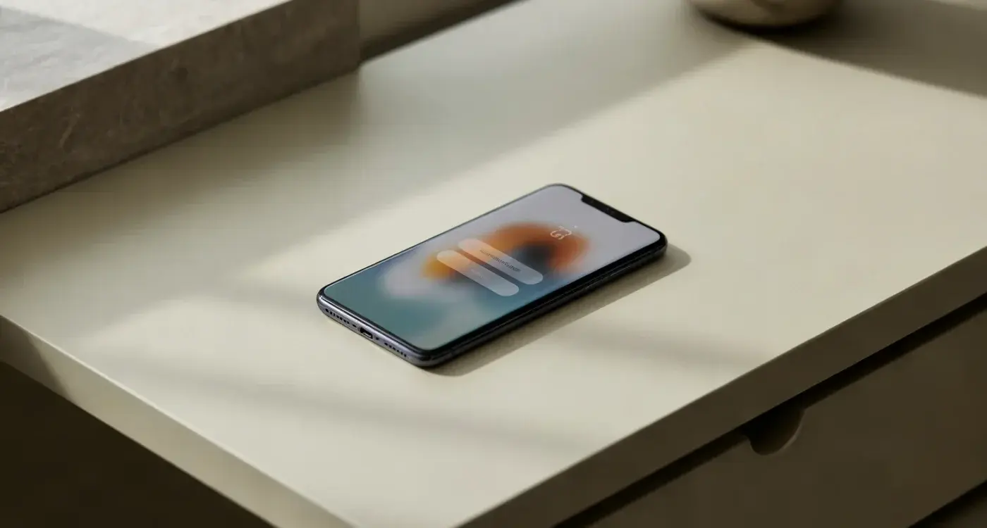
Expert Guide Series
What Is Liquid Glass UI and Should Your App Use It?
Apple shipped Liquid Glass across iPhone, iPad, Mac and Watch in 2025, and the whole system now behaves like it's been poured onto a wet pane. Controls float above your content. Tab bars shrink as you scroll and swell back when you stop. Panels pick up the colour of whatever sits underneath them and bend it slightly at the edges. Liquid Glass UI is the biggest change to Apple's visual language since 2013, when iOS 7 stripped out every leather stitch and linen texture in a single release.
A surface treatment can change how honest a price looks, which makes it a product decision.
Within days of a keynote like that, the same question lands on a lot of desks. Should our app look like that too?
The honest answer depends on what your app asks people to do, and how they feel while they're doing it. A recipe app and a booking flow carrying someone's card details are not the same problem wearing different paint. So this piece covers what the effect actually is, what it costs you in contrast, accessibility and frame rate, and how to try it without putting the product at risk. Along the way there are projects of ours where a surface decision changed how people felt about money, and one where the surface was never the thing holding the product back.
What Liquid Glass UI Actually Is
Liquid Glass is a rendering layer rather than a colour palette. The system takes whatever is behind a control, blurs it, bends it a little at the edges the way thick glass bends light, then adds a bright rim and a soft shadow so the control reads as a separate object sitting above the page. As you scroll, the glass keeps sampling what passes underneath, so its tint shifts in real time.
Liquid Glass UI in plain terms
Think of a sheet of frosted plastic laid over a magazine. You can tell something colourful is under there. You can't read it. Move the sheet and the colours underneath change, so the sheet changes too. That's the effect, running sixty or a hundred and twenty times a second on a phone.
Apple ships it in a few thicknesses. A heavier material hides most of what's behind it and keeps text legible. A clearer one lets more through and looks better over photography, with more risk attached. Elements also morph, so a button stretches into a menu rather than a new panel appearing from nowhere. That morph is the part doing real communication, because it shows people where the new thing came from, and it is one of the more consequential decisions in app UI design.
Why Apple Changed Its Interface Language
Three things pushed it. Apple now designs for a headset as well as a watch, and in Vision Pro the interface genuinely floats over the room, so translucency there describes something true about the hardware. Carrying that material down to the phone gives every platform one family resemblance. A designer learns it once.
Then there's the hardware itself. Screen corners are rounded, bezels have shrunk to almost nothing, and the old rectangular chrome sat awkwardly against that curve. Rounded, floating controls match the physical shape of the thing in your hand.
The third reason is content. Apple wants the photo, the article or the video to fill the screen while the controls recede into it. Glass lets chrome sit on top without a solid bar eating thirty points of height.
None of that reasoning transfers automatically. Apple designs an operating system people use for hours, where the chrome is background furniture. A beauty brand's app gets ninety seconds of attention and needs to say what it is, what it costs and what happens next. Same material, very different job, and the gap between those two jobs is where most adoption decisions go wrong.
UX/UI design built around real psychology
We design app interfaces around how people actually think and behave. User research, psychology-driven UX/UI design and technical specs delivered as one complete package.
Glassmorphism, Neumorphism and the Rest of the Family
Liquid Glass has relatives, and knowing which one you're actually asking for saves a lot of argument in a design review. Glassmorphism, the frosted-card look that spread across dashboards and crypto sites from about 2020, is the closest cousin. It's static, though. The blur is baked in and doesn't respond to motion underneath. Neumorphism is a different animal, soft shadows pressing shapes into a single flat colour, and it failed on contrast almost everywhere it was tried.
Borrowing a look from a product that works in a different scenario doesn't make it work in yours.
Here's how the family compares on the things that matter in practice.
| Style | What it does | Main risk |
|---|---|---|
| Skeuomorphism | Mimics real materials | Dates fast, heavy assets |
| Flat design | Removes depth cues | Tap targets stop looking tappable |
| Glassmorphism | Static frosted panels | Text contrast over photos |
| Neumorphism | Soft embossed shapes | Fails contrast almost always |
| Liquid Glass | Live blur, refraction, morphing | Contrast plus GPU cost |
The liquid glass design trend is the first of these with motion built in, which is why it reads as more alive and why it costs more to run.
What Glass Does to Readability and Contrast
A solid button has one contrast ratio. You measure it once and you're done. A glass button has a different ratio against every pixel that scrolls behind it, so your white label sits at a comfortable eleven to one over a dark jumper and then drops to three to one as a pale sky slides underneath. The text didn't change. The conditions did.
W3C's WCAG 2.1 sets 4.5:1 as the minimum for body text at Level AA, and that's a floor rather than a target. Hitting it reliably on a translucent surface means either a thicker material, a scrim behind the type, or a rule that the content underneath is never user-supplied imagery.
There's a deeper version of this problem. On a meditation app project, we found the design assumed every person arriving was calm, rational and relaxed. A large number of them were anxious, which is why they'd opened a meditation app at all. We flagged it as designing for the ideal user rather than the actual one who turns up. Glass invites the same mistake. It assumes good light, a steady hand, young eyes and a moment of patience.
Accessibility: The Settings Most Teams Forget
Apple gives people a way out of the effect, and a surprising number of them use it. If your design only works with the defaults on, you've built for a subset of your audience and you won't see the rest complain. They'll just leave.
Turn these on and run your whole flow before you ship anything glass.
- Reduce Transparency, which swaps the blur for a solid fill
- Increase Contrast, which darkens borders and flattens subtle tints
- Reduce Motion, which cuts the morphing and parallax
- Bold Text, which changes every label's footprint
- Dynamic Type at the largest accessibility sizes
Each of those produces a different layout. With Reduce Transparency on, a design built around floating panels often collapses into grey rectangles with no hierarchy left, because the depth was carrying the hierarchy. That's the tell. If removing the glass removes the structure, the structure was never there.
Design the solid-fill version first and treat the glass as the variation. It's much faster than retrofitting a fallback after sign-off, and you'll find the hierarchy problems while they're still cheap to fix.
The Performance Cost on Real Devices
Every frame of live blur is work for the GPU. One panel is cheap. Three stacked panels over a scrolling video, each sampling the layer beneath it, start costing real milliseconds, and milliseconds are what a smooth scroll is made of. On a current flagship you'll never notice. On a four-year-old handset with a warm battery, you will.
What people do with a stutter is the part that matters. In the first thirty seconds with a product, there's a lot going through someone's mind at once, consciously and subconsciously. They're judging whether this is a quality, trustworthy thing, or something put together hastily. A juddering scroll answers that question before a single word of your copy gets read, and it answers it badly.
So the cost isn't really frames per second. It's the impression of cheapness attached to an effect you added to look expensive.
Test on the oldest device in your support matrix, outdoors, at fifty percent screen brightness, with the battery under thirty percent. That's the condition your effect has to survive, and the office Wi-Fi and a desk lamp hide all of it.
What Happens to Trust When Information Gets Softer
Glass makes information feel lighter, and light is the wrong register for anything financial. On a travel booking product we worked on, we decided to wrap the platform's Stripe booking fee into the total price. The logic seemed sound, because travellers want one clean number. What we found was the opposite. People expected a platform fee as its own line, because that's how they understand apps working, and hiding it created a fear that something extra was waiting further down the flow.
We broke every fee out instead. More numbers on the screen, more confidence in the total, which is the reverse of what a simplification instinct predicts.
In a usability test nobody is actually paying, so the answer you get back is calmer than the truth.
That's the trap with testing glass on a checkout. Participants assess the screen functionally because no money is leaving their account. Live analytics tell a different story, where something that looked fine in a session erodes trust just enough for someone to bail out. A price rendered on a soft, moving, semi-transparent panel is exactly the kind of detail that behaves one way in a room and another way at the moment of commitment.
Glass on Small Screens and Wearables
On a watch face you get a glance of maybe two seconds, often while walking, often outside. Translucency costs you some of that glance, because the eye has to separate the label from the moving texture behind it before it can read anything. Apple handles this by using heavier materials at small sizes and keeping the critical numbers on near-solid backing, which is the right instinct to copy.
Where glass earns its place
Navigation chrome, media controls, sheets that slide over a photo, anything where the thing underneath is the content and the control is temporary. Here the transparency communicates something real, which is that the layer you're looking at is on top and will go away.
Where it doesn't earn its place is a widget showing one number, a small-screen form, a list of prices, or a notification someone reads at arm's length. Those need edges and a flat background.
Fitness and activewear apps run straight into this, because the use case is sweat, movement and sunlight. A jewellery brand's lookbook app is a far kinder environment for glass, and the same component behaves completely differently across the two.
When Visual Polish Hides a Journey Problem
On a concierge app we worked on, the product started life as a building directory with a maintenance logger attached. It was tidy. The flows made sense. Our focus groups told us something the flows couldn't fix, which was that residents didn't want a directory at all. They wanted to know their neighbours.
So we rebuilt the product around a social feed. Residents post, ask neighbours for help, and follow updates from the concierge team and local charities. Building management stayed in as a secondary layer underneath. The product went from a utility to a social network, and no surface treatment on earth would have got it there.
This is the question worth asking before any visual refresh. If your retention problem is on day three, glass won't touch it. If people abandon on the second screen of a sign-up, that's a question of what you're asking for and why, and the material behind the form fields is irrelevant.
Polish makes a good journey feel better. Applied to a weak one, it produces an app people describe as nice-looking and never open again, which is a more expensive outcome than looking dated.
Is This a Trend Decision or a Founder's Preference?
We've watched the same pattern play out twice, on a fitness and wellness app and on a grassroots football product. In both, the founder held a strong personal conviction about what the product should be, usually because it solved a problem they'd lived. In both, the data coming out of research, focus groups and surveys got set aside when it disagreed. What you end up with is a vanity product, shaped by preference rather than evidence.
The warning signs looked the same across both.
- An urge to perfect the product before anyone outside the team sees it
- Sign-offs rolled back to request another round of changes
- Decisions that stretch out for weeks with no new information arriving
We flagged the trajectory early on both projects. Both spent their budgets in design and build and never reached a full live version.
Adopting the liquid glass design trend because a keynote made it look good is the same mechanism in a smaller frame. The test is simple enough. Ask what evidence you have that your users want this, and if the answer is that it looks current, you've answered a question about taste rather than about the product.
A Decision Framework for Your App
Start from what your app is for, then work out whether a translucent material helps or fights it. These are the questions worth putting to a team before any component gets built.
- Does the content underneath belong to you, or do users supply the photos?
- Is money, health data or a legal commitment on any of these screens?
- What's the oldest device a meaningful slice of your audience is holding?
- Where are people physically when they open this, and in what light?
- If you turn Reduce Transparency on, does the hierarchy survive?
Contrast carries more weight here than the palette debate it usually loses to. Build Grow Scale puts the contrast effect at 3.2 times the impact of the specific colour chosen, which is their own figure rather than a published study, so treat it as a direction of travel.
Glass is a material decision on every screen, so it needs a rule, not a mood.
Write the rule down. Something like "glass on navigation and sheets, solid on anything with a price, never over user photography" gives a whole team a decision they can apply without asking.
How to Adopt It Without Betting the Product
You don't need a redesign to find out whether this works for your audience. Run it as a sequence and stop the moment the evidence turns.
- Pick one surface, usually the tab bar or a single sheet.
- Build the solid fallback at the same time, not afterwards.
- Check every state with the accessibility settings switched on.
- Profile it on your oldest supported device while scrolling real content.
- Ship it to a slice of users and watch the money screens in your analytics.
- Keep it, widen it, or roll it back on what the numbers say rather than what the team prefers.
Consistency does more for the experience than the effect itself. Clear typography, accurate spacing between screens, the same iconography and the same phrasing throughout all reduce how hard people have to think. A product where half the controls are glass and half aren't feels unfinished in a way that's hard for users to name and easy for them to act on.
Keep a kill switch. Put the glass behind a remote config flag so you can turn it off for everyone in minutes rather than waiting on an app store review.
Conclusion
Liquid Glass UI is a well-made material with a narrow brief. Apple built it for an operating system where chrome should disappear behind content, across hardware with curved edges and a headset that genuinely floats things in a room. Some of that reasoning fits a lifestyle app and some of it doesn't, and the only way to know which is to look at your own screens, your own users and the moments where they're deciding whether to trust you.
What we keep coming back to is the travel booking lesson. We hid a fee to make a total look cleaner and made people trust it less, then showed more and got more confidence back. Surfaces carry meaning people read without noticing. Softer edges and more transparency say relaxed, open, low-stakes, which suits a hotel's gallery and works against a basket page.
So use it where it describes something true about the layer it's on. Keep it off anything carrying a number people care about. Build the solid version first, test with the accessibility settings on, and let live behaviour decide rather than a keynote.
If you're weighing this up for your own product and want a second opinion grounded in how people actually feel using it, let's talk about your app's interface.
Frequently Asked Questions
What is Liquid Glass UI in simple terms?
It's a rendering layer rather than a colour palette. The system blurs whatever sits behind a control, bends it slightly at the edges the way thick glass bends light, then adds a bright rim and soft shadow so the control reads as a separate object floating above the page. As you scroll, it keeps sampling what passes underneath, so the tint shifts in real time.
Why did Apple change its visual language in 2025?
Three forces pushed it. Apple now designs for a headset as well as a watch, and translucency genuinely describes how Vision Pro interfaces float over a room, so carrying that material down to the phone gives every platform one family resemblance. Rounded hardware with almost no bezel also suits floating controls better than rectangular chrome, and glass lets photos and video fill the screen without a solid bar eating height.
Should every app adopt Liquid Glass straight away?
No. The right answer depends on what your app asks people to do and how they feel while doing it. A recipe app and a booking flow carrying someone's card details are not the same problem wearing different paint, so the decision is a product one, not just a visual refresh.
What are the main costs of using the effect?
The three to watch are contrast, accessibility and frame rate. Clearer materials let more of the background through, which looks good over photography but puts legibility at risk, and continuous real-time sampling is work the device has to do sixty or a hundred and twenty times a second.
Which material thickness should we choose?
Apple ships the effect in several thicknesses, and the heavier materials hide most of what sits behind them and keep text legible. Reserve the clearer variants for places where legibility is not doing critical work, such as decorative chrome over imagery. Anywhere a price, a total or a confirmation appears, favour the heavier option.
Why does the article say a surface treatment can affect how honest a price looks?
Because translucency changes the perceived weight and clarity of the information sitting on it. If a price or a fee appears on a surface that shifts tint as the user scrolls, it can read as less definite than the same number on a solid panel. That is a trust issue, which makes the surface a product decision rather than a styling one.
What does the morphing behaviour actually do for users?
Elements stretch and transform rather than appearing from nowhere, so a button can become a menu. That morph is the part doing real communication, because it shows people where the new thing came from and keeps the mental model intact.
How can we test Liquid Glass without putting the product at risk?
Start in low-stakes areas such as navigation chrome or secondary panels, and keep the critical path, pricing, checkout and confirmation, on solid surfaces until you have evidence. Check contrast ratios and frame rate on older devices, not just the newest hardware, and respect the system accessibility settings that reduce transparency and motion.
Related Articles
What Is Mobile App UX Design?
Someone opens your app for the first time standing on a train platform, one hand on a bag, two...
by Simon Lee
What 'Emotional Pacing' Means and Why It Decides Whether Users Finish a Multi-Step Flow
On a health and wellbeing product we worked on, four out of five people walked away from the...
by Simon Lee