UX design for apps people actually keep using.
Our UX practice is built on user research and behavioural psychology, not assumption. Every flow, gesture, and screen decision is grounded in evidence about how real people use apps. This is where commercial success is either enabled or undermined.
UX is the architecture of the experience. UI is how it looks.
Most people use the terms UX and UI as if they describe the same thing. They do not. UX design is the logic of the product, the flows users move through, the decisions about what happens when, and the structure underneath every screen. UI design is the visual layer that sits on top of that structure. Both matter. We design both. This page is about the UX work specifically.
UX design covers user flows and information architecture, interaction design and gesture logic, wireframing and prototyping, usability and accessibility, and the relationship between how a product works and whether people come back to it. None of these are decorative. They are the load-bearing decisions in a product, and they are made before a single pixel of visual design is applied.
An app can look beautiful and still fail. A user opens it, gets lost in the first thirty seconds, cannot work out how to do the thing they came for, and deletes it. That is a UX failure dressed up in a UI success. The opposite is rarely true. A product with a clear, well-considered UX can survive an average visual design. A product with broken UX cannot be saved by a beautiful one.
The work begins with understanding people. How they think, what they expect, what they find confusing, and what they do when they hit friction. That understanding becomes the architecture, and the architecture becomes the product.

UX design is the highest-return decision in an app build.
Fixing UX problems after launch costs many times what it costs to design them properly upfront. The cost is not only the rework. It is the engineering hours spent rebuilding flows that were never right, the users lost during the months it takes to fix them, and the brand damage from a product that frustrated people in its first weeks. UX done well at the start is the cheapest UX you will ever buy.
UX problems almost always show up as retention problems. Founders look at a drop-off after day one and assume the issue is the marketing, the audience, or the price. Usually it is the experience. People open an app, cannot work out what it wants from them, feel slightly stupid, close it, and never return. They will not tell you why. They will just stop using the product.
Users form an opinion in the first three seconds of opening an app. Not the first session. The first three seconds. By the time they have scrolled once, they have already decided whether this product feels trustworthy, whether it understands them, and whether it is worth the effort of learning. That judgement is almost entirely a UX judgement, made before they have processed any of the visual design consciously.
The word “intuitive” gets used a lot. It is worth being precise about it. Intuitive means the next action is obvious because the design has anticipated where the user’s attention will land and what they will try to do. Intuitive is engineered. It is the result of research, testing, and careful choices about hierarchy and sequencing. You can read more on how this works in How Do You Make Complex Tasks Feel Simple in Apps? and How Can I Reduce Cognitive Load in My App’s User Interface?
When founders describe a “retention problem”, these are usually the four patterns underneath it. All four are UX problems before they are anything else.
How we approach app UX design.
Five stages, each with a specific output that feeds the next. No stage is skipped to save time. Skipping any one of them is the most common reason an app launches with the wrong product underneath the right visuals.
Discovery and user research
Before a single screen is drawn, we invest in understanding the people who will use the product. Stakeholder workshops, user interviews, behavioural analysis, and competitor review. This is what makes everything that follows accurate rather than assumed. We are not designing for a persona invented in a meeting. We are designing for the actual person who will open this app on the bus on a Tuesday morning.
Information architecture
Mapping the product’s structure before designing its surface. What screens exist, how they connect, what decisions users make at each point, and where the natural pause points sit. Getting the architecture wrong costs significantly more to fix in development than it costs to resolve here. We work it out on paper first because paper is cheap and code is not.
User flows and interaction design
Designing the logic of how users move through the product. Every interaction has intent behind it. We design for the real user, who is distracted, impatient, occasionally confused, often on a poor connection, and rarely paying full attention. We do not design for the ideal user, because that user does not exist.
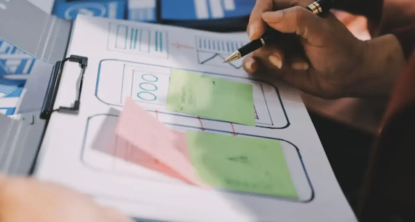
Wireframing and prototyping
Low and mid-fidelity prototypes that test structure and flow before any visual design is applied. Problems caught at this stage cost a fraction of what they cost to fix once a feature is live. We would rather throw away ten wireframes than rebuild one shipped flow.
Handoff to UI design
UX outputs feed directly into our UI design process. Nothing is thrown over a wall. The team that designed the UX works with the team designing the UI, which means the structural intent survives the visual translation. A surprising amount of UX work is undone in handoff to other people. We do not have that handoff.
Want to see how this works in practice?
The how-we-work page covers the full process in detail, including what each stage produces and what to expect at every point in the engagement.

The deliverables.
Each item below is a working document, not a reassurance. Everything goes into the build brief that gets handed to developers, and everything ties back to the research that came out of the first stage.
| Deliverable | What it is and what it does |
|---|---|
| User research report and personas | The research record from interviews, behavioural analysis, and stakeholder sessions, distilled into the specific user types this product is being built for. Not invented personas. Drawn from actual people we spoke to. |
| Information architecture map | The structural map of the product. Every screen, every connection, every branch. The document that tells you what is in the app, where it sits, and why it sits there. |
| User flow diagrams | Step-by-step flows for every core task, including the edge cases and error states. What the user sees, what they do, what happens next, and what the product does when something goes wrong. |
| Annotated wireframes | Mid-fidelity wireframes of every screen, annotated with the logic and intent behind each decision. Developers and UI designers can read the reasoning, not just the layout. |
| Interactive prototype | A clickable prototype that lets you walk the flows before they are built. Used for stakeholder review and user testing. Cheaper to change here than in code. |
| UX specification document | The complete handoff document for development. Behaviour, states, transitions, edge cases, and the rationale for every non-obvious decision. Removes interpretation from the build. |

What goes wrong when UX is treated as a step rather than a foundation.
We see these patterns repeatedly. None of them are unusual, and none of them are a sign of an inexperienced team. They are a sign of a process that did not give UX the room it needed.
Designing for the happy path only
The product works beautifully when the user does exactly what was expected. The moment they do something slightly different, the experience breaks. Real users almost never take the happy path the first time. The edge cases are the product.
Skipping research to save time and budget
Research feels like a delay. It is the opposite. Every week of research saves months of rebuild, because the team is now designing against evidence rather than guessing at what users want.
Treating UX as a single handoff
UX is not a phase that ends. It is an iterative practice that continues through build, launch, and beyond. Treating it as a single document that gets handed over and forgotten is how good early thinking gets quietly undone.
Conflating UX with UI
Prioritising how it looks over how it works. The visual design gets reviewed in detail. The user flows never do. The product ships polished and broken at the same time.
Not designing for the distracted user
First-time users are not focused. They are on a train, between meetings, or half-watching something else. A product that requires undivided attention to make sense will lose most of the people who open it.
Assuming intuitive happens by accident
“Intuitive” is the most common word in product briefs and the most rarely engineered. It is the result of specific UX work, repeated testing, and deliberate hierarchy. It does not appear because the team had good taste.
Not sure if your current UX is working?
Most UX issues are identifiable quickly once the right questions get asked. A short call is usually a good place to start.


The questions founders usually ask first.
How long does UX design take?
The honest answer is that it depends on scope, the depth of research required, and how clear the product proposition already is at the start. For a single focused product, our UX engagements typically run six to twelve weeks. Larger products with multiple user types or significant existing complexity can take longer. Anyone quoting a fixed UX timeline before understanding the scope is selling you a template.
Do I need UX design if I already have a developer?
Yes. Developers build what they are briefed to build. They are not paid to question whether the flow makes sense, whether the user will understand it, or whether the structure is right for the audience. A UX designer creates that brief. Without one, your developer is making UX decisions whether you wanted them to or not, and those decisions get baked into code that is expensive to change later.
What is the difference between UX and UI design?
UX is the architecture of the experience. The flows, the structure, the logic of how users move through the product, and the behaviour of every interaction. UI is the visual layer that sits on top. Colour, type, spacing, imagery, and the look of every component. We do both, and the two work best when the same team owns both. You can read more about the visual side in App UI Design.
Can I see examples of your UX work?
Yes. Our Harley engagement is a good place to start, because it shows how research, information architecture, and flow design fed directly into the final product. The full set of case studies lives at /case-studies.
Three ways to begin.
Pick the route that fits where you are. If you already know what you want to build, send the details. If you want to talk it through first, book a call. If you want to know what this costs before you do anything else, the pricing page sets out the numbers.
Send your project details.
Tell us about the product, the audience, and where you are in the process. We will read it properly and come back with a considered response, not a generic reply.
Send project details →Book a discovery call.
Thirty minutes to walk through what you are building and what you need. Useful if the project is still forming and you want to think out loud.
Book a call →See pricing.
The numbers, the engagement options, and what is included in each. Worth reading before any conversation, so any conversation can be a useful one.
See pricing →