
Expert Guide Series
Whats Included in Ongoing App Maintenance?
Most conversations about app maintenance stop at bug fixes and server uptime. Someone logs a crash, a developer patches it, and the team moves on. That rhythm keeps the product running, but it leaves a much bigger question unanswered: how does the app feel to use, six months after launch, when the team has shipped a dozen new features and the user base has grown and shifted?
Research indicates that around 88% of users will abandon an app due to technical issues like bugs and slow loading times, according to various industry sources. But 72% will abandon due to poor design and poor emotional connection. Those two numbers sit uncomfortably close together, and the gap between them is where ongoing maintenance either earns its place or quietly fails the product.
Ongoing app maintenance, done well, covers far more than keeping the lights on. It tracks how users feel as they move through your product, monitors where confusion creeps in, audits whether your features still serve the people using them, and watches the behavioural signals that tell you something is quietly going wrong before your ratings reflect it. At We Are Affective, the maintenance work we do is rooted in emotional design and behavioural psychology, because a product that runs cleanly but feels wrong will still lose people.
The transparency test
A useful test for any feature under review is to ask: if you had to tell users exactly what this feature does and why it is there, would they still engage with it? If the honest answer is no, the feature is doing something that depends on users not fully understanding it. That is worth fixing. The goal is to educate, inform, and allow natural product discovery rather than to pressurise people into actions they would avoid if they understood them.
Running the audit in practice
A feature audit is not a one-time event. Products that ship regularly should review their feature set on a quarterly cycle at minimum. The audit should flag features with low engagement and investigate whether that reflects irrelevance or poor discoverability. It should also flag features with very high engagement and ask whether that engagement reflects genuine value or confusion that keeps users looping back.
When reviewing a feature, look at the path users take after engaging with it. If a high proportion immediately navigate backwards or close the app, the feature may be delivering something other than what users were expecting.
Managing Cognitive Load as Your App Evolves
Cognitive load is the mental effort required to use your product. At launch, most products have been through enough design review that cognitive load is reasonably well managed. The problems tend to accumulate gradually, as new features are added, new content is introduced, and new onboarding flows layer on top of existing ones.
Each individual addition can seem small and reasonable. Collectively, they shift the product from something that felt clear to something that feels crowded. Users do not usually articulate this as cognitive overload. They just stop using the app, or they start making more mistakes, or their sessions get shorter.
What the data reveals
Error rates are one of the clearest signals of cognitive overload. When users make frequent mistakes within a product, entering information incorrectly or tapping the wrong controls, that pattern often reflects information overwhelm rather than user error in the traditional sense. People are not confused because they are careless. They are confused because the product has asked too much of them at once.
Task completion times offer a complementary signal. If a core task that should take 30 seconds is consistently taking two minutes, something in the flow is creating friction. Drop-off rates at specific steps in an onboarding or checkout flow also point to overload, particularly when the drop-off coincides with a screen that asks for several pieces of information simultaneously.
Progressive disclosure as a maintenance practice
One of the most effective ways to manage cognitive load over time is through progressive disclosure, revealing information and options gradually rather than presenting everything at once. This is worth revisiting regularly as the product grows, because features added to address one user need often land in places that interrupt the flow for everyone else. A maintenance review that maps user journeys against the current information architecture, and asks where complexity is being introduced unnecessarily, will almost always find something worth simplifying.
Review your highest-traffic screens every quarter with fresh eyes. Ask whether the hierarchy still communicates what matters most, or whether added content has gradually pushed the most important information down the page.
Keeping Notifications Timely and Emotionally Appropriate
Notifications are one of the most direct lines between a product and a user's emotional state. A well-timed notification feels like a useful nudge. A poorly timed one feels like an interruption. And a notification sent too often, regardless of its content, starts to feel like pressure.
The frequency and timing of push notifications and in-app messages need regular review, because what felt balanced at launch can drift over time. A product that adds a re-engagement campaign here and a promotional message there gradually builds up a communication load that users experience as noise. The evidence of this shows up in notification opt-out rates, in session frequency declining after a campaign period, and in app store reviews that mention feeling spammed.
Relevance as the primary filter
The most useful filter for any notification is relevance to the user at that specific moment. A travel app sending a packing checklist two weeks before a booked trip is genuinely useful. The same app sending a generic "we miss you" message three days after a trip ends is not. The difference is whether the notification connects to something real in the user's situation.
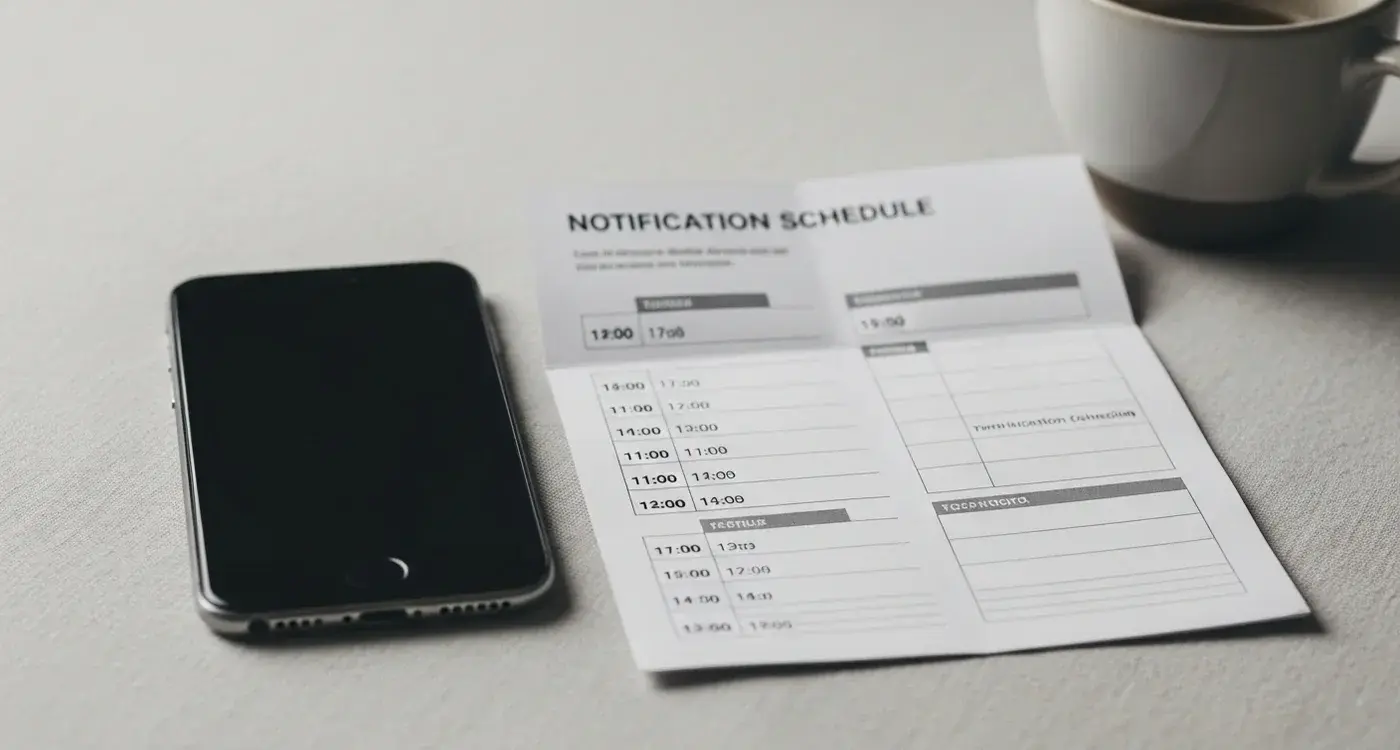
Maintenance here means regularly auditing the notification schedule against user behaviour data, asking whether the timing of each message type reflects when users are most receptive, and removing or rescheduling anything that consistently generates dismissals rather than opens. It also means reviewing the emotional tone of notification copy, because a message that feels warm in a positive context can feel intrusive in a stressful one.
- Review notification opt-out rates by message type to identify which communications are being rejected most often.
- Map notification timing against typical user session patterns to find the windows when users are most receptive.
- Check whether promotional and re-engagement notifications are clustered in ways that create an overwhelming impression, even when individual messages seem reasonable in isolation.
- Audit the tone of notification copy to ensure it matches the emotional context in which it is likely to be received.
Using Behavioural Data to Inform Ongoing Design Decisions
Behavioural data is most useful when it is read alongside self-reported data, rather than instead of it. Survey responses and NPS scores tell you what users consciously think about your product. Behavioural signals tell you what they actually do. The gap between those two sources is often where the most interesting information sits.
Session length is a good example of a metric that can be read two ways. A long session in a productivity app suggests engagement. In a checkout flow, a long session suggests difficulty. The number alone does not tell you which story is true. What resolves the ambiguity is looking at what happens within the session: are users moving forwards through a flow, or circling? Are they visiting the same screens repeatedly? Are they entering and abandoning fields?
Moving beyond vanity metrics
Daily active users and monthly active users are frequently cited as health indicators, but they reveal nothing about why someone opened the app, whether they found what they were looking for, or how they felt when they left. A product can sustain strong active-user numbers while a significant proportion of those users are confused, frustrated, or staying only because switching costs are high. Behavioural data that gets beneath those surface figures, tracking the quality of engagement rather than just its presence, gives a much more honest picture of product health.
Combining data sources
The most complete view of how a product is performing combines behavioural analytics with periodic user research. Behavioural data surfaces patterns and flags anomalies. User research explains them. A spike in dwell time on a particular screen shows up in the data. An interview or usability session reveals whether users are reading carefully because the content is valuable, or re-reading because it is unclear. Both types of evidence are necessary, and ongoing maintenance should build in time for both rather than treating analytics as the whole story.
According to We Are Testers, 69% of users admit to having abandoned an app because it was difficult to use, based on a study of more than 1,000 people. That figure reflects conscious experience. Behavioural data captures the moments that lead to that experience, often before users have consciously registered that something is wrong.
Conclusion
Ongoing app maintenance is sometimes described as keeping the product alive. The more accurate description is keeping the product honest. It is the discipline of checking, regularly and systematically, whether what the product promises and what it delivers are still the same thing, and whether the experience of using it still feels good for the people who matter most.
The technical layer of maintenance, covering patches, performance, and compatibility, is necessary but not sufficient. A product that runs without crashing can still lose users steadily through accumulated friction, notification fatigue, features that have drifted out of alignment with user intent, and cognitive load that has quietly grown beyond what feels reasonable. These are not edge cases. They are the most common ways that products that launched well gradually stop feeling worth returning to.
What the work described in this article has in common is attention. Attention to how users move through the product, to what the behavioural data is actually saying, to whether the emotional tone of the experience has stayed consistent as the product has grown. That attention does not require a large team or a complex process. It requires a clear framework, a regular review cycle, and a genuine commitment to understanding the experience from the user's side rather than the dashboard's side.
If your product is due for that kind of review, or if you are building a maintenance approach from scratch and want it grounded in emotional design from the start, let's talk about your app.
Frequently Asked Questions
What does ongoing app maintenance actually cover?
Ongoing app maintenance goes well beyond fixing bugs and monitoring server uptime. It includes tracking how users feel as they move through your product, auditing whether features still serve your audience, and monitoring behavioural signals that suggest something is going wrong before it shows up in your ratings.
Why do users abandon apps even when there are no technical problems?
Research suggests that around 72% of users will leave an app due to poor design and a weak emotional connection, which sits uncomfortably close to the 88% who leave because of bugs and slow loading times. A product that runs cleanly but feels wrong will still lose people over time.
How often should a feature audit be carried out?
Products that ship regularly should conduct a feature audit on at least a quarterly cycle. The audit should examine features with low engagement to determine whether they are irrelevant or simply hard to find, and should also question whether high engagement reflects genuine value or user confusion.
What is the transparency test and how does it work?
The transparency test asks whether users would still engage with a feature if they fully understood what it does and why it exists. If the honest answer is no, the feature is likely relying on a lack of user understanding, which is worth addressing by prioritising clear communication and natural product discovery.
What is cognitive load and why does it matter for app maintenance?
Cognitive load refers to the mental effort required to use your product, and it tends to increase gradually as new features, content, and onboarding flows are added over time. Users rarely describe this as overload. They simply use the app less, make more mistakes, or have shorter sessions.
What data signals suggest that cognitive load has become a problem?
Frequent user errors, such as entering information incorrectly or tapping the wrong controls, often point to information overwhelm rather than careless behaviour. Task completion times are also telling. If a straightforward action is consistently taking far longer than it should, friction has crept into the flow somewhere.
How can you tell if a feature is delivering what users actually expect?
One practical approach is to look at what users do immediately after engaging with a feature. If a high proportion navigate backwards or close the app straight away, the feature is likely delivering something different from what they were anticipating.
Why is emotional design relevant to app maintenance?
Emotional design influences whether users feel comfortable, confident, and engaged as they move through a product. Maintenance that is rooted in behavioural psychology helps identify where the emotional experience is breaking down, not just where the technical performance is falling short.
Related Articles
What Is Accessibility in Mobile App Design and Why Does It Matter?
A student opens her favourite music app, ready to study with some background tunes. She's...
by Simon Lee

What Features Do Patients Actually Want In Healthcare Apps?
Over 85% of patients abandon healthcare apps within the first month of downloading them. That's a...
by Simon Lee